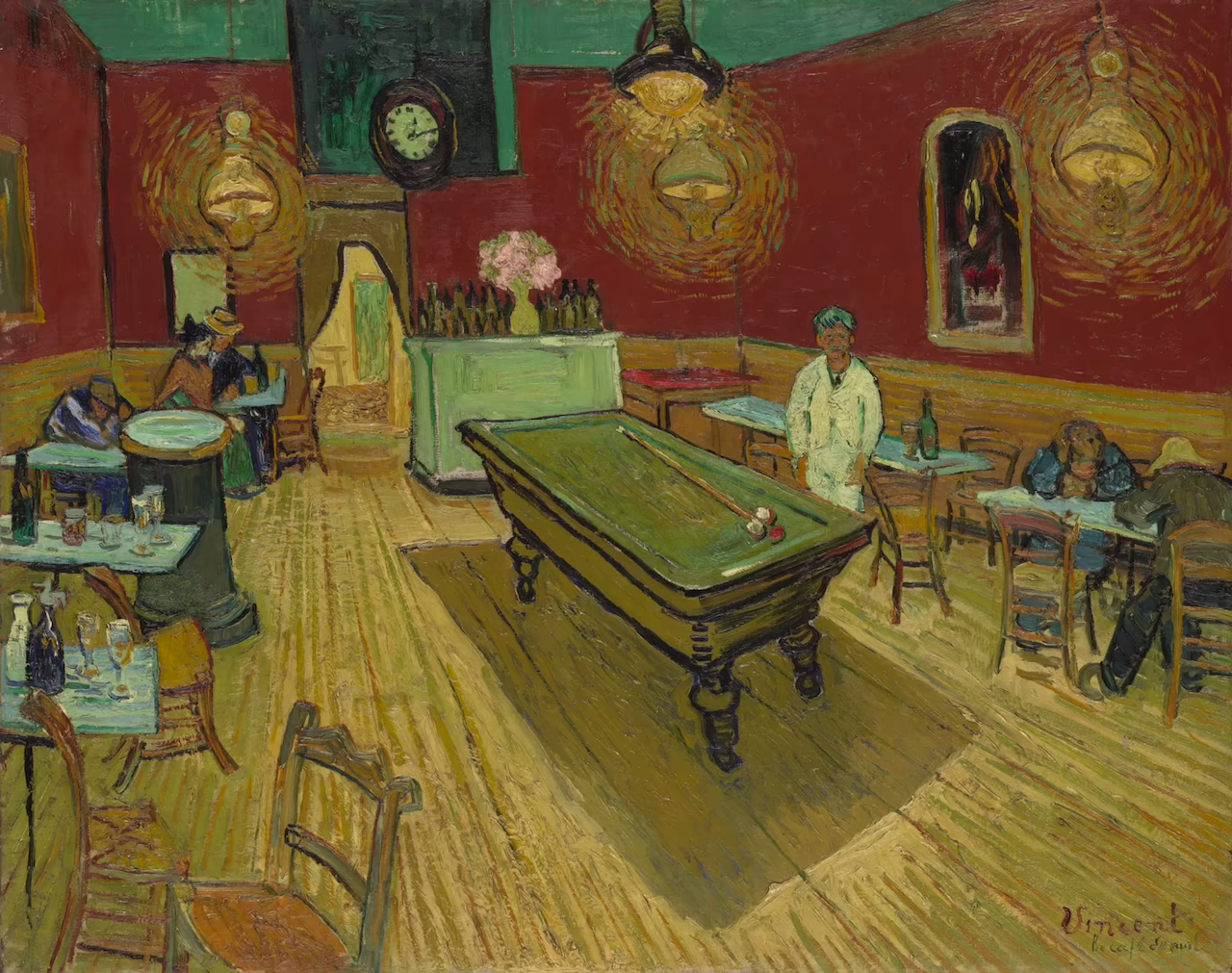
How Vincent Van Gogh Created Optical Anxiety With His Deliberate Use of Conflicting Color in ‘Night Café’

Vlogger Evan Puschak aka The Nerdwriter takes a look at the Vincent Van Gogh masterpiece "Night Cafi(C)" ("Le Cafi(C) de nuit"), the painting that the artist considered to be his ugliest work of all. Puschak explains that Van Gogh was probably referring to the ugliness of the colors (red green) he purposely used to create such optical anxiety to portray such a lonely room with a suffocating yellow light that compromised the color of everything else in the room. Van Gogh had written to his brother about using these colors, so the color effect was absolutely deliberate.
Related Laughing Squid PostsA Virtual Reality Tribute to Vincent Van Gogh and His Famous Painting 'The Night Cafi(C)'Artist Recreates Famous Paintings Using Pantone Color Swatches as PixelsVan Gogh's Iconic Painting 'Bedroom in Arles' Physically Recreated as a Room to Rent on AirbnbI've tried to express the terrible human passions with red and green. "Everywhere it's an anti-thesis of greens and reds.
Follow Laughing Squid on Facebook, Twitter, Flipboard and Subscribe by Email.
The post How Vincent Van Gogh Created Optical Anxiety With His Deliberate Use of Conflicting Color in 'Night Cafi(C)' first appeared on Laughing Squid.