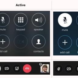
This gallery of mute buttons shows why voice chat apps should be push-to-talk

Dave Rupert put together a gallery of voice chat app screenshots, to show how the mute indicators are inconsistent across applications. For example, the mute indicators for the iPhone and Slack are almost opposite from each other. (See above).
He writes:
I hope you, dear reader, know by now that it's a best practice to mute yourself if you're not talking. Normally I'd say non-muters deserve public shaming but looking at this chart, it's maybe not the non-muters' fault. As you can see, the active mic indicator varies wildly. Sometimes it's a microphone with a background fill, sometimes it's a microphone with a slash, sometimes muted is treated as a background fill with a slash, sometimes the icon fills up with green when talking. It's all even more confusing if someone is sharing out their screen and your entire UI disappears.