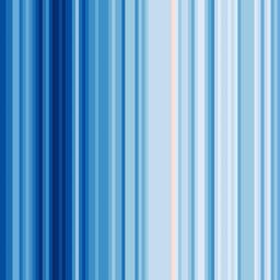
Show Your Stripes: visualizing climate change in your location by displaying 100 years of average temperatures in color bars
by Cory Doctorow from on (#4JZHQ)

Ed Hawkins, a climate scientist, created Show Your Stripes as a way to easily visualize the past century's climate change: give it a location and it will render a series of stripes representing a century's worth of average annual temperatures (above: global average temperature); as Kottke notes: "The warming patterns for particular regions are not going to be uniform"some places are actually forecast to get cooler and wetter rather than hotter and dryer." (via Kottke)