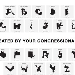
Gerry is an ugly font made from gerrymandered districts

Ooh, this is awesome. Activists have made a free font called Gerry that is made from the shapes of gerrymandered congressional districts. They encourage you to use it to write your representative.
It's here. GERRY. A font created by your congressional districts. Log on to https://t.co/WkuVp7oDpu and use the font to tell congress how happy you are that your vote doesn't matter. pic.twitter.com/j9U5W7qmTz
- Gerry (@UglyGerry) July 23, 2019
The font's creators, Ben Doessel and James Lee, made it to raise awareness and provide a method for disenfranchised voters to protest partisan gerrymandering. The duo, in a press release provided to the media, stated:
"After seeing how janky our Illinois 4th district had become, we became interested in this issue. We noticed our district's vague, but shaky U-shape, then after seeing other letters on the map, the idea hit us, let's create a typeface so our districts can become digital graffiti that voters and politicians can't ignore."
For those unfamiliar with gerrymandering, it's the process by which US voting districts use increasingly nonsensical borders to disenfranchise voters and limit who they can vote for by party lines instead of geography.
(The Week)
Thanks, Veek!
screenshot via UglyGerry.com