Apple rolls out Apple Card Preview to select users
Apple Card is getting its first group of public test users today. A limited amount of customers that signed up to be notified about the release of Apple Card are getting the ability to apply for the card in their Wallet app today - as well as the option to order their physical Apple Card.
I've been using the card for a few days on my own device, making purchases and payments and playing around with features like Apple Cash rewards and transaction categorization.
A full rollout of Apple Card will come later in August. It requires iOS 12.4 and up to operate.
The application process was simple for me. Portions of the information you need are pre-filled from your existing AppleID account, making for less manual entry. I had an answer in under a minute and was ready to make my first purchase instantly. I used it both online and in person with contactless terminals.
It"works.
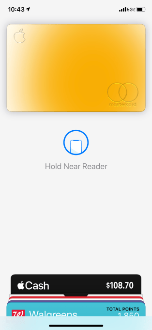
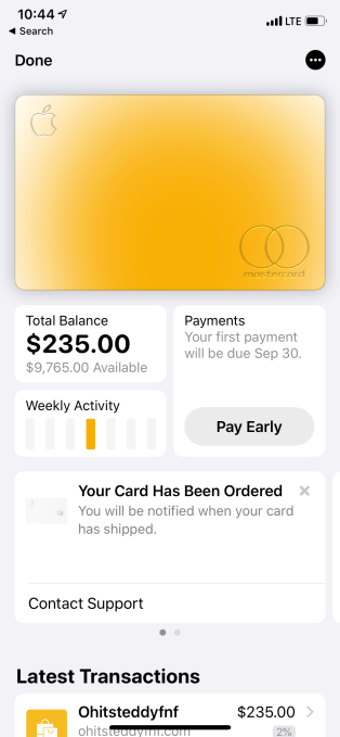
The card on the screen has a clever mechanism that gives you a sort of live heat map of your spending categories. The color of the card will shift and blend according to the kinds of things you buy. Spend a lot at restaurants and the card will take on an orange hue. Shop for entertainment related items and the card shifts into a mix of orange and pink. It's a clever take on the chart based spending category features many other credit cards have built into their websites.

As many have pointed out, if you're the kind of person that maximizes your points on current cards towards super specific rewards, like travel miles, the rewards system of Apple Card will not feel all that impressive. This is by design. Apple's aim on this initial offering was to provide the most representational and easy to understand reward metric, rather than to provide top of category points returns.
But it also means that this may not be the card for you if you're a big travel points maximizer.
I am a points person, and I carry several cards with differing rewards returns and point values depending on what I'm trying to accomplish. Leveraging these cards has allowed me to secure upgrades to higher classes, first class flights for family members and more due to how much I travel. Getting to this point, though, required a crash course in points values, programs and a tight grip on what cards to use when. Shout out to TPG.

You will not be able to leverage Apple's card in this way as a frequent traveler. Instead, Apple decided on a (by comparison) transparent rewards methodology: cash back based on a percentage of your purchases in 3 categories.
Those categories are 3% on all purchases from Apple Stores, the App Store and Apple subscriptions, 2% daily cash on any Apple Pay purchase and 1% with the physical card either online or offline.
The cash rewards are delivered daily, and made available to you very quickly on your Apple Cash card balance. Usually in less than a day. You can then do an instant transfer to your bank for a maximum $10 fee or a 1-3 day transfer for free. This cashout is faster than just about any other cash back program out there and certainly way faster cash reward tallying than anyone else. And Apple makes no effort to funnel you into a pure statement credit version of cash back, like many other cards do. The cash becomes cash pretty instantly.
I could easily see the bar Apple sets here - daily rewards tallies and instant cashouts - becoming industry standard.
The card interface itself is multiples better to use than most card apps, with the new Amex apps probably coming the closest. But even those aren't system level, requiring no additional usernames and passwords. Apple Card has a distinct advantage there, one that Apple I'm sure hopes to use to the fullest. This is highlighted by the fact that the Apple Card application option is present on the screen any time you add a new credit card or debit card to Apple Pay now. Top of mind.
The spending categories and clear transaction names (with logos in many cases) are a very welcome addition to a credit card interface. The vast majority of time with even the best credit card dashboards you are presented with super crappy list of junk that includes a transaction identifier and a mangled vendor ID that could or could not map directly to the name of the actual merchant you purchased from. It makes deciphering what a specific transaction was for way harder then it should be. Apple Card parses these by vendor name, website name and then whatever it can parse on its own before it defaults back to the raw identifier. Way easier.

A note, during the setup process the card will ask you if you want it to be your payment default for everything Apple and will automatically attach to your Apple stuff like App Store and subscription payments. So keep an eye out for that and make a call. You will get 3% cash back on any apps you buy, of course, even if they're third party.
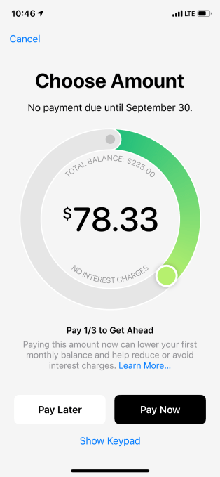
The payments interface is also unique in that Apple is pushing very hard to help you not pay interest. It makes recommendations on how to pay chunks of your balance over time before you incur interest. It places 1-3 markers on the circle-shaped interface that show you how much you need to pay off minimum, minimum with no interest and in full. These markers are personalized a bit and can vary depending on balance, due date and payment history.
I really dug hard on how Apple Card data was being handled the last time I wrote about the service, so you should read that for more info. Goldman Sachs is the partner for the card but it absolutely cannot use the data it gathers on transactions via Apple Card for market maps, as chunks of anonymized data it can offer partners about spending habits or any of the typical marketing uses credit card processors get up to. Mastercard and Goldman Sachs can only use the data for operations uses. Credit reporting, remittance, etc.
And Apple itself neither collects nor views anything about where you shopped, what you bought or how much you paid.
And, as advertised, there are no fees with Apple Card.
One thing I do hope that Apple Card adds is an ability to see and filter out recurring payments and subscriptions. This fits with the fiscal responsibility theme it's shooting for with the payments interface and it's sorely lacking in most first party apps.
Some nice design touches beyond the transaction maps, the color grading that mirrors purchases and the far more readable interface is a pleasant metallic sheen that is activated on device tilt.
My physical card isn't here yet so I can't really evaluate that part of it. But it is relatively unique in that it is nearly featureless, with no printed number, expiration, signature or security codes on its surface.
The titanium Apple Card comes in a package with an NFC chip that allows you to simply tap your phone to the envelope to begin the process of activating your card. No phone numbers to call and, heavens forbid, no 1-800 stickers on the surface of the card.
I can say that this is probably the first experience most people will ever have with a virtual credit card number. The physical card has a 'hard coded' number that cannot be changed. You never need to know it because it's only used in in-person transactions. If it ever gets compromised, you can request a new card and freeze the old one in the app.
For online purchases that do not support Apple Pay, you have a virtual card number in the Wallet app. You enter that number just as you would any other card number and it's automatically added to your Safari auto-fill settings when you sign up for Apple Card.
The advantage to this, of course, is that if it's ever compromised, you can hit a button to request an entirely new number right from within the app. Notably, this is not a 'per transaction' number - it's a semi-permanent virtual number. You keep it around until you have an issue. But when you do have a problem, you've got a new number instantly, which is far superior to having to wait for a new physical card just to continue making online purchases.
Some banks like Bank of America and Citibank already offer virtual options for online purchases, and third party services like Privacy.com also exist. But this is the beginning of the mainstreaming of VCCs. And it's a good thing.