How the Generational Need for Inexpensive Orderly Convenience Led to Manhattan’s Iconic Grid

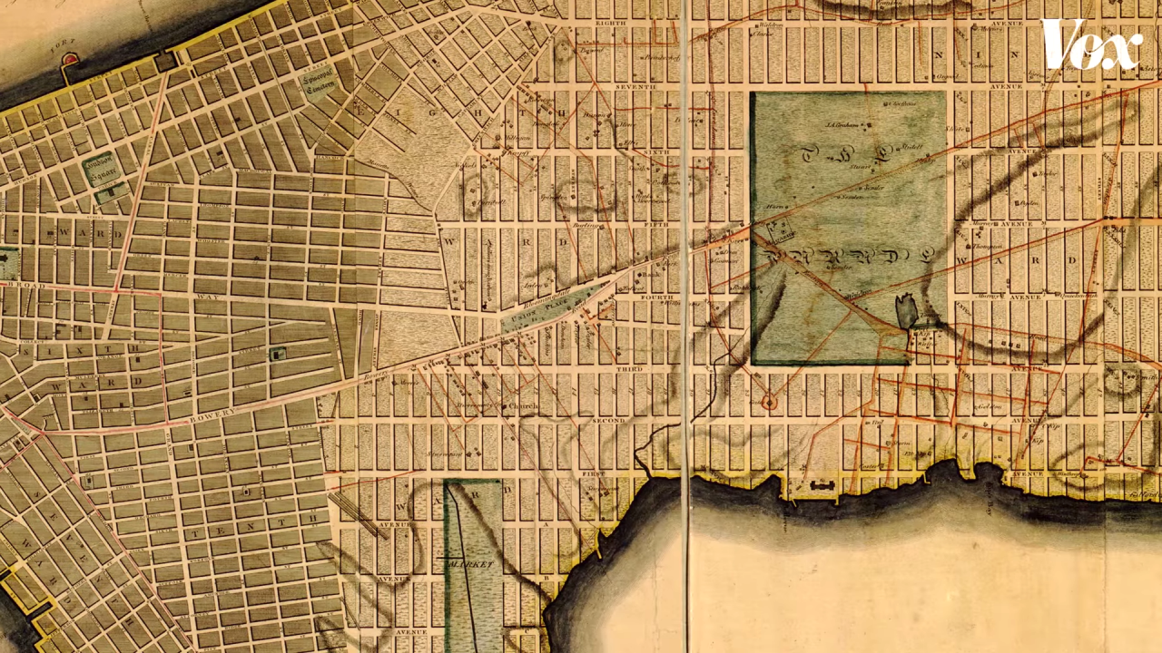
In a geometric episode of Vox Almanac Road Trip Edition, host Phil Edwards explains how the city of Manhattan wound up with its now-iconic grid, a shape that easily lends itself really simple directions and the unique wonder of "Manhattanhenge". As it turns out, the current design isn't what city planners first had in mind, but the chaos of the 18th century led to a real need for a simple, inexpensive, and organized urban layout.
They decided that "right-angled houses are the most cheap to build and the most convenient to live in. The effect of these plain and simple reflections was decisive." The grid did that without screwing up existing property-lines. It was predictable for developers. This was a different type of design. The grid seems orderly to us, but this order was in service of cheapness and efficiency. The city needed to build to keep going. What could be more New York than that?
Related Laughing Squid PostsA Simple Explanation of the North American Power GridA Fascinating Timelapse That Corrects the Thomas Jefferson Grid to the Spherical Shape of EarthA Miniature Downtown Chicago Cityscape Puzzle With 3D Tiles Printed Using Real Time Aerial DataIf my grid video didn't sate your NYC grid curiosity, check out this article by Chaz for a neat quirk the grid created. https://t.co/kwJv9U5AgO
- Phil Edwards (@PhilEdwardsInc) August 2, 2019
Follow Laughing Squid on Facebook, Twitter, Flipboard and Subscribe by Email.
The post How the Generational Need for Inexpensive Orderly Convenience Led to Manhattan's Iconic Grid first appeared on Laughing Squid.