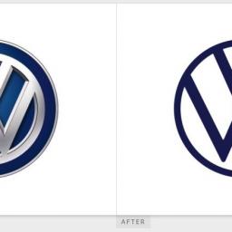
Volkswagen upgrades its logo
by Mark Frauenfelder from on (#4Q46T)

Volkswagen upgraded its logo, which previously looked like a shiny button made of chromed plastic coated with a thin layer of diesel exhaust. The new logo sports a stripped-down simplicity that resembles earlier designs. Wisely, the designers didn't include the swastika incorporated into the original logo.