Subscription email app Tempo hits the right minimalist notes
Email will likely never die, but if new apps can change how we think about using it, maybe it will feel like the worst parts have croaked.
In the wake of popular apps like Inbox and Mailbox being sunsetted, like many, I've been left rudderless trying to find an email client that fills the void. I've been experimenting with so-called premium email clients for a while, and a tiny team in Copenhagen has built what has become my favorite as of late.

Tempo is an email app - currently in free beta - that tries to minimize distractions while helping you be more deliberate and less obsessive about email.
"We believe that we can provide something better for email, but you can't be everything for everybody," co-founder Sebastian Stockmarr told TechCrunch in an interview. "I think we're ready for this fragmentation of the market where we can actually have these niche products, but then they're still for the most widely used technology for communication."
It's Mac-only for Gmail users at the moment, though Android, iOS and Windows platform-support are all on the docket.
Tempo's niche has grown a bit since development began, and the co-founders have eased up on some of their originally spartan design choices that included a desktop app where you couldn't access your full inbox and a beta mobile app that didn't allow you to reply to emails at all.
The radical design decisions were originally made to organize around the idea that being a slave to notifications was bad for productivity and that email was never meant to be an ever-present life blood. The app had "hard-coded in good habits," Stockmarr told me. Over time, the app has become more appealing to a general user, but as the company prepares to launch their mobile app, they are trying to ensure that they can stop their users from defaulting to bad habits with the proper interface.
"Mobile is a pretty important piece," Stockmarr says. "If we want to allow people to focus more and be less disturbed by things, I think the biggest killer of that is in our pockets."
The app has just emerged from its invite-only days in recent weeks and after relying on it for the past couple of months, I've really begun to enjoy some of its intricacies. The most recent email service I spent time with was Superhuman, so expect a few comparisons.
Tempo is an email app that's about directing your focus. Workplace toolsets are so often about sending you mixed signals that drag you out of deep work. Tempo is a design-focused desktop email app that encourages you to give your all to it while it's fullscreen on your computer, and then to let your more trivial emails fade while you get to your other work.
The fundamental difference between the two apps is that Superhuman has optimized for users to get in and out of the app quickly so they can stay current, but Tempo is more focused on you settling into the app but using it less per day. True to the sell, I've ended up checking my email less with Tempo, but I spend more time in the app sending more emails when I do.
The most useful feature of Superhuman was splitting the inbox into messages that were sent only to you and ones that are more likely to be spam or low-priority. You aren't currently able to designate new inbox buckets or set your own rules, which is something that may hold back power users from adopting it.
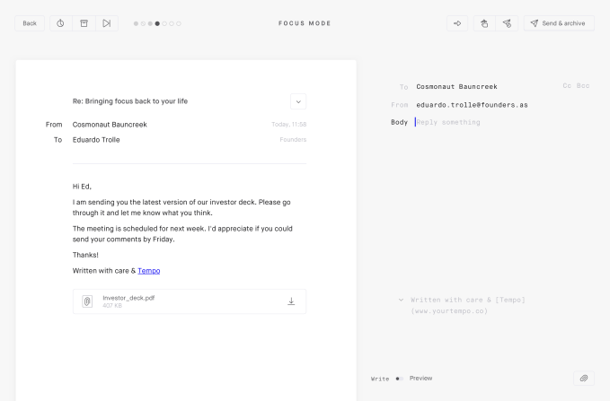
"Focus" is a dedicated mode inside the app that just tosses your most recent email in fullscreen glory right in front of you, and gives you the option to archive it, delete it, send it to the workspace or pound out a quick reply. The quick replies are kind of fun; they somewhat arbitrarily give you a 140-character "limit" that you of course can blow through, but Tempo finds places to encourage you to just get done what you need to rather than rattling on.

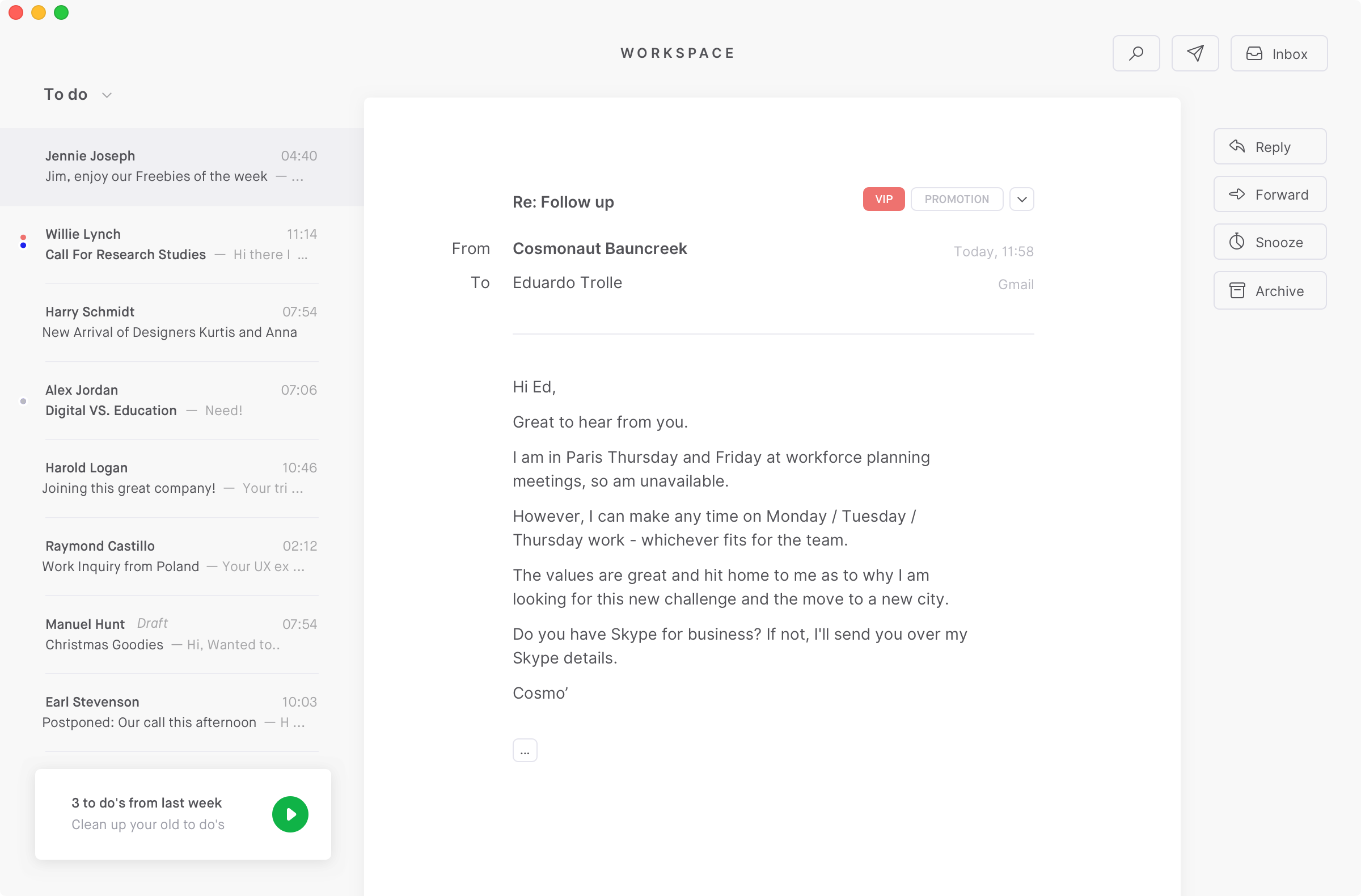
Tempo's workspace (image via Tempo)
The workspace is probably the main distinguishing feature of the app - it's a to-do list that you stock with emails that probably warranted more than a quick reply and may necessitate a few messages before they're safely out of mind. Combining a getting-things-done interface with your inbox makes a lot of sense, given how parallel the mantras of GTD and inbox-zero are. One feature that I don't use, because I can't really afford to as a reporter (or so I tell myself), is scheduled notifications, where you are only sent a desktop notification or two per day letting you know that you have emails to check. You can schedule when these arrive and it encourages you to not be afraid to let a few emails build up in your inbox rather than obsessively checking them.
There are still some design quirks I don't love, especially regarding how search works, some of the reply/forward mechanics and the occasional beta bugginess, but it seems to help me be healthier about email without feeling too preachy. While competing apps like Superhuman are putting the emphasis on speed, Tempo's founders say that shaving milliseconds from open times isn't where much of their focus lies.
"Speed, in itself, is not a goal for us," Stockmarr tells TechCrunch.
That seems pretty in-line with the product's design ethos, but it also might have something to do with the fact that Tempo just has five people on its team and isn't looking to raise any big venture rounds soon, saying that they believe they're within sight of profitability with the current funding from the design studio Founders inside which Tempo sits.
Tempo's Mac desktop app is currently free, but once the startup launches their mobile app, they're planning to charge $15 per month for the service. The service might cost half of Superhuman's $30/mo, but the test for the startup will be forcing users to compare how the app makes them feel about their relationship with email versus how it makes their credit card feel.