iPhone 11 Pro is the most accessible iPhone yet
Last year's iPhone was an outlier for me. Although I reviewed the then-new iPhone XS line, the model I ultimately chose for myself was the "lesser" iPhone XR. I chose it mostly for aesthetic reasons. As much as I appreciated its well-rounded technical merits, I was downright giddy at the notion I could have an iPhone in my favorite color: blue. I've not once regretted my choice nearly a year later. Color aside, the XR was-and remains-a terrific device.
At a fundamental level, choosing the iPhone XR was more significant than a favorite color or a willingness to accept some technical differences. As a visually impaired person, foregoing the XS meant I was purposely giving up a pivotal accessibility feature-the OLED screen-that would have made my experience with the device more accessible. In hindsight, the fact I decided on the objectively worse phone in the XR speaks volumes about how great it was as a product, and how color can spark such raw, immense delight.
This year, there is no blue iPhone. Without the emotional appeal of color in the equation, I'm reminded once again why the best iPhone money can buy-the iPhone 11 Pro Max-is the best, most accessible iPhone for me.

Apple provided me with two review units: one white iPhone 11 and one midnight green iPhone 11 Pro Max. As of this writing, I've had both phones for close to two weeks and I've spent roughly a week with each phone. I also have my year-old XR handy as a reference tool.
While I have spent lengthy time with OLED displays before-my iPhone X had one and, on a much smaller scale, every Apple Watch has had one-coming back after a year with my XR's Liquid Retina LCD screen was quite literally eye-opening. Even with my poor eyesight, I immediately could notice a substantial difference in quality after putting my XR (and iPhone 11) side by side with the 11 Pro Max. For two years now, Apple has rightfully boasted about the XR's (now 11) LCD screen being the best in the industry. It is ridiculously good, but the Pro's OLED display is itself so good that I've wondered during testing how I was able to live happily with my XR last year.
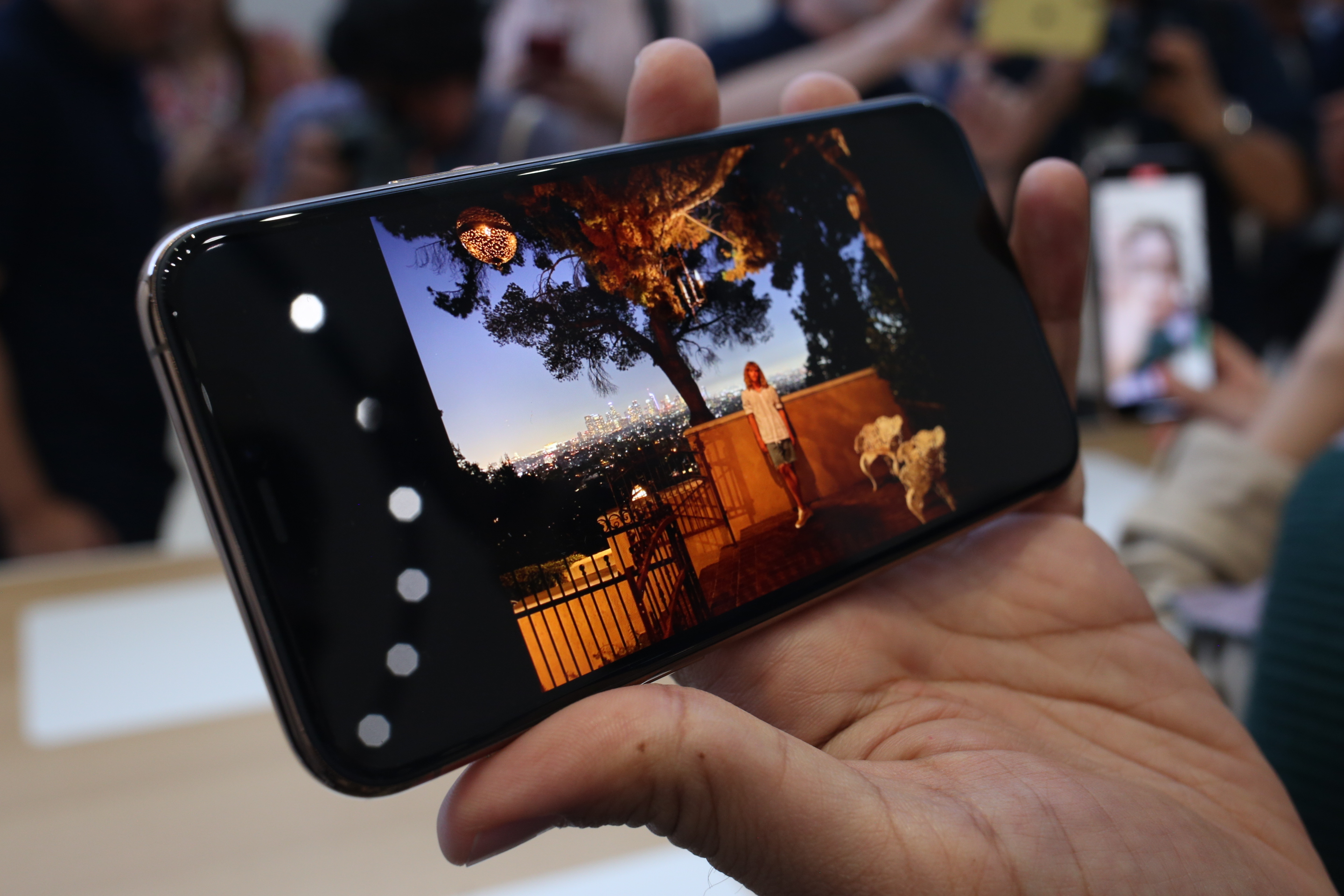
In practice, the Super Retina XDR display on the 11 Pro Max is appreciably better in all phases. In addition to being physically larger (albeit not by much), the 11 Pro Max display's brightness and sharpness make everything I see on my device much easier. It reduces eye strain and fatigue, which are constant battles for me. iOS 13's new dark mode looks fantastic on OLED screens; I have it set to automatically switch from light to dark at sundown, and use apps like Twitter and Things in their pitch black modes at nighttime. Although there are dark mode skeptics, I personally find it to be a welcome reprieve during evening hours, and the credit is due to the Pro's OLED display.
I started my testing with the iPhone 11 Pro Max for a few days, then switched to the regular 11 for another few days. After using both, knowing their respective screen technologies, I instantly knew which model I preferred. I could use the iPhone 11 with no problem, but having access to both phones reaffirmed to me just how superior OLED is for my vision. For my needs, it's OLED or bust.

I've written about my trials with Face ID before. As we collectively enter our third year with Apple's facial recognition system, I think it's worth briefly examining where it stands in context of the new iPhones and accessibility.
Apple says Face ID in the new iPhones is "up to 30 percent faster" while working from further away and at more angles than before. I cannot tell how much better it is in these regards; it's Face ID and it seems to work just as well as it ever has. My strabismus still seems to wreak havoc on the phones' TrueDepth camera system.
I set up Face ID on my 11 Pro Max and turned off Require Attention so that I needn't look directly at the camera to unlock my phone. (When you do this, Apple blasts a modal alert on screen saying Face ID won't be as secure as it could be. Fair enough, but it's a trade-off I have to make in order to use it.) It's worked like a charm, as usual.
What's interesting, though, is what happened when I switched to the regular iPhone 11. I set up Face ID, but forgot to go into Settings and disable Require Attention. I suddenly realized this the other day, as I had clearly forgotten Face ID settings don't sync from device to device. In hindsight it's impressive how much Face ID has seemingly improved at recognizing my gaze. Whether it's purposeful on Apple's part, I don't know, but I think it's telling that I was unlocking my phone and paying for Lyft rides pretty much hassle-free for days with Require Attention on by default.
My strabismus still makes me an edge case, so I prefer Require Attention be disabled, as it's the path of least resistance. Yet the happy accident I had regarding Require Attention led to a pleasant surprise. I can't say it's directly attributable to this generation of Face ID, but it's an improvement regardless.
Adieu, 3D TouchLike the much-maligned Touch Bar on the MacBook Pro, I have long been an ardent supporter of 3D Touch. I wrote about how it could positively impact accessibility when in debuted with the iPhone 6s four years ago, and missed it with my XR.
Apple's removal of 3D Touch lends credence to the cons I outlined in my 2015 piece-namely, that it was too complex (for users and Apple) and it was too undiscoverable. The Apple community at large has felt this way about the feature since the beginning, especially bemoaning how it never percolated across iOS devices, most notably the iPad.
iOS 13 has brought Haptic Touch, first introduced with the iPhone XR last year, as a replacement for 3D Touch. It's more or less equivalent; iOS 13 has expanded Haptic Touch's scope so as to pick up many of 3D Touch's tricks. These include Quick Actions on home screen icons and message previews in Mail and Messages. And importantly of course, these features work on iPads running iPadOS.
From an accessibility perspective, I have enjoyed having access to these shortcuts again on my iPhone 11 review units. I missed them during my time with the XR until now; the contextual menus throughout the OS really do cut down on excessive swiping and tapping. I like how Apple has grown Haptic Touch for the most part. I cannot tell an appreciable functional difference between it and 3D Touch in terms, say, starting a new email or text message from the home screen.
Where I believe Haptic Touch is a regression from 3D Touch is in performance. Accessing Quick Actions or link previews, for instance, feels like it takes forever relative to before. It isn't so bad to the point that it's unusable, but it's definitely noticeable. More importantly, it causes Haptic Touch to lose a bit of the luster that makes haptic feedback such a promising assistive technology. Where 3D Touch always felt instantaneous, Haptic Touch, capable as it is, feels slower, thus ruining the fun a little. I assume this latency can and will improve over time, but count me as one who misses 3D Touch in the new iPhones.
[gallery ids="1885238,1885228,1885236,1885214,1885218,1885223,1885222"]
MiscellanyA few cursory notes on the new iPhones worth mentioning.
SIM card swapping. This is an extremely first-world problem, because I am privileged in the sense I get to review new iPhones every year. But this is an accessibility matter! Every year I get a new iPhone (or multiple iPhones) for testing, I'm reminded just how inaccessible the act of swapping my SIM card can be. It is a test of my visual acuity and fine-motor skills, both of which are not strong suits of mine. Especially on the midnight green, where the finish is so dark on the sides I can hardly see where the SIM tray is, moving between three iPhones can be quite adventurous. (I remember the jet black iPhone 7 having the same issue in terms of finding the SIM tray.) I like that Apple provides users with the SIM tool; the SIM card dance isn't their fault. Still, as a visually impaired reviewer, I felt compelled to share this bit of accessibility minutia.
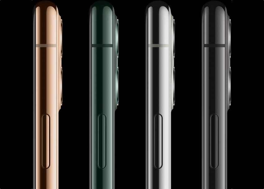
Color. Speaking of color, I do like the new midnight green finish a lot. The CW's Arrow is my favorite television show, and the shade of green strikes me as the iPhone Oliver Queen would choose.
Battery life. One of the iPhone 11's biggest selling points is the dramatically increased battery life. I've long compromised my battery-on an iPhone, iPad, or Apple Watch-because I need to run my devices with maximum screen brightness in order to see. That I can do so on iPhone 11 and still mostly benefit from the battery gains speaks volumes about Apple's battery work. I can go a whole day, using my phone normally at max brightness, and not stress about conserving my battery or finding an outlet somewhere.
Portrait (pig?) Mode. Seriously, Portrait Mode on the new iPhones was made for pigs.
The bottom linePortrait Mode on iPhone 11 was made for pigs. Namely, mine.
cc: @Pickavet pic.twitter.com/jUXGsRiIDv
- Steven Aquino (@steven_aquino) September 30, 2019
It's a testament to the "completeness" of last year's iPhone XR that I was so happy with it. Yes, it was beautifully blue, but it was also a damn good all-around iPhone. Apple describes the iPhone 11 as having "just the right amount of everything," the iPhone for everyone, but that tagline could just as easily apply to the XR. Even today, the XR is a great phone if you can do without the second camera. The iPhone 11 is simply a better iPhone XR.
The iPhone 11 and 11 Pro are close enough, spec-wise, that if it the regular 11 came in blue, I might've been tempted to upgrade to that. There's a reason Apple offers iPhones in a rainbow of colors; the psychological impact color has on consumerism is a very real phenomena. Perhaps someday soon there will be a blue iPhone with a Super Retina OLED display. That said, while both iPhones are highly impressive, I'm happy with the Pro for the upgraded screen quality and three cameras. You really can't go wrong with either iPhone 11, but for this year anyway, the return to OLED was the clincher for me.