Hulu ramps up its personalization efforts, starting with launch of Like / Dislike buttons
Hulu says it's working on several product changes to make its service more personalized to viewers. It recently launched an enhanced recommendation engine that now accounts for not just what you watch, but also when. And today, it's introducing the first of what will be many more personalization-focused improvements, with the addition of Like and Dislike buttons. These will allow you to give Hulu direct feedback about your interests, the company says.
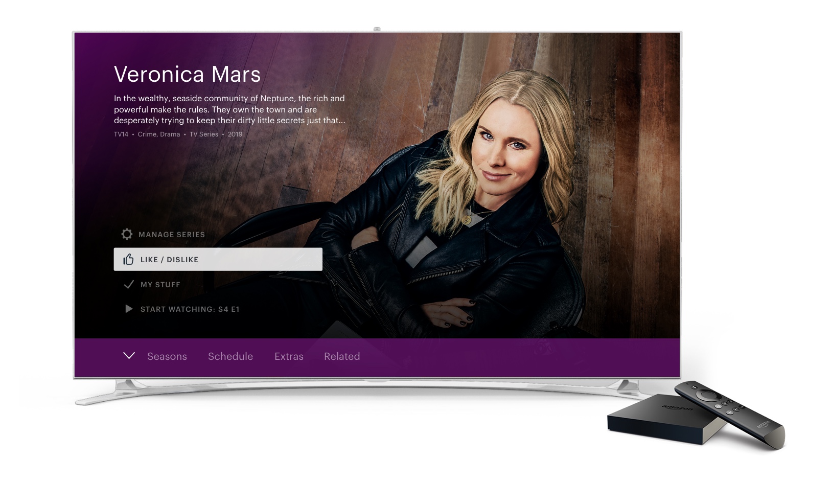
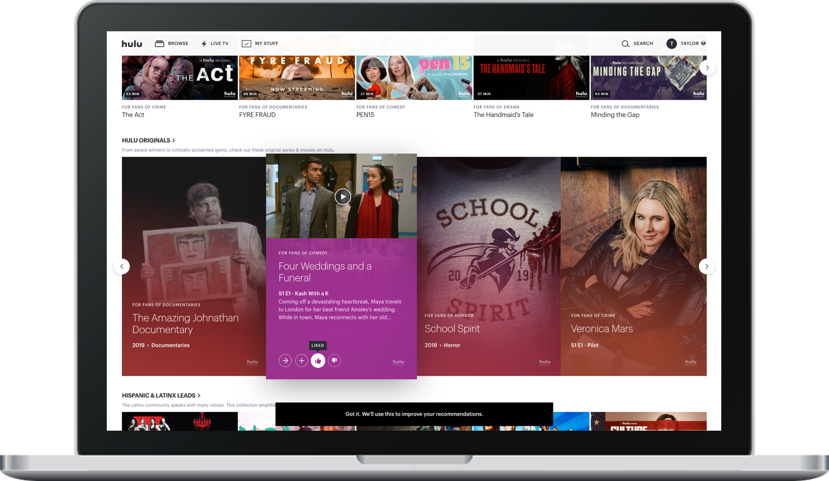
The new buttons will appear across Hulu's content, including on the title's Details page right above the plus (+) button where you can add the show or movie to your watchlist (aka "My Stuff.") On living room devices, you'll see the buttons on all Details pages. On the web, you'll see the buttons on any show, movie or program on the Home page for now, with support for Details pages coming soon, Hulu tells us.
The buttons will also be accessible on some of the content recommended across Hulu's main interface, so you can share your likes and dislikes as you're browsing for something new to watch.
When you like a movie or TV show, Hulu will show you more titles and shows that are similar. And when you "Dislike" a show or movie, Hulu won't show you that title again.

The latter option, the "Dislike," is similar to another feature Hulu had been developing. At its Upfronts presentation last year, Hulu introduced a "Stop Suggesting" feature that would stop Hulu from recommending a title you didn't want to see.
But "Stop Suggesting" wasn't an explicit signal that you hated something - it could mean you've already watched that show elsewhere, for example. It could have meant you liked the show, but didn't want people to know that, because it's a little embarrassing - like some trashy reality TV. Or it may have just meant you felt neutral about the title in question, but wanted it out of your recommendations to make room for better suggestions.
Hulu confirmed with us that the new Like / Dislike buttons will replace this Stop Suggesting feature going forward.
The new Like and Dislike buttons are rolling out today to Hulu.com, Amazon Fire TV devices, XboxOne, Nintendo Switch, select LG, Samsung and Android TVs, VIZIO SmartCast TVs and Chromecast, with other devices coming soon.
The buttons are only one of many new features Hulu has in the works.
It's also working on a new, personalized homepage for viewers that will display the most relevant collections for you and order them based on your watch preferences.
The homescreen is an area where Hulu, to be frank, has been lacking in recent years.
For instance, the company said in January it would drop the confusing landing page called "Lineup" in order to simplify navigation. It then followed through later in the year by doing just that. Lineup had never made much sense to Hulu end users. It wasn't clear if it was some sort of personalized section or a list of things Hulu wanted to promote or some combination of both.
Hulu's plans for its revamped homescreen make it sound like it will go more in the direction of Netflix, as it will feature sections dedicated to the user's favorite shows and movies alongside a number of content collections personalized to what that person actually watches. For example, animation fans would see an animation section higher on their page, while those who never watch family movies or kids shows would see a kids content collection ranked much lower.

Hulu said it will also roll out more improvements to its recommendation engine to make the collections it suggests more reflective of what you've watched in the past. And it will refine its suggestions for content that's "Up Next."
In addition, an editorial team will work to identify any "can't miss" items - like breaking news or trending shows - and place those at the top of the algorithmically driven recommendations.
Finally, Hulu says it's working on a better search experience that will be more useful when you typo or misspell things, or if you use common abbreviations - like HIMYM for "How I Met Your Mother," for example.
The company already tested this with "The Handmaid's Tale," and was able to identify and correct more than 1,500 unique misspellings, it says.
"We know that today's connected consumers expect a deeply personalized experience when they watch TV. At Hulu, we've always taken a unique approach to recommendations," said Jason Wong, director, Product Management at Hulu, in an announcement about the changes. "It's a combination of human curation, empowering our viewers, and algorithms that round out the personalized experiences we deliver to Hulu subscribers," he said.
The changes are being introduced ahead of the launches of two highly anticipated new streaming services, Disney+ (Disney is also the majority owner of Hulu) and Apple TV+. It's unclear how consumers will adapt to the expanded choice in streaming - especially with HBO Max and NBCU's streaming service, Peacock, on the horizon. Existing streaming services are enhancing their products in advance of these launches with the hopes of better retaining their viewers. Netflix, for example, recently added a "coming soon"-type section to encourage users to stay subscribed.
The new Like / Dislike buttons are arriving starting today, but Hulu didn't give a timeline for the other changes, beyond noting they're "coming soon."