Adobe celebrates Photoshop’s 30th anniversary with new desktop and mobile features
Adobe's Photoshop celebrates its 30th birthday today. Over that time, the app has pretty much become synonymous with photo editing and there will surely be plenty of retrospectives. But to look ahead, Adobe also today announced a number of updates to both the desktop and mobile Photoshop experiences.
The marquee feature here is probably the addition of the Object Selection tool in Photoshop on the iPad. It's no secret that the original iPad app wasn't exactly a hit with users as it lacked a number of features Photoshop users wanted to see on mobile. Since then, the company made a few changes to the app and explained some of its decisions in greater detail. Today, Adobe notes, 50 percent of reviews give the app five stars and the app has been downloaded more than 1 million times since November.
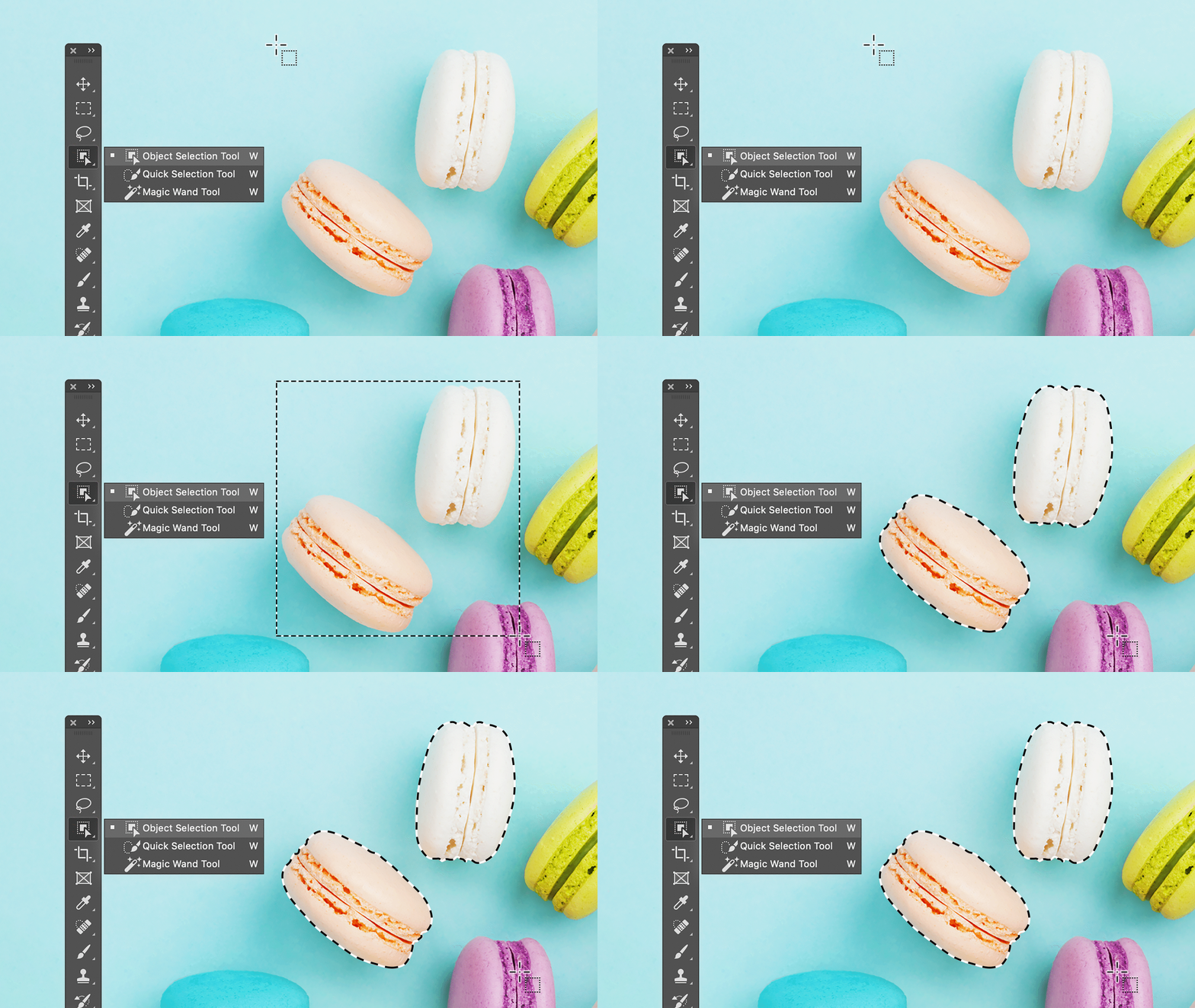
With the Object Selection tool, which it first announced for the desktop version three months ago, Adobe is now bringing a new selection tool to Photoshop that is specifically meant to allow creatives to select and manipulate one or multiple objects in complex scenes. Using the company's Sensei AI technology and machine learning, it gives users a lot of control over the selection process, even if you only draw a crude outline around the area you are trying to select.
Also new on the iPad are additional controls for typesetting. For now, this means tracking, leading and scaling, as well as formatting options like all caps, small caps, superscript and subscript.
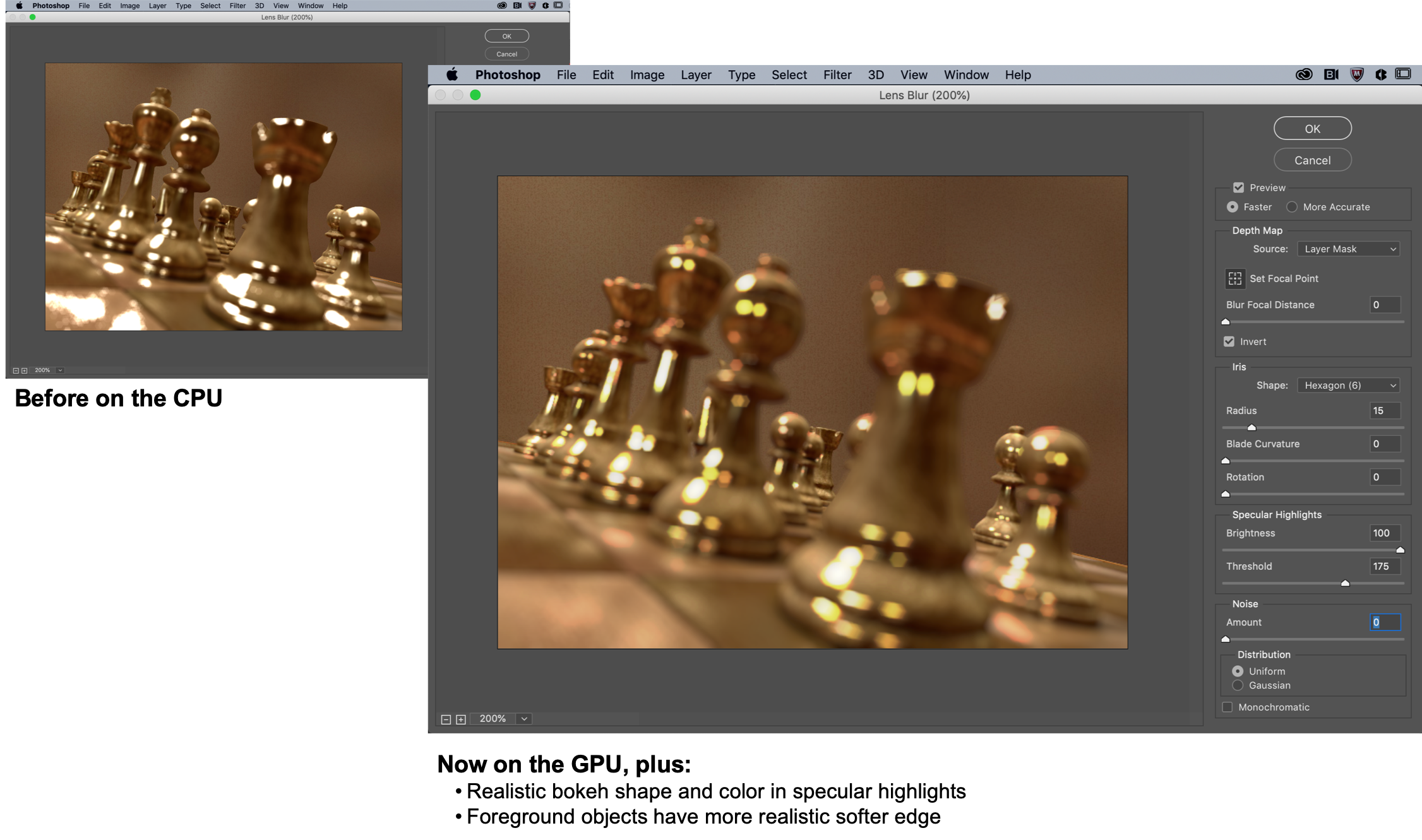
On the desktop, Adobe is bringing improvements to the content-aware fil workspace to the app, as well as a much-improved lens blur feature that mimics the bokeh effect of taking an image with a shallow depth of field. Previously, the lens blur feature ran on the CPU and looked somewhat unrealistic, with sharp edges around out-of-focus foreground objects. Now, the algorithm runs on the GPU, making it far softer and foreground objects have a far more realistic look.
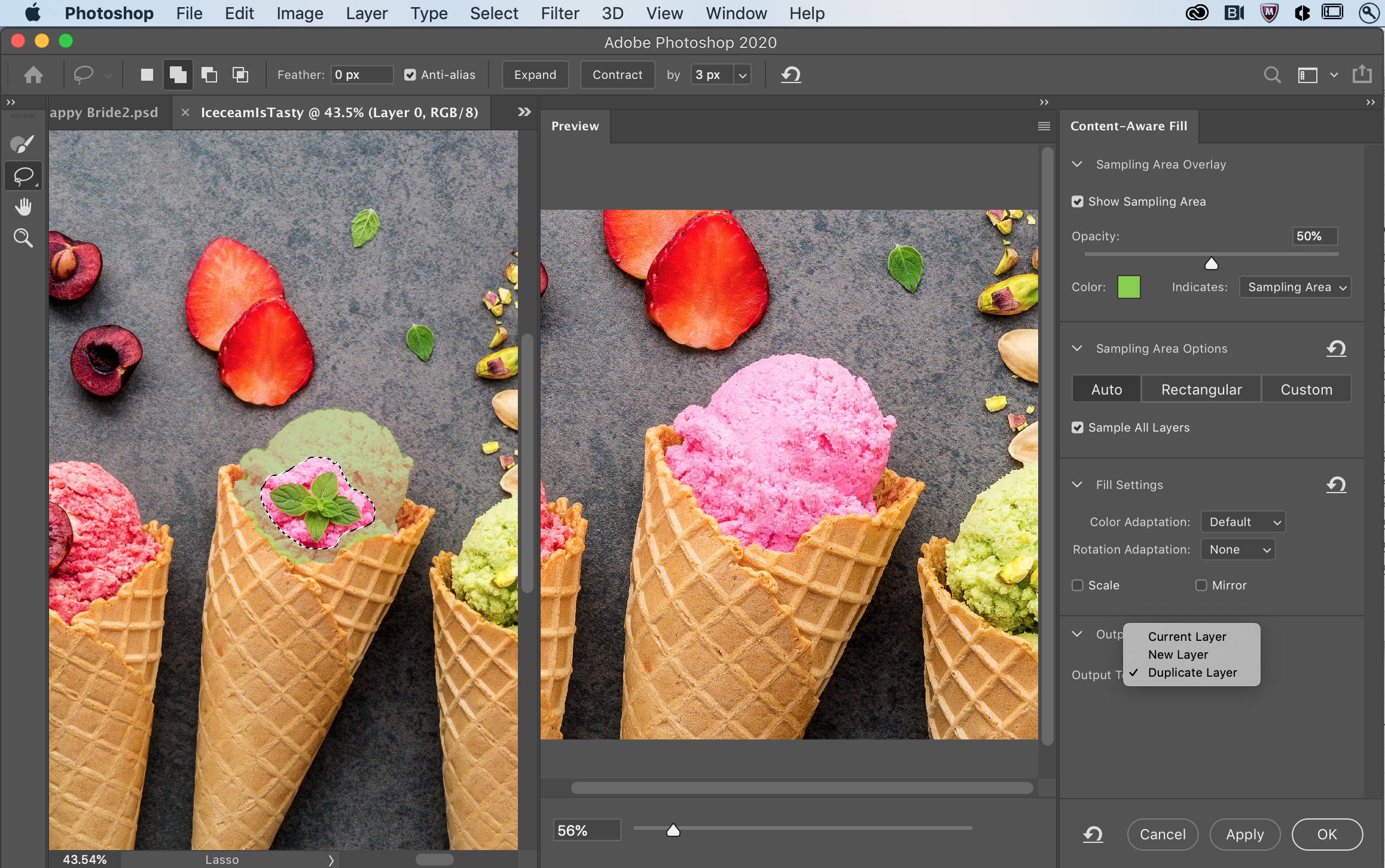
As for the improved content-aware fill workspace, Adobe notes that you can now make multiple selections and apply multiple fills at the same time. This isn't exactly a revolutionary new feature, but it's a nice workflow improvement for those who often use this tool.


