Spotify tries making its app easier to use in latest update
After recently tweaking its design to better showcast podcasts, Spotify today announced it's giving its entire mobile experience a refreshed look-and-feel. Starting initially with the iOS app, both Spotify Free and Premium users will notice the app has a more consistent, streamlined look, new in-app icons, changes to how cover art displays, and more.
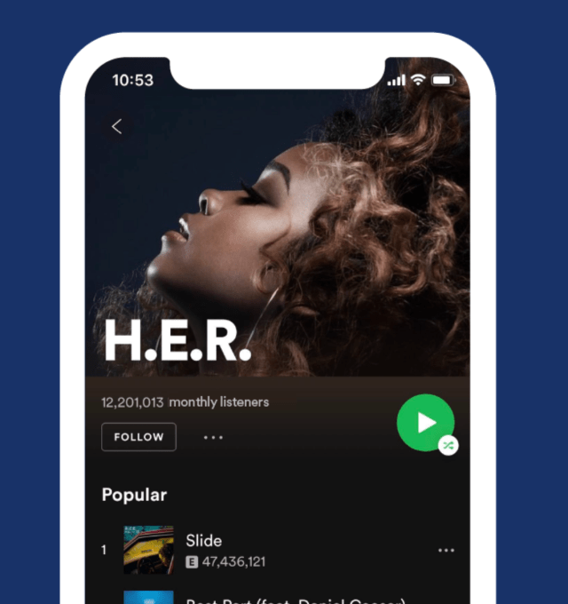
The new app has a simpler, universal Shuffle Play button which now saves you a click by letting you tap once to start shuffling songs and playing them.

Action buttons used by Premium users, including "like," "play," and "download," are now grouped in a row at the bottom-center of the screen instead of spread out around the interface, as before. The downloading button for Premium users has also been updated so it looks the same as the one used for downloading podcasts.
Not only does grouping actions make for a more intuitive experience, it also better lends itself to using Spotify with just one hand. That's definately been more difficult to do in the past, as actions were on far sides of the screen or even buried away in the More menu at the top right - causing you to have to reach all the way around the screen with your (hopefully) long thumb or use the app two-handed.

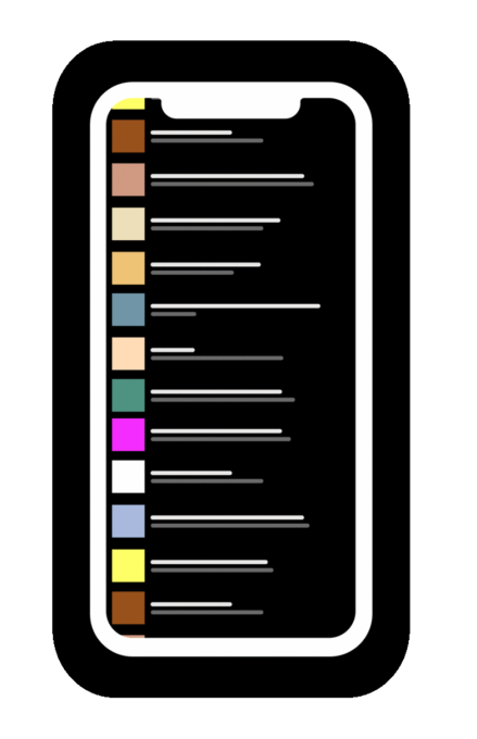
The refreshed app is also easier to browse visually, as it's now displaying a track's cover art in all views - except, obviously, the album view. This way, when you're scrolling through lists of songs, you won't have to read every title - you can just scan the screen for the cover art instead. Plus, songs you've previously "liked" will show the heart icon next to the the track name as another visual clue.

Though the individual tweaks on their own are subtle, the overall goal is to make Spotify's app easier to use. This is an area that Spotify has struggled with, to be fair. The app tends to be praised more so for its clever personalization technology and wide range of curated playlists - not its design. Some users switching over from Apple Music, which has a cleaner and brighter feel, find Spotify lacking.
Today's changes may not address those problems. Spotify still loves its dark theme and its app is still busier than it needs to be - mainly because it's had to cram podcasts into the same app as music, while Apple breaks them out separately. But the update makes the app a bit easier to use and navigate, which is particularly important when it expands to global markets where a simplified experience could be key to its adoption among first-time mobile users.
The changes are arriving starting today on iOS, but you may not see them until the rollout completes.
Spotify says the new look will be "coming soon" to Android users.