GOAT Uniforms: Sunbursts, bruised bananas highlight Part 2 of our countdown
"If you look good, you play good." - Deion Sanders
theScore is counting down the 100 best uniforms in sports history, with a new post every weekday until May 15.
May 4-8:
100-91 | 90-81 | 80-71 | 70-61 | 60-51
May 11-15:
50-41 | 40-31 | 30-21 | 20-11 | 10-1
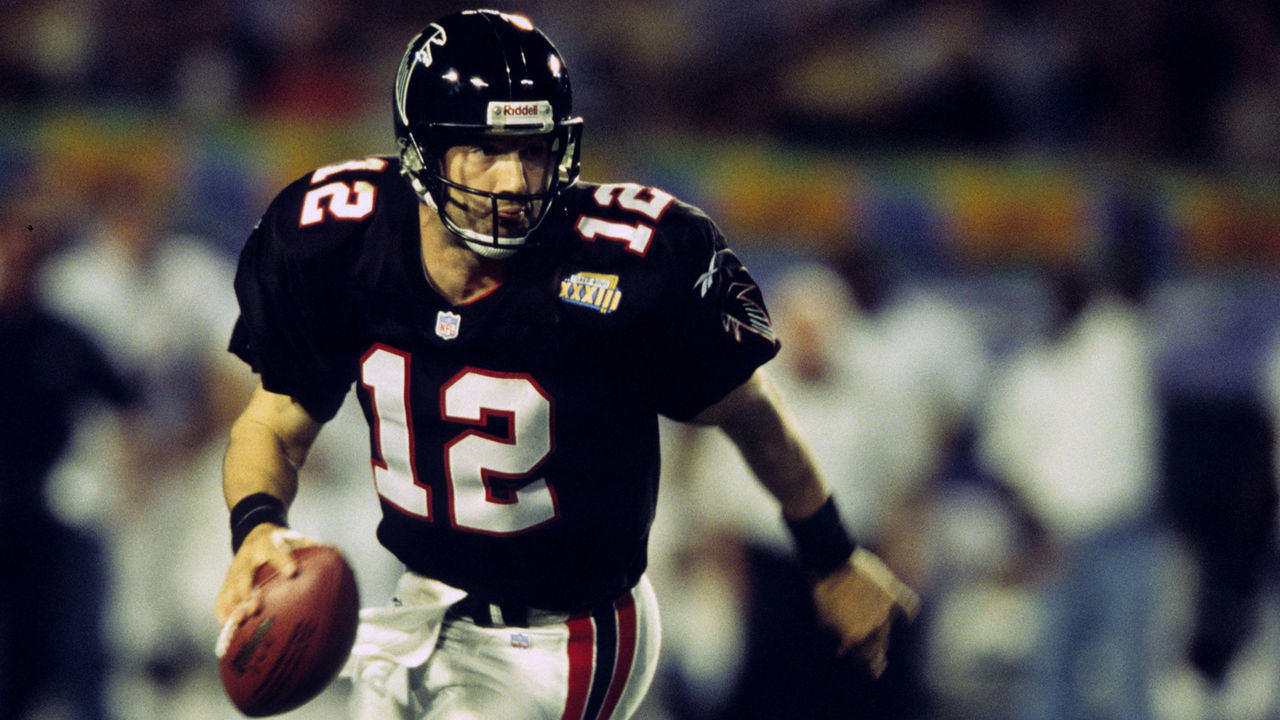 Al Pereira / Getty Images Sport / Getty
The Dirty Bird-era Falcons had a certain swagger about them, and these uniforms helped the cause. With no frills attached, the red trim around the numbers on the black jersey helped things pop, and it all blended perfectly with the simple stripes down the side of the pants. It's a shame Atlanta didn't go back to something similar with its recent redesign.
89. Phoenix Suns (1990s)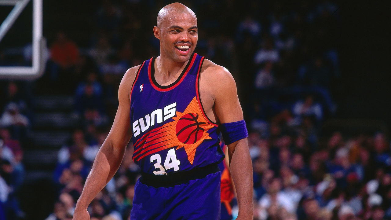 Sam Forencich / National Basketball Association / Getty
The Suns' vibrant purple-and-orange color scheme deserves a bold design, and the "sunburst" digs from the Charles Barkley days were the best in franchise history. The giant logo used by Phoenix helped inspire a trend mimicked across the NBA through the '90s, and many of those unis live on today as classics for an entire generation.
88. Arizona Coyotes (1990s)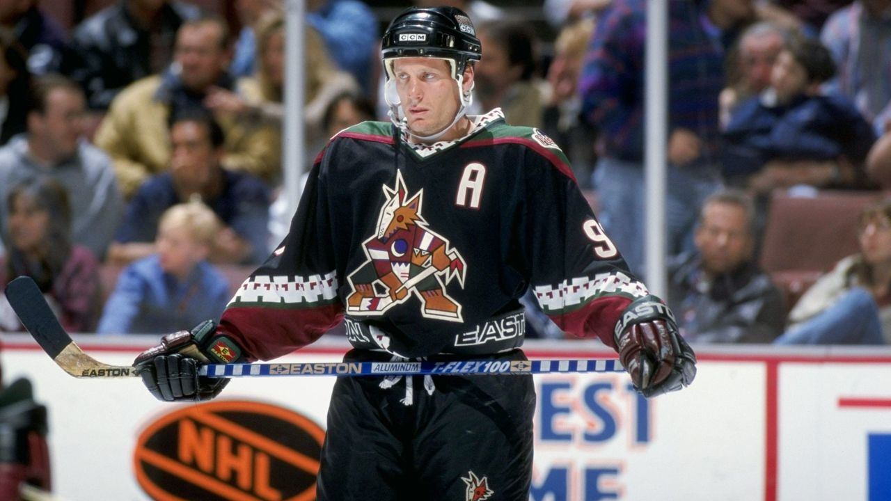 Robert Laberge / Getty Images Sport / Getty
This uniform just screams '90s, but after relocating from Winnipeg to Phoenix, the Coyotes needed something to stand out from the pack. The Kachina design pays homage to Native American history in the southwestern United States, and the exclusive color scheme looks outstanding on the ice. Modernizing the look and using it as a third jersey beginning in 2018 was a brilliant decision.
87. New Jersey Nets (1970s)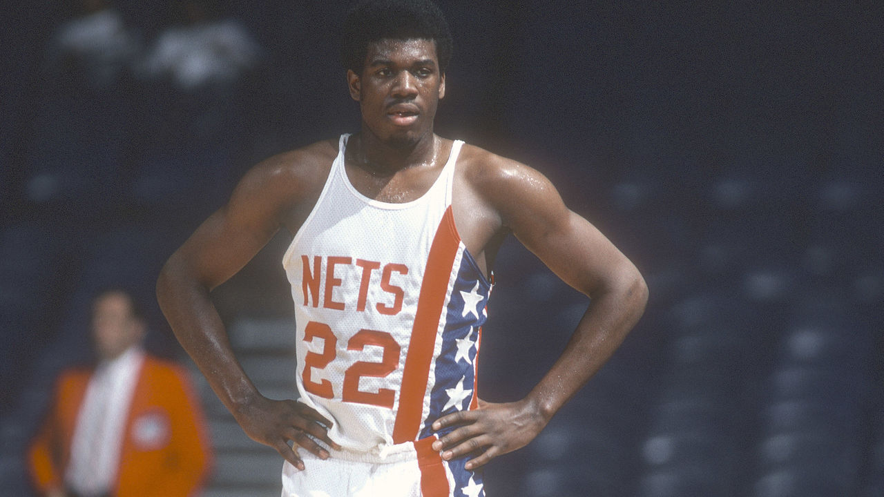 Focus On Sport / Getty Images Sport / Getty
The Nets have sported some of basketball's best and worst looks across their ABA and NBA history, including an acid-washed monstrosity that lasted just the 1990-91 season. The 1970s jerseys, made famous by Dr. J, are a masterpiece of asymmetrical uniform design.
86. Arsenal (1991-93)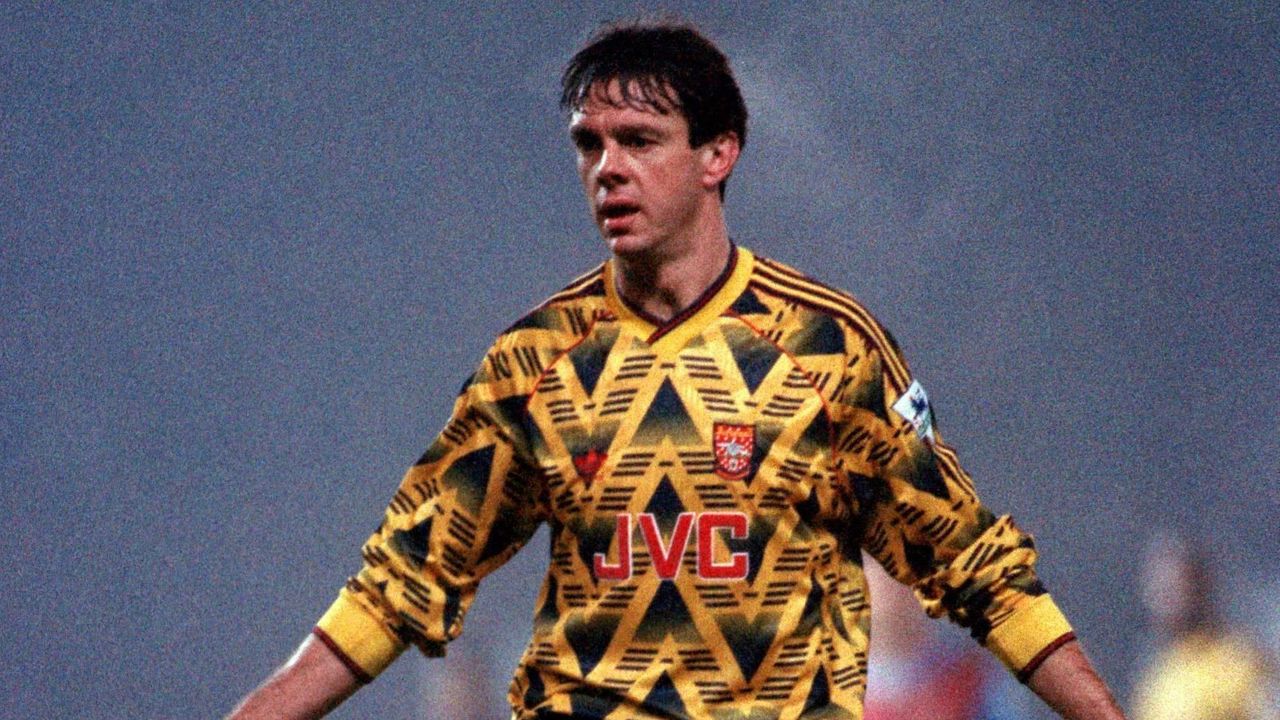 Neal Simpson - EMPICS / PA Images / Getty
As campy and polarizing as anything you'll find on our top 100 list, Arsenal's original "bruised banana" away kit, worn in the early 1990s, earned cult status among supporters, and Adidas recently relaunched a modern version. Even the sponsor's logo on the front (JVC is known primarily for developing the VHS video format) adds to the retro mystique.
85. New York Islanders (current)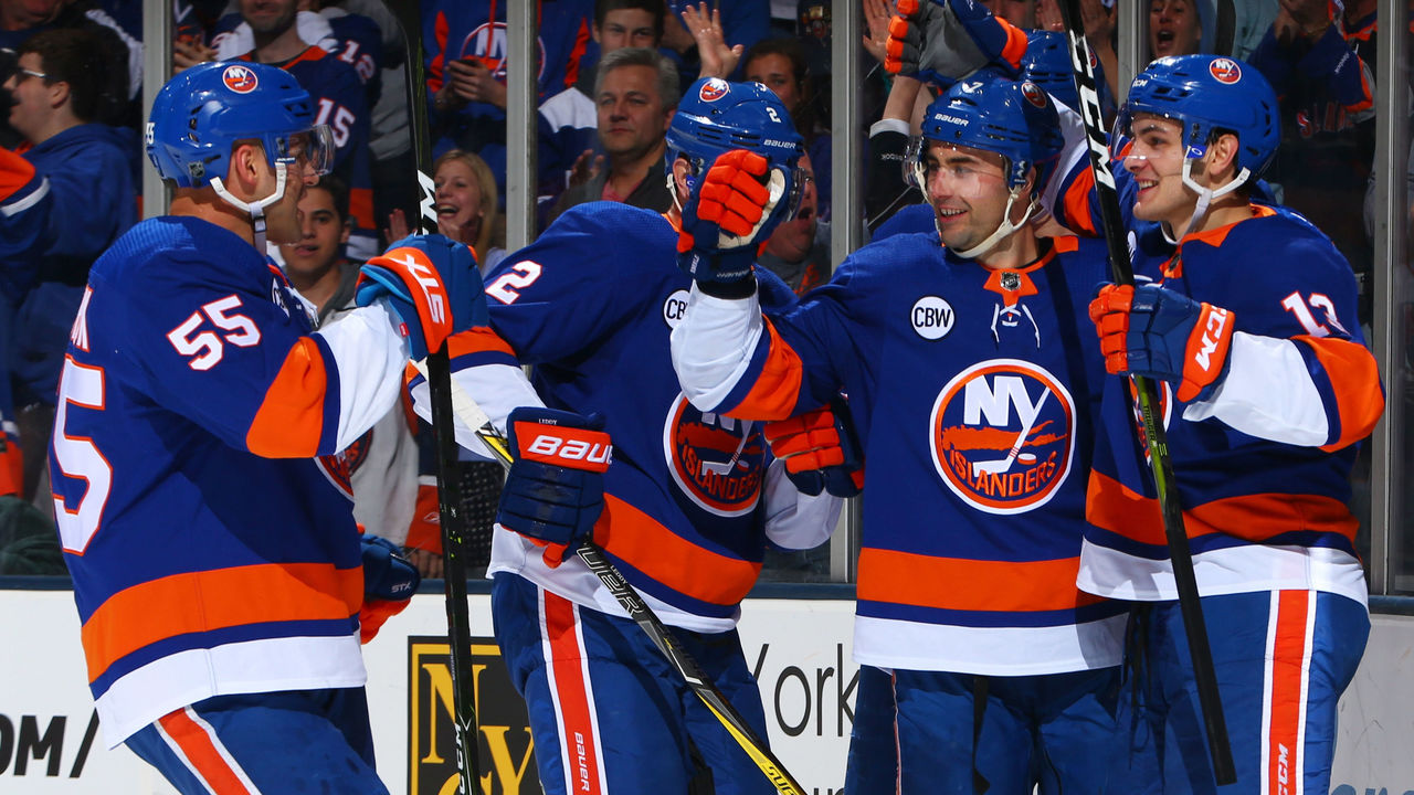 Mike Stobe / National Hockey League / Getty
The Islanders have had some truly awful, miserable, and downright atrocious uniform ideas over the years, which is difficult to fathom considering how perfect their current home-and-away set is. This was the look the club rocked during four consecutive Stanley Cups wins in the early '80s, and now that it's back, it should never change again.
84. Denver Broncos (1980s)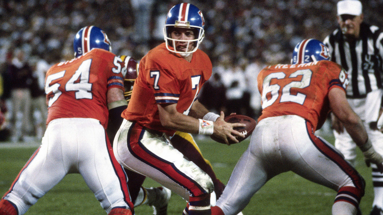 Focus On Sport / Getty Images Sport / Getty
The Broncos' current navy-and-orange set is a rare '90s design that holds up today, but the best the franchise ever looked was in orange tops and royal blue helmets.
83. Hartford Whalers (1990s)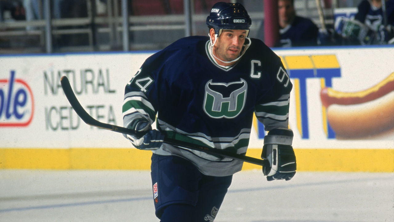 J Giamundo / Bruce Bennett / Getty
Adorned with a logo that makes the best use of negative space in sports history (once you see the H sitting on the W, you'll never unsee it), these beauties and their unique color scheme are sorely missed in the NHL.
82. Atlanta Braves (current)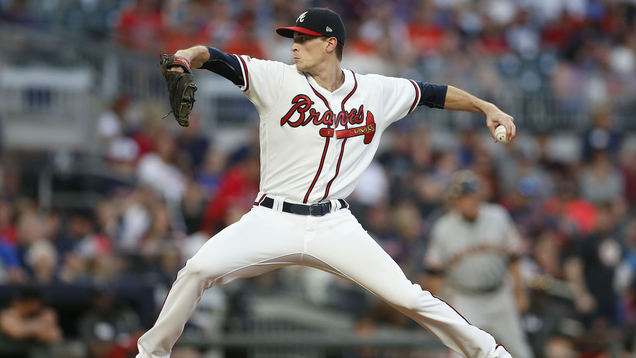 Mike Zarrilli / Getty Images Sport / Getty
The Braves have donned dozens of uniforms over the course of a franchise history that dates back more than a century, but their current style is the best of the bunch. The tomahawk underlining the cursive wordmark is as iconic as it gets in MLB, and the subtle red piping surrounding the buttons and collar provides the perfect finishing touch.
81. Los Angeles Rams (1990s)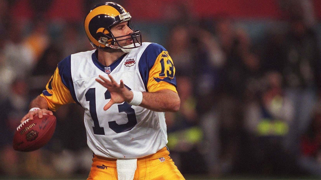 Lutz Bongarts / Bongarts / Getty
The shades of blue never quite matched between the various elements of the Rams' old uniforms, but the horned helmet is a truly inspired skeuomorphic design. Incorporating the same shape into the sleeve striping is a touch of genius.
Copyright (C) 2020 Score Media Ventures Inc. All rights reserved. Certain content reproduced under license.