Hulu’s biggest redesign in years offers a more standardized experience, improved navigation and discovery
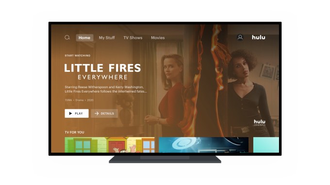
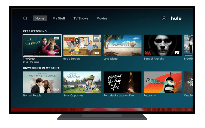
Hulu today will begin rolling out its largest redesign in years. The company is moving towards a more standardized, even Netflix-like user interface featuring collections laid out vertically within the Home screen, while tiles within the collections are laid out horizontally, in scrollable rows. However, the end result is not a Netflix clone, as Hulu continues to make use of its editorial imagery to highlight select titles and now uses a variety of tile sizes to communicate information about the content it recommends.
Hulu will also simplify its top-level navigation, moving categories like TV," Movies," and Sports" to the top of the screen, to make it easier for users to drill down into the type of content they watch.
These changes follow Hulu's first big redesign in 2017 which arrived alongside the launch of Hulu's Live TV experience. Though that update did help to differentiate Hulu from other streaming services, it also overcomplicated the user interface. Hulu's customer feedback forums were filled with complaints about the interface being too difficult to navigate and the confusing layout.
To some extent, today's changes are an acknowledgment on Hulu's part that its interface had room for improvement. They're also meant to make it easier for viewers who move between other Disney-owned services, like Disney+ or ESPN+, the company says.
When we launched the current experience three years or so ago, it was a pretty radical change," admits Jason Wong, Hulu's Director of Product Management. I think a standard has emerged as people have adopted streaming - it's evident, and not just within the Disney family," he continues. We know that the majority of users have between three to five different services, and I think all of them employ this orientation on the living rooms devices."
Though a desire for more uniformity with the other Disney streaming service was part of the consideration for the changes, Hulu says the overall redesign has been in the works for a year and a half - well before Disney acquired Fox and took operational control of Hulu.
The redesigned user interface combines what works on other streaming services with Hulu's own unique features.
For instance, Hulu now organizes content into familiar, scrollable horizontal rows, but it continues to showcase its standout titles with bold, cinematic imagery, along with title art, color sampling, and a gradient in larger tiles - much as it did before. However, in the new interface, not all of Hulu's content gets thrown into this large template. (Seen below).

Instead, the large templates will be used to pull in users to start watching new content - like Hulu's originals or other shows that are popular on the service. Meanwhile, more familiar content - like shows you're currently watching or those in your My Stuff" - may not be displayed in the same way.
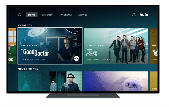
As you scroll down through the revamped Hulu Home screen, you'll notice the content is broken up by a variety of differently-sized tiles. In addition to the large, masthead template, there are other larger templates appearing throughout the experience as well as medium and smaller, standard templates. This design encourages users to pause their scroll and consider the highlighted titles, as opposed to getting lost in a sea of titles.

In addition, Hulu is turning its recommendation engine on the selection of the collections and tiles. Every module on the screen can be powered by either editorial curation or algorithms, or some combination of both.
At the top of the Home screen, collections like Movies for You" or TV for You" will appear for all users, but as you continue to scroll down, suggested collections will become more personalized to people's unique interests. While Hulu isn't being as explicit as Netflix with its Because You Watched X" collections, it is powering its suggestions based on what content the user has been engaging with.

For example, in a row of Sci-Fi Movie recommendations for someone who regularly watched that genre, it may remove the movies you had already watched or gave a thumbs down to from its row of suggestions. It may also remove those from a subgenre you never watched, like Sci-Fi/Horror, while promoting those from another subgenre you watch more often.
Hulu's editors will also have the ability to rank certain titles first (or within a range), for those times when they want to better highlight a title - like a new release that serves as a tentpole to a genre.
The end result is a row of suggestions personalized and ranked based on your individual tastes, but one that also benefits from human curation.
According to Jim Denney, Hulu VP and Head of Product Management, the user interface redesign will not only help users to better navigate the streaming service, it will also improve discovery.
One of the things [we wanted to improve on] is around density - giving people enough of a view into Hulu's catalog. We've got one of the largest catalogs of any service available," Denney explains. Plus, he noted, When we look at our current [user interface], there are several ways to achieve the same thing. We want to close some of those gaps so it becomes more obvious which path to follow so users don't get lost."
These changes speak directly to the user complaints from years' past, and lay the groundwork for more improvements over time.
Further down the road, Hulu plans to turn its recommendation engine not only on the titles it suggests but on the presentation of those titles to the individual user, too. That means choosing which titles appear in larger or smaller modules, for example, or how and when those modules appear. A new user, for example, might see more of the larger tiles highlighting top Hulu shows compared with how may an existing user would see. Hulu expects to roll this out sometime in 2021.
The new Hulu interface will roll out this week, initially on tvOS and Roku first. In July, it will expand to other platforms and a larger group of users.