The Boox Poke 3 is my new favorite e-reader
There are plenty of e-readers to choose from out there, but never enough for me. I'm always questing for the one that will make me forget that there are others available, and in the Onyx Boox Poke 3, I think I have found it - at least for now. The Chinese e-paper device maker has nailed the size, the screen, and added a sprinkle of versatility that I didn't know I was lacking.
The Poke 3 fits in the same original flavor e-reader" category as the Kindle Paperwhite and Kobo Clara HD: 6 inches, 300 PPI or so (which makes for very clear text) and somewhere between $100 and $200.
These readers fit easily in a pocket, unlike the larger Oasis and even larger Forma; they tend to lack anything but a power button and are very focused on books and saved articles.
Kobo's new entry-level Clara HD e-reader has a crisp, color-adjustable display
But the Kindle and Clara both have major flaws. The Kindle is tied to Amazon in all the ways I can't stand, including on-device ads by default, and the Clara... well, beside the screen, the hardware is honestly just bad. Kobo made my previous favorite e-reading device, the compact and flush-front Aura, and I've finally found a worthy successor to that beloved gadget.
The Poke 3 is the latest device to come from Boox, the e-reader line from parent company Onyx. The company has mostly been a presence in Southeast Asia, particularly its home country of China, so don't be surprised if you've never heard of it. Boox makes a wide variety of e-paper devices (which I will evaluate in a separate article), and the Poke 3 is the simplest and smallest of them.
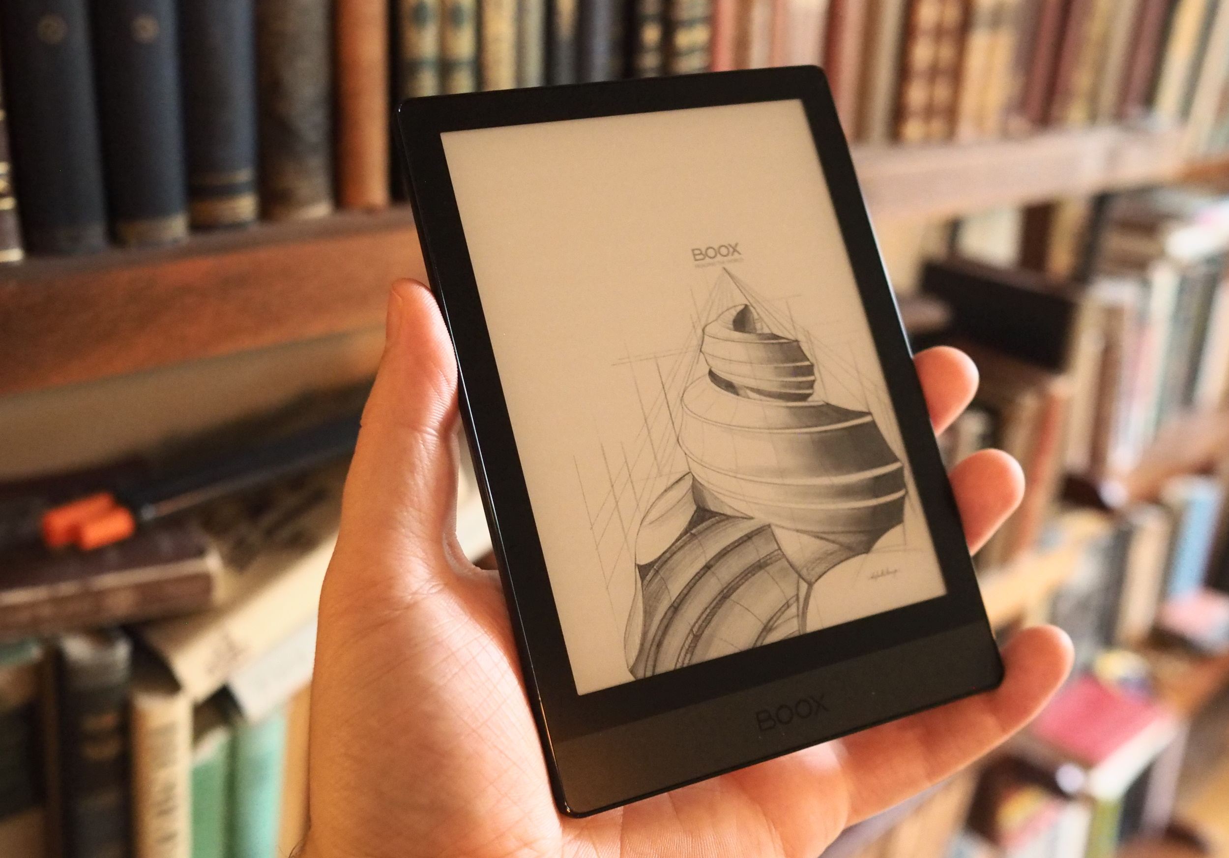
Image Credits: Devin Coldewey / TechCrunch
I'll highlight the device's strengths first. Most importantly, it is a lovely piece of hardware. The flush front is a pleasure to read on, as there is no raised bezel to shade the text or collect grime. The power button is well located and clicky. There's just enough border to hold onto without worrying about smudging or activating the screen, and a bit of extra space at the bottom enables plenty of comfortable grips.
It's thinner than the competition and the build quality is excellent. The front is hardened glass from partner Asahi, which will hopefully prevent it from needing a cover.
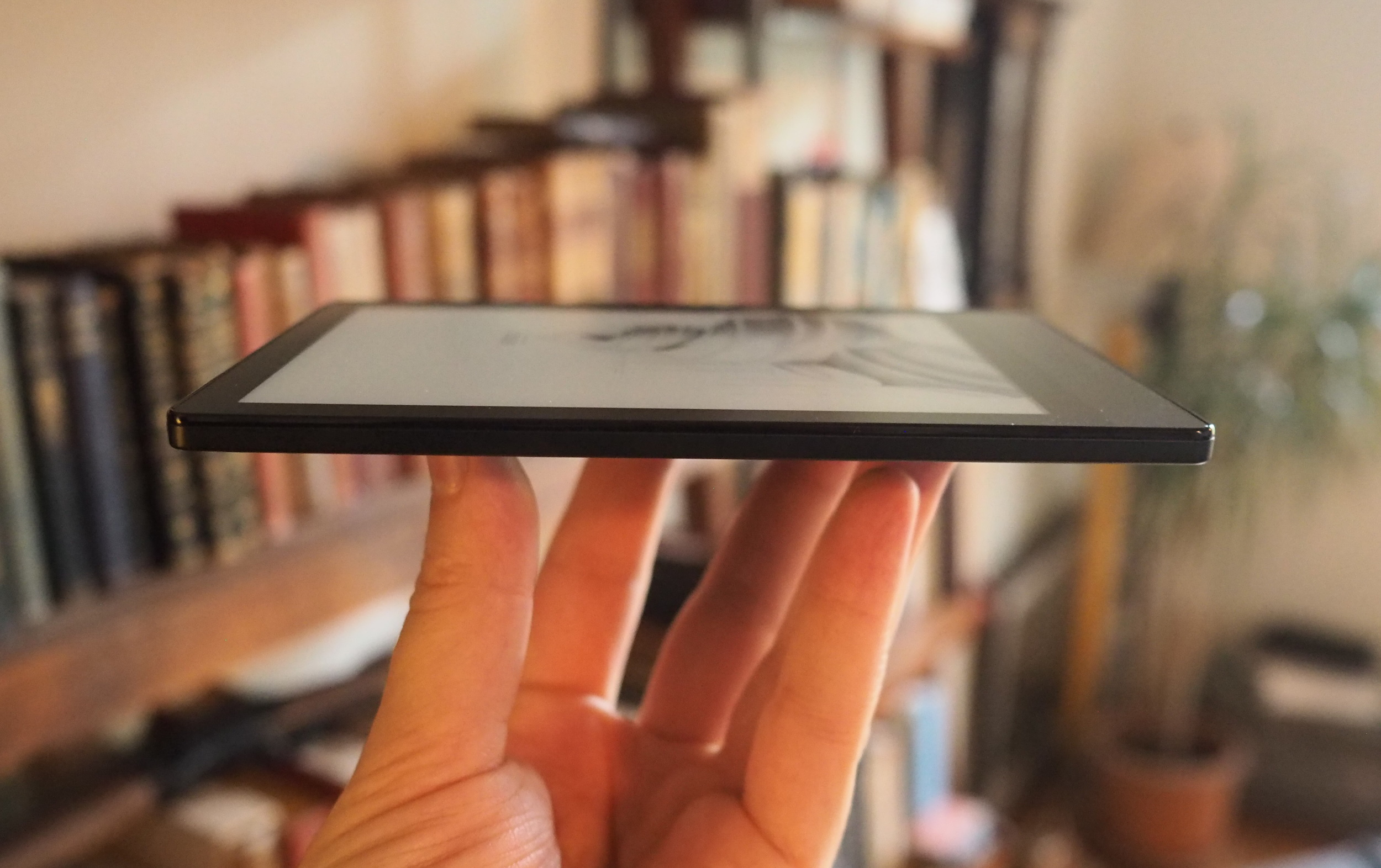
Image Credits: Devin Coldewey / TechCrunch
The finish is, to be honest, something of a fingerprint and oil magnet, and could be grippier. The Paperwhite has it beat on texture but I prefer the smooth back to the weird perforated one of the Clara.
At 150 grams it's 16 lighter than the Clara and 32 lighter than the Paperwhite. That doesn't sound like a lot, but when you're holding a device for hours straight, every little bit counts, and at this size it also helps with balance.
Its six-inch screen is not meaningfully different from the Kindle or Kobo devices out there in terms of resolution or font rendering. I scrutinized the Poke 3 next to the Clara HD and Forma and found no differences that anyone would notice reading from 10-20 inches away.
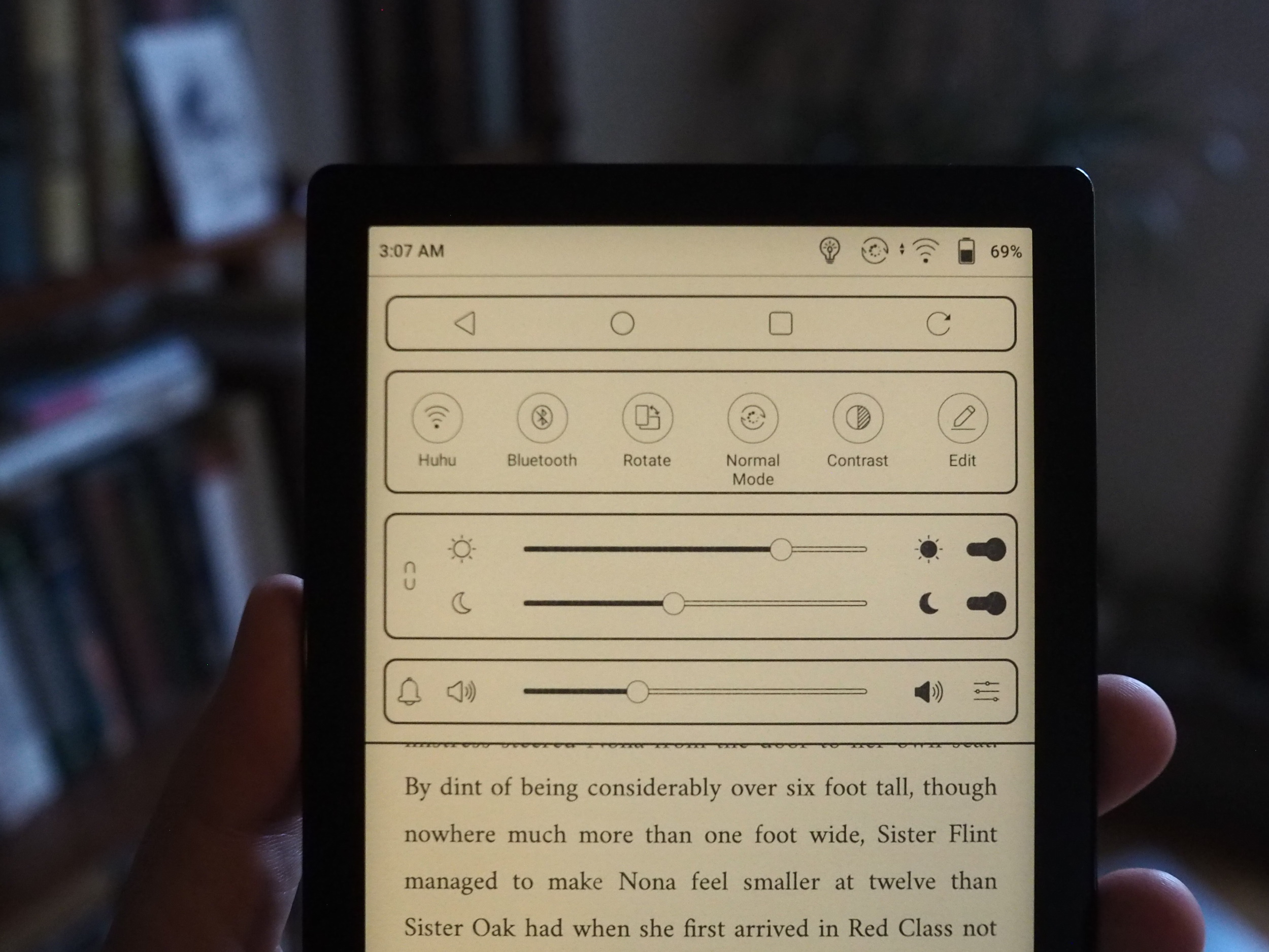
Image Credits: Devin Coldewey / TechCrunch
It does differ in its approach to illumination, though whether meaningfully so is a matter of opinion. Instead of having a brightness slider and a temperature slider, it has a warm and cool slider, and increasing or decreasing either one changes both the brightness and temperature. You can also turn either one off entirely or link them together so they are adjusted as one.
If it sounds more complicated... it is. I don't see that it adds any real new capabilities, but once you get the feel for it, it isn't that much harder to use, either. I do wish that when you linked the two sliders, they kept their positions relative to one another. The whole system seems a little baroque and I hope Boox streamlines it. That said, the quality of the light is equally good and once you dial it in, it looks great.
Type formatting is good, and has plenty of options for tweaking how any of the many (too many...) included fonts look, even weight and contrast adjustments to really fine tune them. Adding custom fonts is as easy as dragging and dropping them, just like documents.
The operating system of the Boox provides far more options than either Kobo or Kindle. Amazon keeps tight control over its ecosystem and outside of a handful of associated services the devices can't do much. Kobo at least allows for more file formats to be loaded directly on, and now has excellent Pocket integration for saving articles from the web. Boox takes things two steps further with a custom Android launcher onto which you can download full apps.
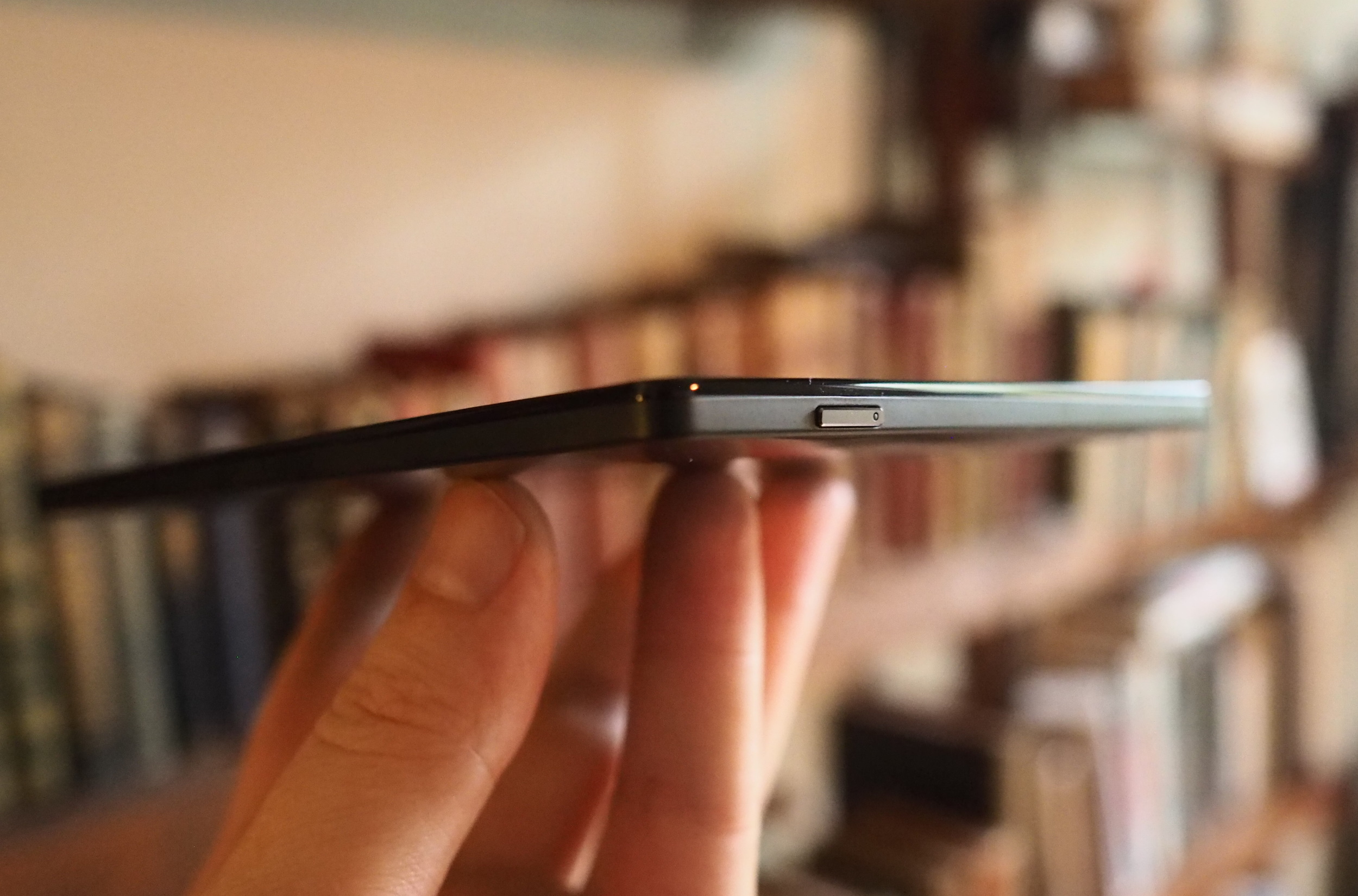
Image Credits: Devin Coldewey / TechCrunch
Now, there are really only so many apps that you actually might want on an e-reader like this one. And not everything works as well as I'd like. But for the first time I can actually get Simplenote on my e-reader.
It's not as simple as it would be on an ordinary Android device, though. Because the Poke 3 comes from China, it doesn't have access to Google services right off the bat. You can add it through settings, which isn't hard, but there's also a sideloading store built in with recent (if not quite brand new) install packages of popular, vetted apps for the device.
Let's just admit right now that compared to the simplicity of Kindle and Kobo, this is already a bit out there. And whether you feel comfortable logging into a version of Evernote that you can't (without a bit of work) verify the contents of... well, it's not for everyone. But to be clear on this, Boox isn't some fly-by-night operation - they may not be well known over here, but it's hard to argue with the quality of the devices. The problem is simply that localizing an OS built for users in China has some fundamental challenges.
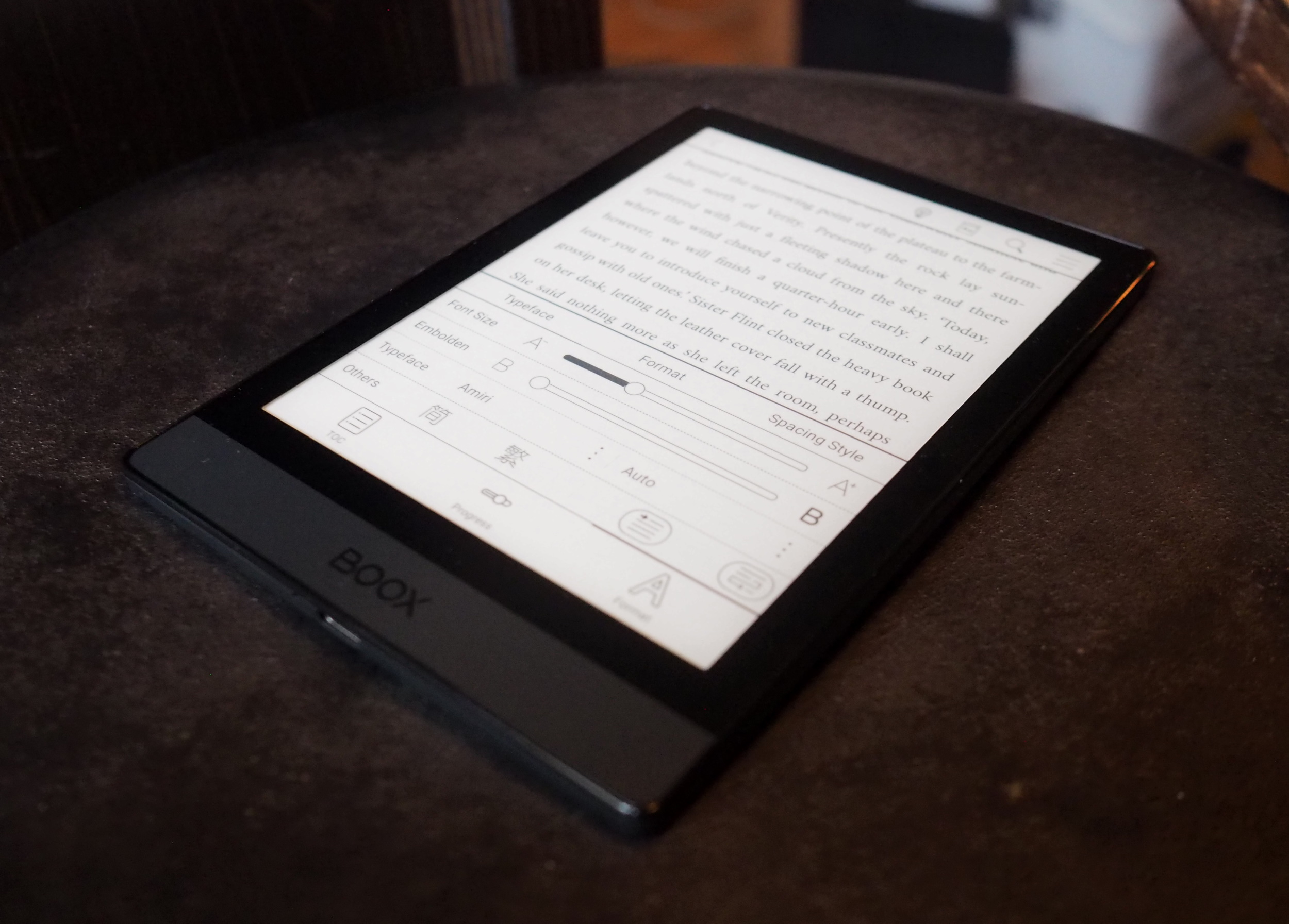
Image Credits: Devin Coldewey / TechCrunch
Fortunately for everyone, the basic capability to load books on there and read them is solid and it's what you'd be doing most of the time. There may be a busy interface when you're doing other stuff, but you can easily hide all indicators like progress and title while you're reading, dedicating every square inch of the screen to actual reading.
It has 32 gigs of internal memory, making storage of audiobooks (it has Bluetooth for sound) and bulky documents easy, and connects quickly as a drive when you plug in its USB-C cord.
The Poke 3 will cost $189 when it ships next week, which is on the high end for this type of device. That's $30 more than a Kindle Paperwhite and $70 more than a Clara HD. But I honestly think it is worth the premium. This is a better e-reader, period; despite the sometimes fussy interface, I enjoy using it, and appreciate that it provides capabilities that its competition doesn't. If you need simple and don't mind a cheap build, the Clara is a great cheaper option, but for a step up consider the Poke 3.
The reMarkable 2 improves on the original in every way, but remains firmly in its niche