I’m obsessed with the Ford Mustang Mach-E physical touchscreen volume knob
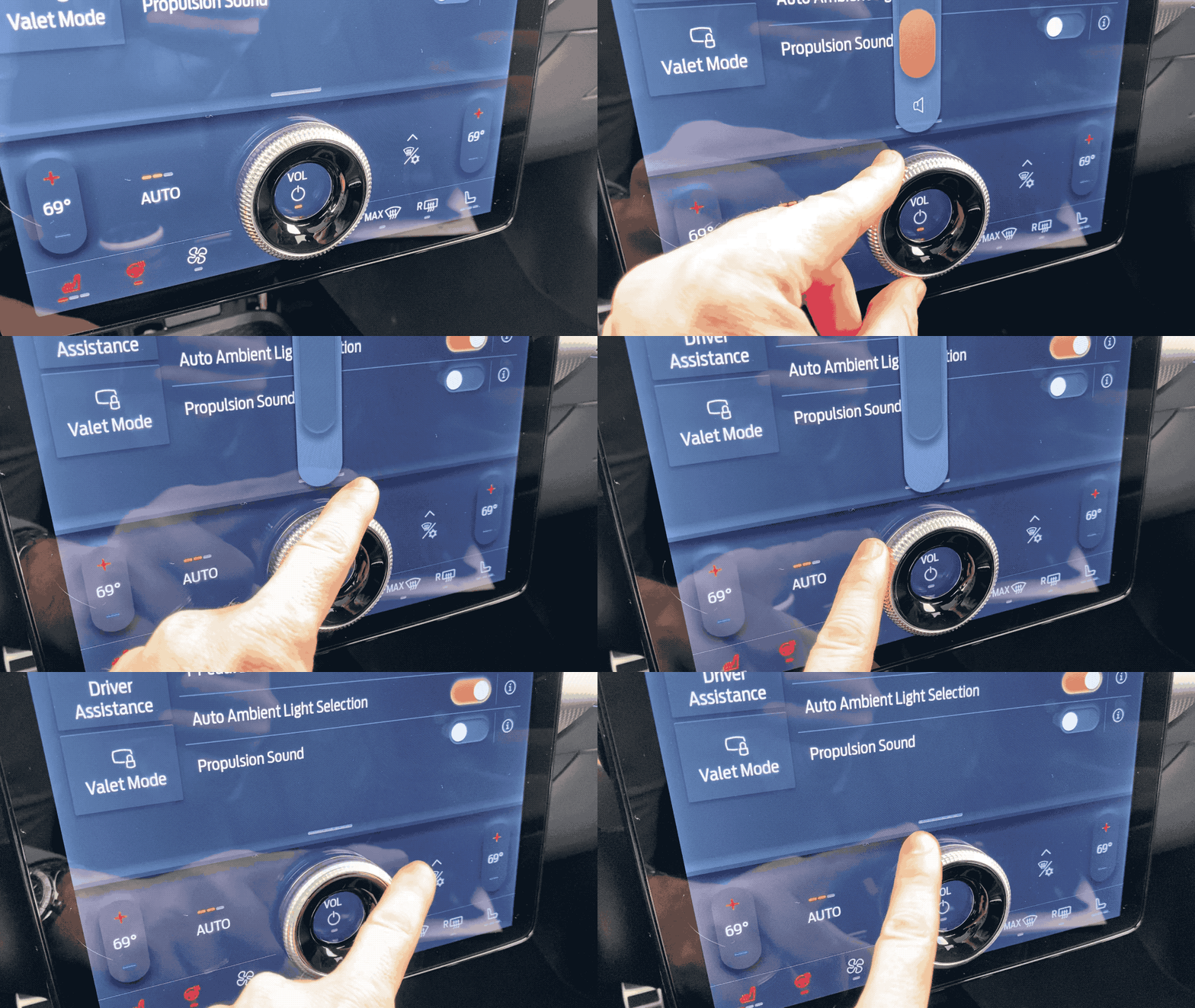
The 2021 Ford Mustang Mach-E features a giant touchscreen, and at the bottom is a sizable knob for volume control. I love it. There, stuck on a touchscreen, is a physical knob. Twist it! Spin it! There's even a resounding click as it twists. The knob works so much better than a touchscreen slider bar, and I implore other automakers to follow Ford's lead. This knob is a surprisingly simple solution.
Under the knob are tiny strips that interact with the touchscreen as if it was touched by a finger. When the knob is twisted, these strips drag across the screen, tricking the system into thinking a human is controlling it. As far as I can tell, the knob itself is nothing more than a few pieces of plastic glued onto the screen.
Ford's system in the Mustang Mach-E is a happy compromise between massive touchscreens and good user interfaces. The user gets the benefits of a spinning knob, while Ford doesn't have to build and install additional physical components to maintain standards. From my experience with the volume control, there's no discernible lag, and it works very well. Spin it to change the volume or press the center to mute the audio. As with any great design, it works exactly like one would expect.
Audio volume should always be controlled by a rotating knob, dial, or wheel. There's no debate.

Automakers have long played with alternative volume control schemes, and I've yet to find one that works better than a simple knob.
BMW offers in-car gesture controls: Hover your hand over the center stack, stick one finger out and draw a circle in the air. It works okay. I like the gesture control for somethings, but it feels silly, spinning a finger to change the volume.
Other car makers like Cadillac looked to touch-sensitive slider bars for controlling volume. Most have since abandoned this design for several reasons. The control strips are often built flush with the rest of the dashboard and do not provide the user with any feedback. The systems are often slow to respond, too, making the experience frustrating and underwhelming.
Thankfully, most modern cars have steering wheel controls in addition to the main volume knob. Some are spinning wheels, others are buttons, and I'm clearly on team spinning wheel.
As touchscreens started infiltrated cars, more automakers looked to offload volume controls to the screen with onscreen slider bars. It's often less expensive to use a touchscreen than a physical button, but the experience is never superior. At this point, most automakers put interactive content on a screen and install a twisting knob for volume and mute elsewhere on the dashboard.
What's it like to drive the 2021 Ford Mustang Mach-E? I can't tell you for a few days.
Also note, this post consumed my monthly allotment of the word knob. There are 14 instances in this post and I'm very sorry.