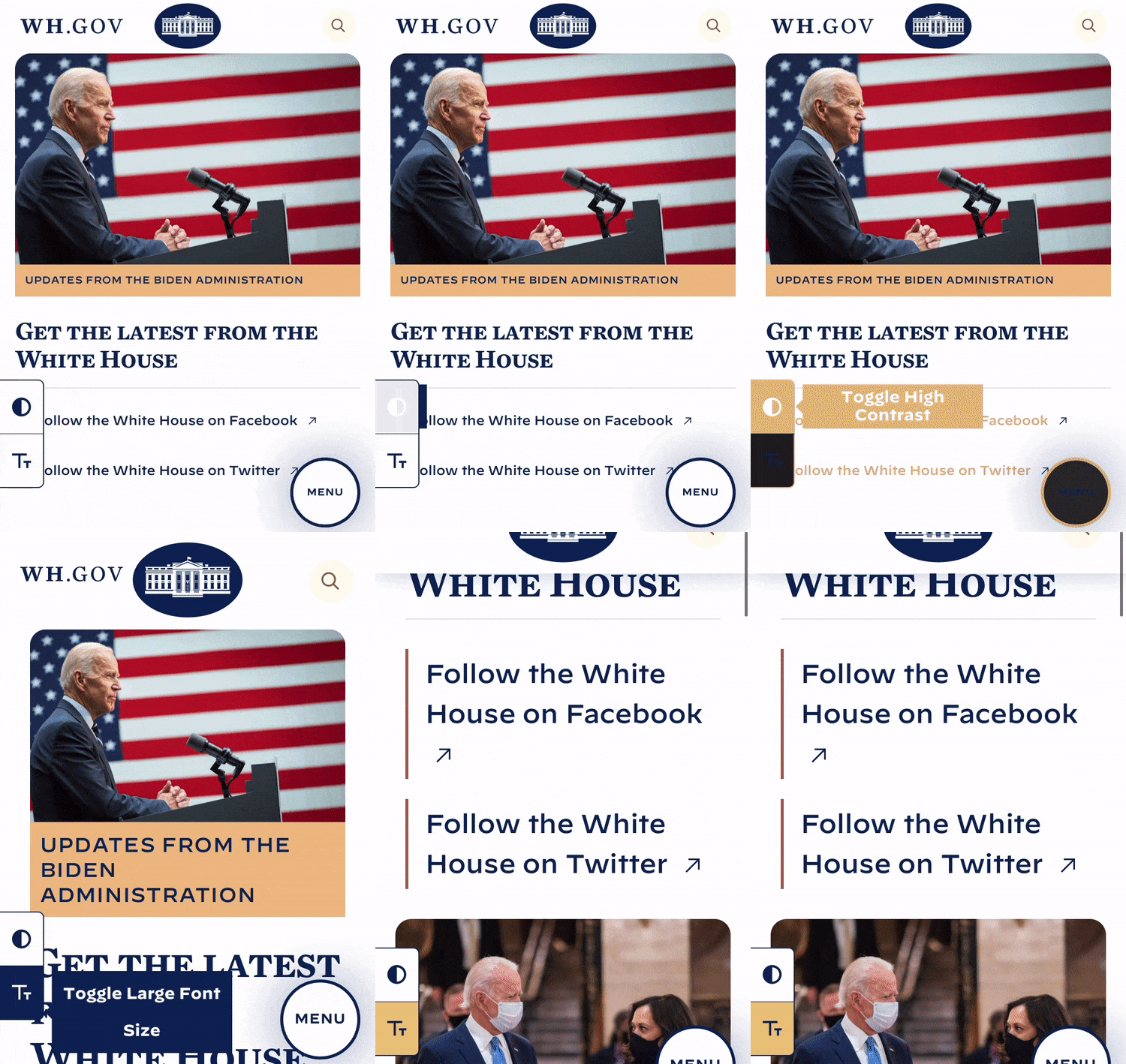
White House, dark mode: Biden admin refreshes presidency’s website, vows accessibility
WhiteHouse.gov, the official website for all presidential actions and efforts, is among the first things to be changed up under the freshly inaugurated President Biden. A fashionable dark mode appeared, as well as a large text toggle for straining eyes, and the webmaster has committed to making the whole site conform to the latest accessibility guidelines.
The look isn't so very different from the previous administration's site - they're both fairly modern and minimal experiences, with big photos up front and tidy lists of priorities and announcements once you drill down into a category.

Image Credits: White House
But one big design change implemented by the new administration that many will appreciate is the inclusion of a dark mode, or high contrast mode, and a large type toggle.
Dark modes have been around forever, but became de rigeur when Apple implemented its own system-wide versions on iOS and macOS a while back. It's just easier on the eyes in many ways, and at any rate it's nice to give users options.
The WhiteHouse.gov dark mode changes the headline type from a patriotic blue to an eye-friendly off-white, with links a calming Dijon. Even the White House logo itself goes from a dark blue background to full black with a white border. It's all very tasteful, and if anything seems like a low-contrast mode, not high.
The large type mode does what it says, making everything considerably bigger and easier to tap or click. The toggles, it must be said, are a bit over-prominent, but they'll probably tweak that soon.
There's also a Spanish-language option, no doubt welcome by the millions of Americans whose first language that is. This was not present on the previous White House/Casa Blanca page.
More forward-looking is the pledge in the accessibility section:
This commitment to accessibility for all begins with this site and our efforts to ensure all functionality and all content is accessible to all Americans.
Our ongoing accessibility effort works towards conforming to the Web Content Accessibility Guidelines (WCAG) version 2.1, level AA criteria.
The WCAG guidelines are a set of best practices for designing a website so that its content can be easily accessed by people who use screen readers, need captions for audio or can't use a mouse or touchscreen easily. The guidelines aren't particularly hard to meet, but as many have pointed out, it's harder to retrofit a website to be accessible than to design it for accessibility from the start. Government sites are required to be accessible, but have varying levels of conformity.
One thing I noticed was that many of the photos on the White House website have alt text or visible captions attached - these help visually impaired visitors understand what's in an image. Here's an example:

Image Credits: White House
Normally that alt text would be read out by a screen reader when it got to the image, but it's generally not made visible.
Unless the metadata was stripped from the previous administration's site (it's archived here), none of the photos I checked had text descriptions there, so this is a big improvement. Unfortunately some photos (like the big header photo on the front page) don't have descriptions, something that should probably be remedied.
Fable aims to make disability-inclusive design as simple as a service
Accessibility in other places will mean prompt inclusion of plaintext versions of governance items and announcements (versus PDFs or other documents), captions on official videos and other media, and as the team notes, lots of little improvements that make the site better for everyone who visits.
It's a small thing in a way, compared with the changes expected to accompany the new administration, but small things tend to pile up and become big things.
As Microsoft's Isaac Hepworth noted, there's still lots of work to do, and that's why U.S. Digital Services hid a little message in the source code:

Image Credits: White House
If you're interested in helping out, sign up here.
Matt Cutts on solving big problems with lean solutions at the US Digital Service