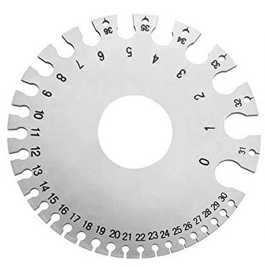
Wire gauge and user perspective
Wire gauge is a perennial source of confusion: larger numbers denote smaller wires. The reason is that gauge numbers were assigned from the perspective of the manufacturing process. Thinner wires require more steps in production. This is a common error in user interface design and business more generally: describing things from your perspective rather than from the customer's perspective.
RestaurantsWhen you order food at a restaurant, the person taking your order may rearrange your words before repeating them back to you. The reason may be that they're restating it in manufacturing order, the order in which the person preparing the food needs the information.
RheostatsA rheostat is a device for controlling resistance in an electrical circuit. It would seem natural for an engineer to give a user a control to vary resistance in Ohms. But Ohm's law says
V = IR,
i.e. voltage equals current times resistance. Users expect that when they turn a knob clockwise they get more of something-brighter lights, louder music, etc.-and that means more voltage or more current, which means less resistance. Asking users to control resistance reverses expectations.
If I remember correctly, someone designed a defibrillator once where a knob controlled resistance rather than current. If that didn't lead to someone dying, it easily could have.
ResearchWhen I worked for MD Anderson Cancer Center, I managed the development of software for clinical trial design and conduct. Our software started out very statistician-centric and became more user-centric. This was a win, even for statisticians.
The general pattern was to move from eliciting technical parameters to eliciting desired behavior. Tell us how you want the design to behave and we'll solve for the parameters to make that happen. Sometimes we weren't able to completely automate parameter selection, but we were at least able to give the user a head start in knowing where to look.
RelaxTechnical people don't always want to have their technical hat on. Sometimes they want to relax and be consumers. When statisticians wanted to crank out a clinical trial design, they wanted software that was easy to use rather than technically transparent. That's the backstory to this post.
It's generally a good idea to conceal technical details, but provide a service panel" to expose details when necessary.
Related postsThe post Wire gauge and user perspective first appeared on John D. Cook.