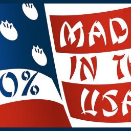
The History of the ‘Chop Suey’ Font in the United States

Lettering artist Linus Boman spoke with designer Raven Mo to learn more about the so-called chop suey" font that has been used rather ubiquitously to identify food of Chinese originating in the United States.
Chop suey fonts are a subcategory of so-called ethnic" display fonts, and are a unique American invention with roots in the 170 year history of Chinese migrants in United States.
Both Boman and Mo explain the origins of this particular font in 1883, how the font was formed by mimicking two separate strokes from Chinese lettering - Na (forceful stroke) and Ti (raised stroke), and how the font itself does not make sense to Chinese readers due to the difference in respective alphabets.
The Latin alphabet has many letters that are built from circular shapes - O, B, D, etcetera.Whereas we don't draw circles in Hanzi at all. The most curved stroke is the G?u, Hook" stroke, and it's only very slightly bent, so there's a fundamental difference in structure that doesn't naturally translate. As a result, the round letters in chop suey look almost shattered somehow.
Due to the incredibly racist underpinnings of the Chinese Exclusion Act in 1882, many Chinese communities in the United States became very insular. However, with the turn of the 20th Century, these communities were redesigned by those who incorporated exaggerated versions of ancient architecture. Albeit objectionable, the design did lead to an expansion of Chinese-owned businesses, particularly restaurants. And with that, came the font.
. ...After the 1906 earthquake destroyed San Francisco's Chinatown, it had to be rebuilt from the ground up. For the redesign, an architect and an engineer were hired who had never visited China. They built exaggerated Chinese architecture that referenced temples from the Song Dynasty, a period in Chinese history that occurred during the middle ages. ...Where the dragon gates and pagoda roofs went, the chop suey font was sure to follow. In an ironic twist, the Chinese Exclusion Act ended up propelling the spread of Chinese restaurants across the US.
The font is also considered to be a reflection of stereotypes and tropes.
If typography is a voice, what is this type but a fake foreign accent?....Sadly, it also has an equally long history of being used to mock and otherize people of Asian descent. ..While Chinese migrants spread the use of Chop suey fonts, this font was never created by them. It was part of an outsider-created makeover that helped their economic survival during a time when they were the targets of suspicion and discrimination. Typographic caricature was one minor insult among many for first-wave migrants. When fighting for basic human rights, authentic cultural expression is a luxury.
View this post on Instagram