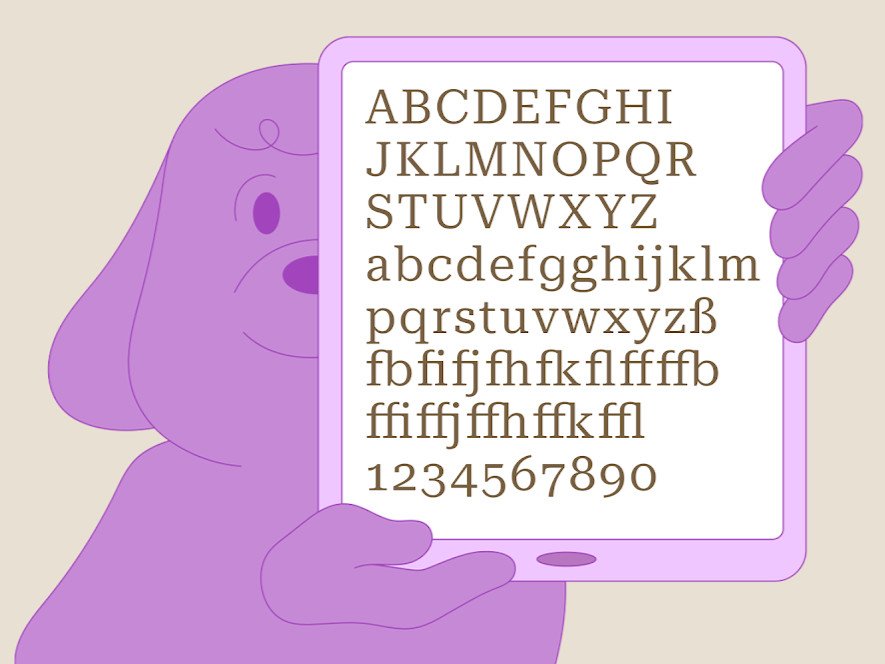
Google's new Roboto Serif typeface aims to make on-screen text more legible
Meet Google's new typeface with a minimal design that's optimized for readability at any point size.
What you need to know- Google has announced a new typeface that should make reading texts online a bit easier on the eyes.
- The new Roboto Serif is designed to provide a comfortable reading experience across various screen sizes and print.
- It is available to download and use for free, joining four other fonts in the Roboto lineup.
A lot has changed since the early days of the internet when there were only a few typefaces designed to help make reading texts on low-resolution screens easier on the eyes. Back in 1996, people used to spend less than 30 minutes a month browsing the web, according to a researcher.
These days, however, we spend an average of seven hours per day online, according to a more recent study. To provide an ideal reading experience for longer periods, Google announced on Thursday a new typeface that it says makes reading online "more comfortable."
Commercial Type was commissioned by Google to create the new font. Roboto Serif joins the Roboto family of fonts, which also includes Roboto Sans, Mono, Slab, and Condensed. Commercial Type's Greg Gazdowicz and his team experimented with different proportions, contrast types, and shapes to improve the font's legibility.
"Our aim has been to make a typeface that you could use for long-form journalism or a novel-something very long and involved; an immersive piece of text that you read on your phone-without wanting to complain about it," Gazdowicz said.
The result is a typeface with four variable axes (via 9to5Google) and six optical sizes (micro, small text, text, deck, display and poster). Its weight, width, size and grade can be adjusted. You can also select from nine versions of the font.
Sarah Daily, a consultant for Google Fonts, wrote in a blog post:
The resulting aesthetic harmonizes with the rest of the Roboto superfamily instead of duplicating it in serif form. With curves anchored to decisive terminals, it's minimal with just a "whisper" of a serif.
Roboto Serif is available to download via Google Fonts from today, and you can use it free of charge. It should be easy to read on a variety of screen sizes, including the best Android phones and laptops, as well as in print.

