Taking .NET MAUI for a spin
I've been keeping an eye on MAUI - the .NET Multi-platform App UI - for a while, but I've only recently actually given it a try.
MAUI is essentially the evolution of Xamarin.Forms, embracing WinUI 3 and expanding from a mobile focus to desktop apps as well. It's still in preview at the time of writing, but only just - release candidate 1 came out on April 12th 2022.
I've been considering it as a long-term future for my V-Drum Explorer application, which is firmly a desktop app, just to make it available on macOS as well as Windows. However, when a friend mentioned that if only I had a mobile app for At Your Service (my church A/V system), it would open up new possibilities... well, that sounded like an opportunity to take MAUI for a spin.
This blog post is about initial impressions. It's worth being really clear about that - please take both praise and criticism of MAUI with a pinch of salt. I'm not a mobile developer, I'm not a UI designer, I haven't tried doing anything massively taxing with MAUI, and I may well be doing a bunch of things in the wrong way.
What's the goal?Besides having fun", the aim is to end up with a workable mobile app for At Your Service (AYS from here onwards). In an ideal world, that would work on iPhones, iPads, Android phones and Android tablets. In reality, the number of people who will ever use the app is likely to be 1 or 2 - and both of us have Android phones. So that's all I've actually tested with. I may at some point try to build and test with an iPad just for kicks, but I'm not really bothered by it. As it happens, I've tried the Windows app version, but that hasn't worked out for me so far - more details later.
So what does this mobile app need to do? While I dare say it may be feasible to replicate almost everything you can do with AYS, that's not the aim here. I have no desire to create new service plans on my phone, nor to edit hymn words etc. The aim is only to use the application to direct" a service without having to physically sit behind the A/V desk.
Crucially, there's no sensible way that a mobile app could completely replace the desktop app, at least with our current hardware. While a lot of the equipment we use is networked (specifically the cameras and the mixer), the projector in the church building is connected directly to the desktop computer via an HDMI cable. (OBS Studio captures that output as a virtual webcam for Zoom.) Even if everything could be done with an entirely standalone mobile app, it would mean reimplementing or at least adapting a huge amount of code.
Instead, the aim is to make the mobile app an alternative control mechanism for an instance of AYS running on the church desktop in the normal way. I want it to be able to handle all the basic functionality used during a service:
- Switch between scenes" (where as scene in AYS is something like a hymn" or a reading" or the preacher in a particular place"; switching between scenes brings up all the appropriate microphones and cameras, as well as whatever text/PowerPoint/video needs to be displayed)
- Change pages in scenes with text content (e.g. hymns and liturgy)
- Change slides in PowerPoint presentations
- Play/pause for videos, along with volume control and simple back 10 seconds" and forward 10 seconds" buttons
- Basic camera controls, across multiple cameras
- Move to a preset
- Change whether the camera is shown or not, and how it's shown (e.g. top right corner")
- Basic mixer controls
- Mute/unmute microphones
- Potentially change the volume for microphones - if I do this, I might want to change the volume for the Zoom output independently of the in-building output
The desktop AYS system already has a slightly split architecture: the main application is 64-bit, but it launches a 32-bit secondary app which is a combined WPF + ASP.NET Core server to handle Zoom. (Until fairly recently, the Zoom SDK didn't support 64-bit apps, and the 32-bit address space ended up causing problems when decoding multiple cameras.) That meant it wasn't much of a stretch to figure out at least one possible architecture for the mobile app:
- The main (desktop) AYS system runs an ASP.NET Core server
- The mobile app connects to the main system via HTTP, polling for current status and making control requests such as switch to scene 2".
Arguably, it would be more efficient to use a gRPC stream to push updates from the desktop system to the mobile app, and at some point I might introduce gRPC into the mix, but frequent polling (about every 100ms) seems to work well enough. Sticking to just JSON and regular" HTTP for requests and responses also makes it simple to test some aspects in a browser, too.
One quirk of both of the servers is that although they receive the requests on threadpool threads, almost all of them use the WPF dispatcher for execution. This means I don't need to worry about (say) an status request seeing half the information from before a scene change and half the information after a scene change. It also means that the rest of the AYS desktop code can still assume that anything that affects the UI will happen on the dispatcher thread.
Even without using gRPC, I've made a potentially-silly choice of effectively rolling my own request handlers instead of using Web API. There's a certain amount of wheel reinvention going on, and I may well refactor that away at some point. It does allow for some neatness though: there's a shared project containing the requests and responses, and each request is decorated (via an attribute) with the path on which it should be served. The commands" (request handlers) on the server are generic in the request/response types, and an abstract base class registers that command with the path on the request type. Likewise when making a request, a simple wrapper class around HttpClient can interrogate the request type to determine the path to use. At some point I may try to refactor the code to keep that approach to avoid duplication of path information, while not doing quite as much wheel reinvention as at the moment.
What does the UI look like? (And how does it work?)When I first started doing a bit of research into how to create a MAUI app, there was a pleasant coincidence: I'd expected a tabbed UI, with one of the tabs for each part of the functionality listed above. As it happens, that's made particularly easy in MAUI with the Shell page. Fortunately I found documentation for that before starting to use a more manually-crafted use of tabs. The shell automatically removes the tab indicator if only one tab is visible, and basically handles things reasonably simply.
The binding knowledge I've gradually gained from building WPF apps (specifically V-Drum Explorer and AYS) was almost immediately applicable - fortunately I saw documentation noting that the DataContext in WPF is BindingContext in MAUI, and from there it was pretty straightforward. The code is mostly-MVVM" in a style that I've found to be pretty pragmatic when writing AYS: I'm not dogmatic about the views being completely code-free, but almost everything is in view models. I've always found command binding to be more trouble than it's worth, so there are plenty of event handlers in the views that just delegate directly to the view model.
There's a separate view model for each tab, and an additional home" tab (and corresponding view model) which is just about choosing a system to connect to. (I haven't yet implemented any sort of discovery broadcast. I don't even have app settings - it's just a manually-curated set of URLs to connect to.) The home" view model contains a reference to each of the other view models, and they all have two features (not yet via an interface, although that could come soon):
- Update the view model based on a status polling response
- A property to determine whether the tab for the view model should be visible. (If there's no text being displayed, we don't need to display the text tab, etc.)
I'm not using any frameworks for MVVM: I have a pretty simplistic ViewModelBase which makes it easy enough to raise property-changed events, including automatically raising events for related properties that are indicated by attributes. I know that at some point I should probably investigate C# source generators to remove the boilerplate, but it's low down my priority list.
MAUI supports dependency injection, and at some point when investigating navigating between different tabs (which initially didn't work for reasons I still don't understand) I moved to using DI for the view models, and it's worked well. The program entry point is very readable (partly due to a trivial ConfigureServices extension method which I expect to be provided out-of-the-box at some point):
public static MauiApp CreateMauiApp() => MauiApp .CreateBuilder() .UseMauiApp<App>() .ConfigureFonts(fonts => fonts .AddFont("OpenSans-Regular.ttf", "OpenSansRegular") .AddFont("OpenSans-Semibold.ttf", "OpenSansSemibold")) .ConfigureServices(services => services .AddSingleton<AppShell>() .AddSingleton<HomeViewModel>() .AddSingleton<MixerViewModel>() .AddSingleton<MultiCameraViewModel>() .AddSingleton<TextViewModel>() .AddSingleton<MediaViewModel>() .AddSingleton<PowerPointViewModel>() .AddSingleton<ScenesViewModel>() .AddSingleton<ApiClient>()) .Build();I've had to tweak the default style very slightly: the default unselected tab" colour is almost unreadably faint, and for my use case I really need to be able to see which tabs are available at any given time. Fortunately the styling is pretty clear - it didn't take much experimentation to get the effect I wanted. Likewise I added extra styles for the next/previous buttons for the PowerPoint and text tabs.
Sources of truthOne aspect I always find interesting in this sort of UI is what the source of truth is. As an example, what should happen when I select a different text page to display? Obviously I need to send a request to the main application to make the change, but what should the UI do? Should it immediately update, expecting that the request will be successful? Or should it only update when we next get a status polling response that indicates the change?
I've ended up going for the latter approach, after initially using the former. The main reason for this is to make the UI smoother. It's easy to end up with race conditions when there's no one source of truth. For example, here's a situation I've seen happen:
- T=0: Make status request
- T=1: Status response: text page 3 is selected
- T=2: Start status request
- T=3: User clicks on page 4
- T=4: Start move to page 4" request
- T=5: Status response: text page 3 is selected
- T=6: Page change response: OK
- T=7: Start status request
- T=8: Status response: text page 4 is selected
(These aren't meant to be times in seconds or anything - just a sequence of instants in time.)
If the UI changes at T=3 to show page 4 as the selected one, then it ends up bouncing back to page 3 at T=5, then back to page 4 at T=8. That looks really messy.
If instead we say that the only thing that can change the UI displaying the selected page is a status response, then we stay with page 3 selected from T=1 until T=8. The user needs to wait a little longer to see the result, but it doesn't bounce between two sources of truth. As I'm polling every \~100ms, it doesn't actually take very long to register. This also has the additional benefit that if the change page" request fails, the UI still reflects the reality of the system state.
If this all sounds familiar from another blog post, that's because it is. When originally writing about controlling a digital mixer using OSC an X-Touch Mini I observed the same thing. I'm sure there are plenty of cases where this approach doesn't apply, but it seems to be working for me at the moment. It does affect how binding is used - effectively I don't want to allow" a list item to be selected, instead reacting to the intent to select it.
ScreenshotsThis section shows the tabs available, without very much explanation. I really wanted to include two of my favourite features: PowerPoint slide previews (little thumbnail images of the slides) and camera snapshots (so the user can see what a camera is currently pointing at, even if that camera isn't being displayed on-screen at the moment). Unfortunately, images seem to be somewhat-broken in RC-1 at the moment. I can get the PowerPoint slides to display in my ListView if I just use an ImageCell, but that's too restrictive. I can't get the camera preview to display at all. I think it's due to this issue but I'm not entirely sure.
With that caveat out of the way, let's have a little tour of the app.
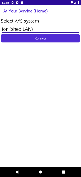
Home tabOn starting the app, it's not connected to any system, so the user has to select one from the drop-down and connect. Notice how there are no tabs shown at this point.
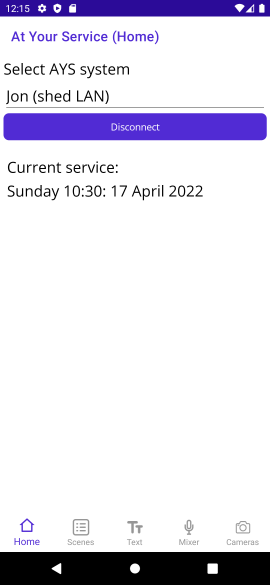
After connecting, the app shows the currently-loaded service (if there is one). If there's a service loaded that contains any scenes at all, the Scenes tab is visible. The Mixer and Cameras tabs will always be visible when connected to a system (unless that system has no sound channels or no cameras, which seems unlikely).
In the screenshot below, the Text tab is also visible, because it so happens that the current scene contains text.
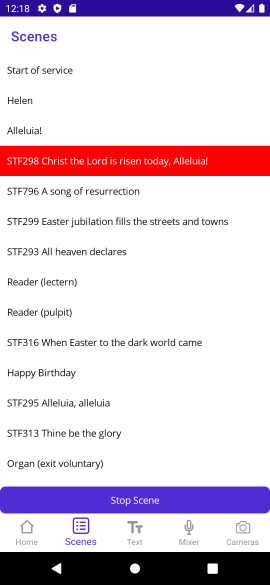
The Scenes tab shows the list of scenes, indicating which one is currently active" (if any). If there is an active scene, the Stop Scene" button is visible. (I'm considering having it just disabled if there's no active scene, rather than it appearing and disappearing.)
Tapping on a scene launches it - and if that scene has text, PowerPoint or a video, it automatically navigates to that tab (as the next thing the user will probably want to do is interact with that tab).
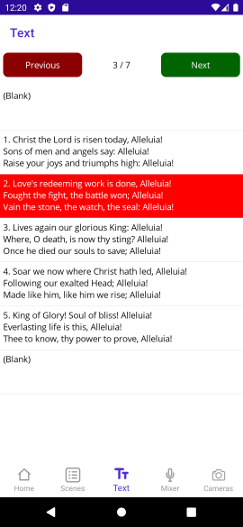
The text tab shows the various pages of the text being displayed. Even though AYS supports styling (different colours of text, bold, italic etc) the preview is just plain text. It's deliberately set at about 3 1/2 lines of text, which makes it obvious when there's more being displayed than just what's in the preview.
The user can select different pages by tapping on them - or just keep using the next" button in the top right. The selected page is scrolled into view when there are more pages available than can be shown at a time.
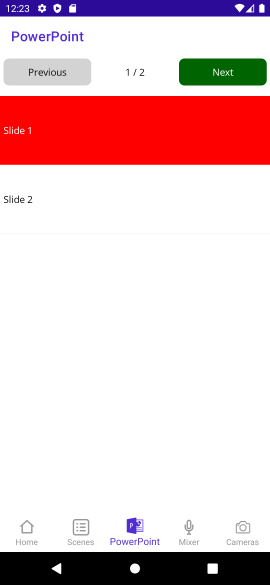
The PowerPoint is like the text tab, but for PowerPoint slides. The screenshot below looks pretty awful due to the image display bug mentioned earlier. When preview images are working, they appear on the right hand side of the list view. (The slide numbers are still displayed.)
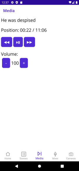
The media tab is used for videos, audio, and picures. (There's nothing that can usefully be done with a single picture; at some point I want to create the idea of a multi-picture media item" as an alternative to creating a PowerPoint presentation where each slide is just an image.)
As noted before, simple controls are available:
- Play/pause
- Back/forward (10 seconds)
- Volume up/down (in increments of 10 - a slider would be feasible, but not terribly useful)
One thing I've found very useful in AYS in general is the indicator for the current position and the total length of the media item. The screenshot below shows that the media filename is shown in this tab - whereas it's not in the PowerPoint tab at the moment (nor the title of the text item in the Text tab). I could potentially move the title to become the title of the tab, and put it in all three places... I'm really not sure at the moment.
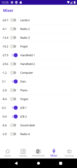
The mixer tab shows which microphones are muted (toggled off) or unmuted (toggled on) as well as their current output gain within the church building (the numbers on the left hand side, in dB). At the moment, the only interaction is to mute and unmute channels; I'm not sure whether I'll ever implement tweaking the volume. The intention is that this app is only for basic control - I'd still expect the user to be in the church building and able to access the computer for fine-grained control where necessary.
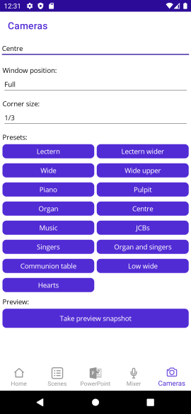
The cameras tab starts off with nothing useful: you have to select a camera in order to interact with it. At that point you can:
- Change its window position
- Change the corner size" - when a camera position is top-left, top-right, bottom-left, bottom-right you can change that to be 1/2, 1/3, 1/4 or 1/5 of the size of the window
- Move it to a different preset
- Take a preview snapshot (currently not working)
As you can see by the screenshot below (taken from the church configuration) we have quite a few presets. Note that unlike the Scene/Text/PowerPoint tabs, there's no concept of a currently selected" preset, at least at the moment. Once the camera has moved to a preset, it can be moved separately on the desktop system, with a good deal more fine-tuning available. (That's how new presets are created: pan/tilt/zoom to the right spot, then set that up as a new preview.) That fine-tuning isn't available at all on the mobile app. At some point I could add up a bit", down a bit" etc, but anything more than that would require a degree of responsiveness that I just don't think I'd get with the current architecture. But again, I think that's fine for the use cases I'm actually interested in.
So that's the app. There are two big questions, of course:
- Is it useful?
- What's MAUI like to work with?
The answer to the first is an unqualified yes" - more so than I'd expected. Just a couple of days ago, on Maundy Thursday, we had a communion service with everyone seated around a table. A couple of weeks earlier, I would have had to be sat apart from the rest of the congregation, at the A/V desk. That would definitely have disrupted the sense of fellowship, at least for me - and I suspect it would have made others feel slightly awkward too. With the mobile app, I was able to control it all discreetly from my place around the table.
In the future, I'm expecting to use the app mostly at the start of a service, if I have other stewarding duties that might involve me being up at the lectern to give verbal notices, for example. I still expect that for most services I'll use the desktop AYS interface, complete with Stream Deck and X-Touch Mini... but it's really nice to have the mobile app as an option.
In terms of MAUI - my feelings vary massively from minute to minute.
Let's start off with the good: two weeks ago, this application didn't exist at all. I literally started it on April 5th, and I used it to control almost every aspect of the A/V on April 10th. That's despite me never having used either MAUI or Xamarin.Forms before, hardly doing any mobile development before, MAUI not being fully released yet, and all of the development only taking place in spare time. (I don't know exactly how long I spent in those five days, but it can't have been more than 8-12 hours.)
Despite being fully functional (and genuinely useful), the app required relatively little code to implement, and will be easy to maintain. Most of the time, debugging worked well through either the emulator or my physical device, allowing UI changes to be made without restarting (this was variable) and regular debugger operations (stepping through code) worked far better than it feels they have any right to given the multiple layers involved.
It's not all sunshine and roses though:
- The lack of a designer isn't a huge problem, but it did make everything that bit harder when getting started.
- Various bugs existed in the MAUI version I was using last week, some of which have now been fixed... but at the same time, other bugs have been introduced such as image one mentioned above.
- I've seen various crashes that are pretty much infeasible for me to diagnose and debug, given my lack of knowledge of the underlying system:
- One is an IllegalStateException with a message of The specified child already has a parent. You must call removeView() on the child's parent first."
- One is a NullPointerException for Object.toString()
- I don't know how to reproduce either of them right now.
- Even when images were working, getting the layout and scaling right for them was very much a matter of trial and error. Various other aspects of layout have been surprising as well - I don't know whether my expectations are incorrect, or whether these were bugs. I'm used to layouts sometimes being a bit of a mystery, but these were very odd.
- The Windows app should provide an easy way of prototyping functionality without needing an emulator... and the home tab appears to work fine. Unfortunately the other tabs don't magically appear (as they do on Android) after connecting, which makes it hard to make any further progress.
- Sometimes the emulator seems to get stuck, and I can't deploy to it. Unsticking it seems to be hit and miss. I don't know whether this is an issue in the emulator itself, or how VS and MAUI are interacting with it.
In short, it's very promising - but this doesn't really feel like it's release-candidate-ready yet. Maybe my stability expectations are too high, or maybe I've just been unlucky with the bugs I happen to have hit, but it doesn't feel like I've been doing anything particularly unusual. I'm hopeful that things will continue to improve though, and maybe it'll all be rock solid in 6 months or so.
I can see myself using MAUI for some desktop apps in the future - but I suspect that for anything that doesn't naturally feel like it would just fit into a mobile app (with my limited design skills) I expect to keep using WPF. Now that I've got a bit of experience with MAUI, I can't see myself porting V-Drum Explorer to it any time soon - it very much feels like a mobile app framework that lets you run those mobile apps on the desktop". That's not a criticism as such; I suspect it's an entirely valid product direction choice, it just happens not to be what I'm looking for.
All the problems aside, I'm still frankly astonished at getting a working, useful mobile app built in less than a week (and then polished a bit over the following week). Hats off to the MAUI team, and I look forward to seeing the rough edges become smoother in future releases.