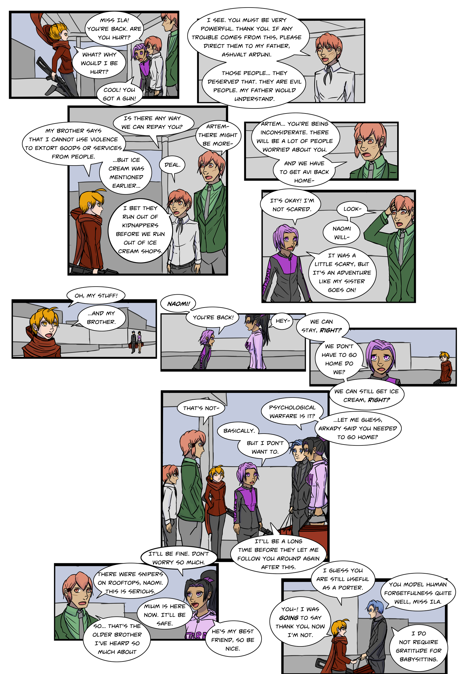
Comic for Monday, July 25th, 2022
So...
Obviously the format on this one is slightly different. It's not as different as it might seem. As is probably obvious, I still drew it as the normal half page comic, but expanded out the panels. The main reason to do this to combat text shrinkage. As some of you have noticed, over time I have tended to make the text smaller to basically just turn a half page into a page.
Since there's really no good reason to try to conform to the half page model (it was just a result of literally cutting the pages in half previously) and it doesn't seem likely that I will return to doing full page updates in any time soon, I'm thinking about going this route and just officially deciding a half-page is a page, that way I can increase the text size again (as I know some people were not a fan of it).
I will still probably draw the comics in full pages, split into half pages, but may keep going with this more expanded web format.
There's a bit of a backstory here in that this was a page I was originally going to skip, but decided to go back and do it because I felt sad skipping it, but fitting this whole page into a half page was a bit of a challenge and I didn't want to spend two weeks on it, so it was going to have be a combination of smaller text and cutting text... and I decided that I don't see what the point of trying to condense it was, since this is on a webpage anyway.
I dunno. If you like it, let me know. If you hate it, let me know. Those that have been around a long time will remember this isn't actually the first time I've done this. But I feel the math has changed slightly. With the full page style comics, this wasn't as necessary, as there was more room for text and page flow is a bit cleaner on a full page comic. On a half page comic, page flaw is always a little awkward as increasingly the just rely on two panel strips stacked, and text has been getting smaller and smaller to accommodate that I often try to just put a whole page into the half page.
I know there will be a few places that's hard to follow where the text goes here. Ultimately this was converted about half way through the page, so won't be perfect. In the future I may consider to an even more vertical format. Or I might go back to the traditional format. I'll fiddle around with it a bit, and feel free to complain about the ones I try you don't like. I also made it with a white background. Feel free to let me know if you prefer that. I also made it with a black background. Feel free to let me know if you prefer that.
