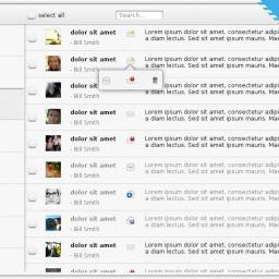
KDE rumored to be focusing now on simplicity
 KDE has always been full of tons of configuration options. And the KDE team has remained somewhat stalwart in defending that approach even as the Gnome3 project decided their mantra would be "simplify, simplify, simplify."
 Suddenly, at least one journal is reporting the KDE developers are reconsidering that approach and deciding they'll simplify too.
KDE usability team lead Thomas Pfeiffer posted on the future roadmap of the KDE user interface and user experience on his blog. While he acknowledges that the great power and flexibility that comes with KDE Plasma and associated applications is the main reason behind its huge fanbase, in his opinion these are also the reasons why newbies get intimidated by the overwhelming number of features exposed at one place.Developer Thomas Pfeiffer is behind the statement, having posted on his blog: "Anything that makes Linux interesting for technical users (shells, compilation, drivers, minute user settings) will be available; not as the default way of doing things, but at the user's discretion." In the design vision and principles section of the KDE HIG, we condensed and evolved this goal into a simple guiding principle: Simple by default, powerful when needed."
[Ed. note: I've got a bad feeling about this.]
Interesting about the GNOME story; I had actually been thinking of the bared down to the bone new interfaces of Microsoft and Google and Apple, where it doesn't look as if you can do a damn thing until you manage to stumble/click over the right mystery pixels. All the acreage of 1080 and higher resolutions (RETINA RETINA RETINA RETINA) and they can't spare a few millimeters for a god damn menu any more. GMail and Hotmail/whateveritscallednow are the worst, next to maybe "Metro".
Same reason I still love LibreOffice until they get around to sticking us in the back and aping the still-useless freaking ribbon interface, which I continue to work around on a daily basis.