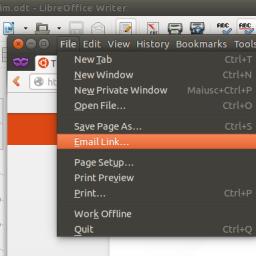
Ubuntu desktop moving application menus back into application windows
 Ars Technica reports that the next version of Ubuntu (14.04, or Trusty Tahr ; a Long Term Support Release) will allow users an option to display menu bars inside their parent application windows -- a move away from Mac OSX interface conventions towards the menu placement more commonly used in Windows.
"Despite displaying the menu contents outside of the window, the menus are still window-specific," we noted in a review of Ubuntu 12.04 in May 2012. "By design, the global menu bar displays the menu of the focused window. This proves awkward in some applications with dialogs and multiple windows."
The intended result is to "fix the main UX bug we have [had] in Unity since its very first release: the menus being hard to find or too far from their parent window ", according to a blog post Canonical employee Marco Trevisan . "The amount of technical work needed [is] not to be underestimated [...] one of the blockers we had in 12.04 was our dependency on the legacy compiz decor plugin + gtk-window-decorator, that has worked 'OK' in the last years but -- apart from using deprecated technologies (gtk2 in primis) -- it really would have made this concept impossible to realize."
A tahr appears to be some species of mountain goat indigenous to the Himalayas.
Speaking of changes, I am looking at the latest OpenOffice.org Calc. It has the standard dropdown menus at the top starting from the left, File Edit Insert Format Tools Data Window Help, and on the right a large ribbonesque properties box taking up 1/7 of the screen showing icons for text alignment orientation cell border etc. I am not offended by this. It has been sitting there for the last few hours. I haven't used any of the options in this spreadsheet. It isn't offensive. It has an x in the top right corner for closing it.
I find the MS Office ribbon highly offensive. I don't find this offensive. I can't quite put my finger on why.
Your comment has inspired a theory: In OpenOffice Calc I can close this large panel of icons down easily. In MS Office I can't. Perhaps this simple ability to be able to remove the parts of the interface makes it more appealing.
Or maybe that it is taking up horizontal room for which I have lots and not crowding the screen vertically.