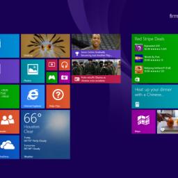
Windows Finally Gets a Shutdown Button
 I admit it; amongst all my Linux computers, I still have one remaining Windows box. Until Blizzard takes a hint from Steam, I have to endure the horror of Windows in order to get my weekly raid fix.
 Now, being a higher end gaming box and the graphic card being one of those 2 slot varieties, the fans can make a good bit of racket. No problem, I simply moved the system to another room (the cords go through the wall and are still plenty long enough) and viola! Quiet gaming room! All is good, until I finish and want to turn off the system. You see, Windows 7 had this convenient little "Shut Down" button that was easy to get to.
But, last year when I upgraded the system's hardware I (mistakenly) opted to try out the newer version 8 of Windows. Well, Microsoft did a fine job of hiding that shutdown option. It takes no less than 6 clicks and several full screen transitions to get to it using the default UI. When it takes less time to get out of your chair, open the door, walk down a small hallway, open another door, walk over to a humming tower, and depress its power button than it does to do the software equivalent, you know your interface is borked.
But no longer! Microsoft's new Windows 8.1 Update 1 will re-add that missing "Shut Down" option to its (still) metro-tiley start page. And that is progress!
A lot of people are experimenting because of the rise of mobile devices. The situation will stabilize eventually when people are more experienced with making desktop interfaces that are adapted to the desktop, but familiar to mobile users.