Link Station Interiors on Google Maps

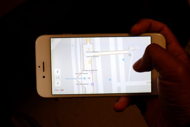
Finding your way through Link stations just got a little bit easier if you have a smartphone in hand or a computer. A map of Link's SeaTac/Airport Station is now available on Google Maps. Included on the map are the locations of station amenities and features such as entrances and exits, ticket vending machines, ORCA card readers, stairs, elevators, and escalators. When zoomed in, you can change levels to see what's on the mezzanine and platform levels. And coming soon is the ability to take a virtual tour inside the station so you know exactly what to expect.
Indoor mapping has the potential to be a great navigational aid but there are obvious omissions in Sound Transit's first try that would puzzle those unfamiliar with the station. Since SeaTac will be the model for the rest of the system, it is important to get it right.

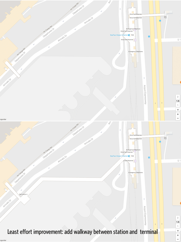
- There's no access to the station from the terminal. The walkway through the garage is not shown. Yes, there is a tiny label for "Entrance/Exit to Airport" but it's not clear how you would get from there to the terminal. The entrance from from International Blvd isn't well marked either, with a label appearing where the bridge meets the station, not on the other side of the street.
- Where's the platform? The levels are unintuitively labeled 1, 1.5, and 2. There are elevators, stairs, and escalators marked on the mezzanine map but it doesn't tell you where they go, up or down. This seems to be a recurring problem at Sound Transit where they're unable to label the elevator buttons in a user-friendly way. The levels seem to correspond to the airport levels but you wouldn't know that (because #1 above).
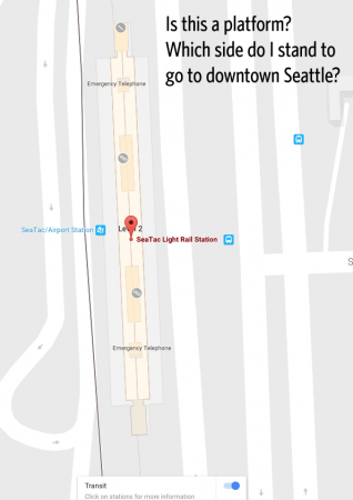
- Which platform takes me to downtown Seattle? The platforms are not labeled at all. So even if you do figure out that the platforms are on "Level 2", all you see is a thin tan strip without any indication of direction. The misaligned tracks in the background don't help.

Let's talk about the information hierarchy. The choice of what to emphasize at each zoom level is rather curious. When you zoom in close enough, the first things you see are the "Orca[sic] Card Scanner" and emergency telephones. Do you use an emergency telephone every day? Is that the most important and commonly used feature of the station?
Zooming in further" elevators and restrooms begin to appear, then escalators, stairs, and (some) ticket vending machines (TVMs), until you reach maximum zoom does everything in the station becomes visible. I would prioritize entrances and exits, then the TVMs and ORCA readers, then the stairs and elevators, then everything else.
Compounding the poor hierarchy are the labels and symbols. Most maps have a key that explain what the symbols mean. Google Maps doesn't explain that the symbol that looks like two sheets of paper are ticket vending machines nor is there a pop up label when you touch or hover your pointer over the symbol.
Because emergency telephones are ranked higher than TVMs their long labels take up room that crowds out more important information. ORCA readers should appear as ORCA symbols on the map or marked with a standard symbol.
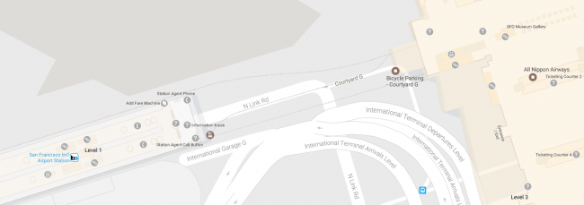
Some of these problems are not unique to Sound Transit's instance and are more a result of Google's approach to transit mapping, which in my opinion and others' lacks finesse. You can see the missing station-terminal link at BART's San Francisco International Airport station as well.

Having station maps on a popular mapping service is nice but it is clear that this is a first beta that needs some critical fixes, more polish, and better integration with ST's website. Isn't it strange that none of this information is available on Sound Transit's own website, which ironically uses Bing Maps instead of Google's?