Google News website gets redesigned, now looks like something from this decade
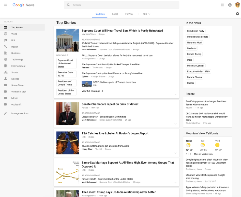
Google is launching a major redesign for Google News, bringing the site more in line with Google's company-wide "Material Design" guidelines. A gray background and white cards around each story bring the site more in line with what Google has been doing on Android and makes it look a lot like Google Now. Everything is a lot more spaced out, so you'll see less information on a single page. Google says the airier design is "designed for readability" and will make it easier to scan stories.
The site remains recognizable as Google News. There's still a vertical column of sections on the left side, but now the list is customizable. There's also still a right-side column that houses recent items, the weather, sports scores, and local news. Google is highlighting its "Fact Check" labeling program with a new block in the right column that will show "the top fact checked articles recently published." One new navigation element is a top bar that lets you jump between top headlines, local news, and "For You"-a suggested content section.
Read 2 remaining paragraphs | Comments