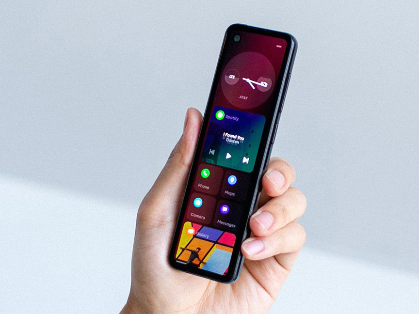
Essential’s new smartphone has the aspect ratio of a TV remote

Essential's Project Gem. It has the form factor of a TV remote. [credit: Essential ]
Believe it or not, Essential seems financially solvent enough to release one more (one last?) smartphone. Despite having no discernible income since the complete flop of the Essential Phone in 2017, canceling the Essential Phone sequel, canceling its smart home device, being put up for sale, laying off 30% of its staff, and having its founder and CEO Andy Rubin stained by a sexual misconduct scandal, Essential is somehow still around. And it hopes you'll forget about all that stuff while it teases a shiny new smartphone on Twitter.
Meet "Project Gem," a tall, ultra-skinny smartphone with an aspect ratio approaching that of a TV remote. It looks like what would happen if you took a normal smartphone and cut it in half vertically. The front has an even bezel all the way around the phone, with a hole-punch camera in the top-left corner. The back has a sizable camera bump for the single-lens camera and a divot for your finger, which could be a button, or a fingerprint reader, or both. The color scheme definitely lives up to the "Gem" name, with four versions each showing a different shiny, color-shifting finish.
Every phone must be assumed to run Android unless proven otherwise, but boy, does this not look like normal Android. The hero image features what we assume is the home screen, showing a clock widget, a music widget, and apps icons that live in a 2x2 grid of tiles, making it look a bit like Windows Phone. The home-screen design seems to prefer showing apps as square widgets with some info and functionality, rather than app icons. The Spotify widget shows music controls, the Gallery shows a picture preview, calendar shows your next appointment, "Maps" shows a map with your current location, and we're going to assume the weather widget shows a weather preview. It's different, but it also looks pretty scroll heavy, since only four widgets are necessary to fill up the screen.
Read 9 remaining paragraphs | Comments