Is it time to turn away from touchscreens in our cars?

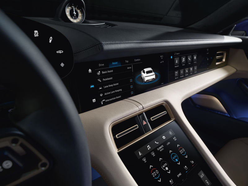
Enlarge / The Porsche Taycan can feature up to four touchscreens, three of which are seen here. That might be overkill. (credit: Porsche)
The primary controls for operating a car are the same today as they were a hundred years ago. We push one foot pedal to speed up, another to slow down, and turn a hand-operated wheel to steer our direction. Over the years, people have suggested joysticks or other radical replacements for controls, but none has proven superior to wheels and pedals. However, when it comes to our other interactions with automobiles, the past decade or so has seen quite the change within our car interiors. The high-definition, multicolored glitz of the consumer electronics world has proliferated throughout the industry, replacing dials and buttons with touchscreens. Whether that's an entirely good thing is up for debate.
It might all be infotainment's fault. In the old days, there were just car stereos. You turned a knob or pushed a button to listen to the radio, inserted some kind of physical media, and if you were really fancy, maybe there were some sliders to change the EQ settings. Soon, small digital screens were appearing in our cars' center consoles, built-in alternatives to the suction-cupped GPS units that all of a sudden rendered the road atlas a thing of the past. Those screens grew and became more capable, so there was more need to interact with them. Dedicated physical buttons have given way to jogwheels, scroll- and touchpads, and then the touchscreen.
One problem with all of these additions is that they can be a distraction from driving. Taking your eyes off the road is bad, and touchscreen interfaces are generally not conducive to developing "eyes-off" muscle memory, particularly if they lack haptic feedback. It's not that touch interfaces are inherently bad, but they do let designers get away with shipping poor user interfaces.
Read 13 remaining paragraphs | Comments