New COVID-19 dashboard just for the US offers rich, county-level data

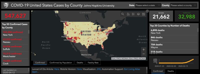
Johns Hopkins University on Monday, April 13, released a new version of its wildly popular COVID-19 dashboard that focuses solely on the United States and includes rich, county-level data and infographics not seen in the global version.
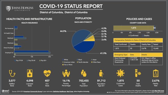
While the initial landing page looks much like the global version, clicking through to the county-specific infographics adds extensive context to each location's situation. Each county's cases, deaths, and fatality rate are displayed alongside state-level data on testing, cases, deaths, and the fatality rate.

(credit: JHU)
The infographic also contains critical information on county-level healthcare resources, including staffed hospital beds and ICU beds, as well as mitigation policies that have been put in place.
Read 5 remaining paragraphs | Comments