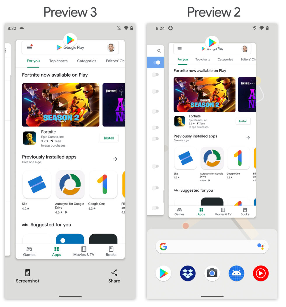
Android 11 Preview 3 hands-on—Strange changes to Recent Apps and notifications
There's a new Android 11 Developer Preview. This one is Preview 3, and it launched yesterday for Google's Pixel line. Previous Android 11 previews haven't had a ton of new additions, but this version has a lot of strange and interesting UI changes for us to discuss and puzzle over.
Recent Apps loses the app drawerIn Android 9 Pie, the Recent Apps screen turned into a horizontally scrolling list of thumbnails with an expandable app drawer at the bottom. In the Android 11 Preview 3 release, the app drawer is gone. It has been replaced with a pretty weak selection of two buttons: "Screenshot" and "Share."

Preview 3 Recent Apps dumps the bottom app drawer in exchange for two buttons, share and screenshot. It looks incomplete. [credit: Ron Amadeo ]
Removing the app drawer from Recent Apps is a pretty interesting decision, considering just two years ago Recent Apps was rearchitected to support this access to the app drawer. The app drawer and app icons are all a part of the home screen launcher, so to make the feature work in Recent Apps, the Recent Apps were pulled out of the core System UI and made a part of the launcher code. This saved Google from having to make any kind of special API allowing another app to access the app drawer-everything was just bundled into the launcher app.
Read 16 remaining paragraphs | Comments