What’s new in the first Android 12 Developer Preview

Enlarge / This green circle (we added the background) is the Android 12 logo, we guess.
The first Android 12 developer preview hit the streets Thursday, and we've played with it for a day. There's not a lot to see in this release-at least not at first. Most of the interesting bits are hidden, and the developer community is slowly enabling them. Many changes are half-finished alpha tweaks that will look different in the final release; after all, Google says these releases are for "testing and feedback."
This first release of Android 12 is meant to get some APIs and other changes in front of people for feedback, but it's also designed to not spill the beans too much on what the final build of Android 12 will look like. With that in mind, many of the features in an earlier Android 12 leak seem right on the money. This public release is a sanitized build with a lot of stuff turned off, but the more we flip on hidden flags and catch hints in the documentation, the more this build looks like a solid halfway point between Android 11 and those leaked Android 12 screenshots.
The notification panel
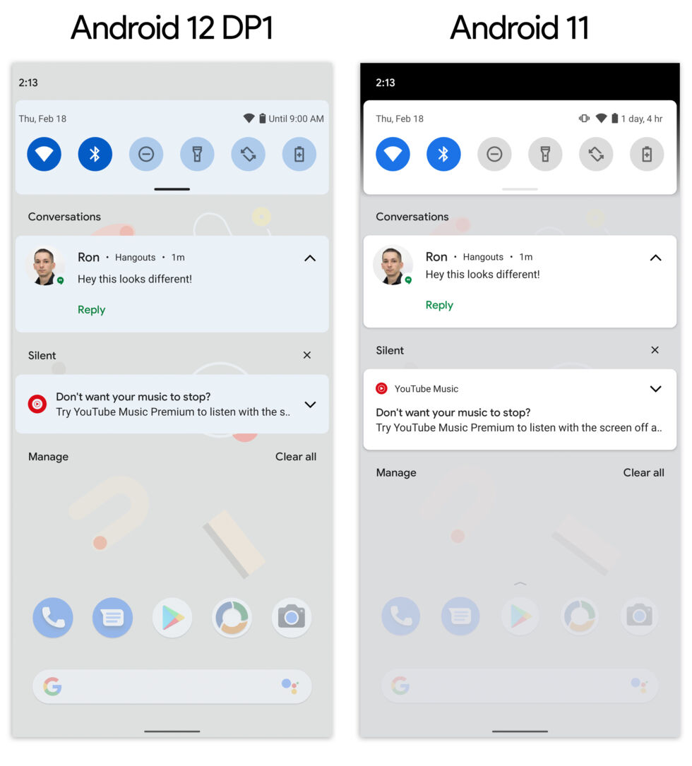
The top back bar is gone, all the colors are a little different (and bluer), and the background is less transparent. [credit: Ron Amadeo ]
Google can never let an Android release go by without some notification changes, and this year it looks like we're getting a fresh design and a few other tweaks. Like everything else in the preview, we're only getting a half-finished look at things here.
Read 12 remaining paragraphs | Comments