Google shows off Android 12’s huge UI overhaul

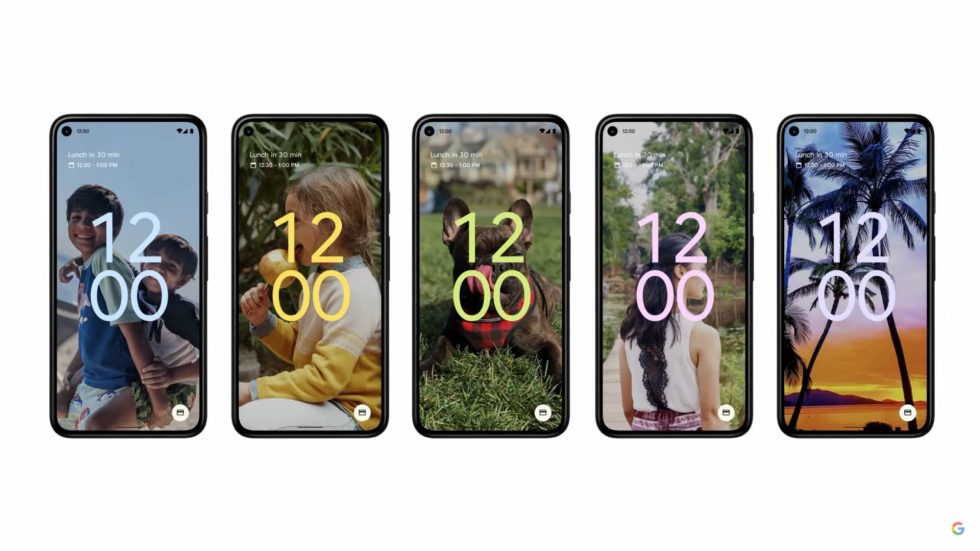
The Android lock screen, now with lots of different colors. [credit: Google ]
Google I/O kicks off today, and the big news is that Android 12 is getting a huge new design. Google calls the new design "Material You," and just like in the leaks, it's a UI that changes colors like a chameleon. For now, this design will only show up in Google Pixels, but Google says it will roll out across the ecosystem to the web, Chrome OS, smart displays, cars, watches, tablets, and every other Google form factor.
The new interface is powered by a "color extraction" API that can pull the colors out of your wallpaper and apply them to the UI. This sounds exactly like the Palette API that was introduced in Android 5.0 (along with the original introduction of Material Design), but it's apparently a second swing at the color extraction idea, and Google is heavily using it in the UI now. The demo interfaces featured customized highlight colors, clock faces, widget backgrounds, and more, all matching the color of your wallpaper.
Besides new colors, there are also tons of layout changes to the quick settings and notification panel. We'll dive into this more as soon as we get some code to play with, which might only be when the final version of Android launches.
Read on Ars Technica | Comments