Preview builds begin to fix Windows 11’s Start menu and taskbar

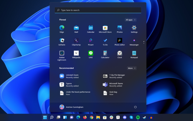
Enlarge / The new Start menu kills Live Tiles and puts the All apps view on a separate screen. Like the taskbar, it's cleaner-looking but also less customizable and flexible than before. (credit: Andrew Cunningham)
Microsoft may have given the taskbar and Start menu a fresh coat of paint in Windows 11, but the updated look also came with new limitations. Microsoft appears to be listening to at least some of the ensuing complaints because the latest preview build of Windows 11 for Windows Insiders in the Dev channel includes some improvements to both the taskbar and the Start menu, among many other tweaks.
For example, the Windows 11 version of the taskbar won't show the time and date on all monitors in a multi-monitor setup, only on the primary monitor; in this preview build, the time and date show up on all monitors again. Hooray!

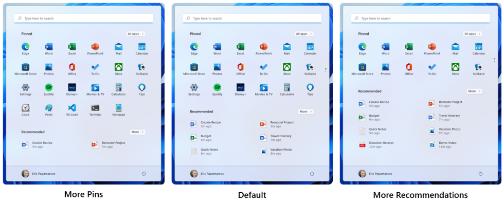
Different Start menu view options. (credit: Microsoft)
In the Start menu, users will be able to shift the balance between pinned apps and "recommended" items depending on what they want to see more of. "More pins" adds another row of pinned apps while shrinking the Recommended field to just a couple of entries, while the "more recommendations" view removes a row of app icons and displays up to eight recommended items.
Read 2 remaining paragraphs | Comments