Decade-old volume indicator gets a new look in latest Windows 11 preview

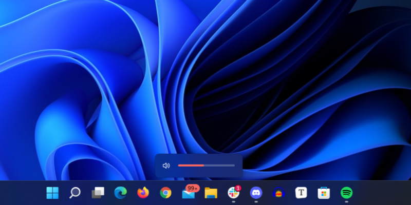
Enlarge / The humble volume indicator, reimagined for Windows 11. (credit: Andrew Cunningham)
Improving Windows 11's visual and functional consistency is shaping up to be a major priority for Microsoft this year, as evinced by the continued updates to core apps like Notepad, Paint, and Media Player, as well as the ongoing effort to move advanced settings out of the old Windows 7-era Control Panels and into the modern Settings app. Restoring some flexibility to redesigned areas of the OS like the Start menu and Taskbar has also been a focus.
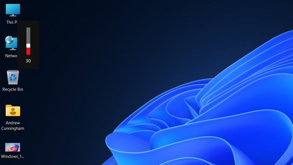
The latest Windows 11 Insider build released to Dev channel users continues this work, updating the overlays for volume, brightness, and other settings to match Windows 11's more rounded look. The new indicators pop up in the bottom center of your screen rather than the top left, they will respect your light or dark mode setting, and, like the Start menu and taskbar, they use Mica styling to match the color of your desktop wallpaper.

The volume and brightness indicators in current Windows 11 builds are the same as they were in Windows 10 (and Windows 8). (credit: Andrew Cunningham)
The other changes in this preview build are pretty small; "Apps and Features" in the Windows + X shortcut menu has been relabeled as "Installed apps," the Voice Access accessibility feature can be pinned to the Taskbar and Start menu, and the Clock app can be uninstalled. Exciting times!
Read 1 remaining paragraphs | Comments