New Gmail rolls out to everyone, and you can hide that big sidebar now

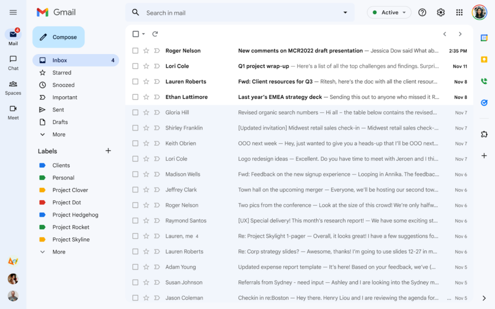
The new Gmail. It's blue and has a big sidebar, but there are options for both of these big changes. [credit: Google ]
The new desktop Gmail design started rolling out this weekend. If you use the default theme, you'll know it has arrived when your entire Gmail interface turns blue. Gmail's new design first entered an opt-in preview in February, and after gathering feedback and fixing a few things, Google is pushing the design out to everyone. Everyone dislikes Gmail changes, so let's talk about what's different and how to turn it back.
A few things have changed between now and the February preview. The most striking change is the all-blue color scheme. Google's blog post says: "You'll notice the new navigation now features Material You, our updated, fresh look and feel for your Google apps." "Material You" launched with Android 12 as a color-coordinated theming system that matched your OS color scheme with your wallpaper. There's no color-matching with Gmail's "Material You," though, just the blue color scheme.
Gmail still has a theme system, so you can change the color to whatever you want. Click on the settings gear in the top right and then under the "theme" section, click "view all." The background closest to the old Gmail is the solid "soft gray" background option. To truly match the Old Gmail background, you would want "white," but that's not an option. (You can also pick from your Google Photos collection via a "my photos" link at the bottom, and I tried uploading a solid-white background, but trying to apply it only brings up an error message). This "theme" screen is also where you can apply Gmail's weirdly hidden dark mode: Just pick the black background option, and everything will switch over to light text on a dark background.
Read 4 remaining paragraphs | Comments