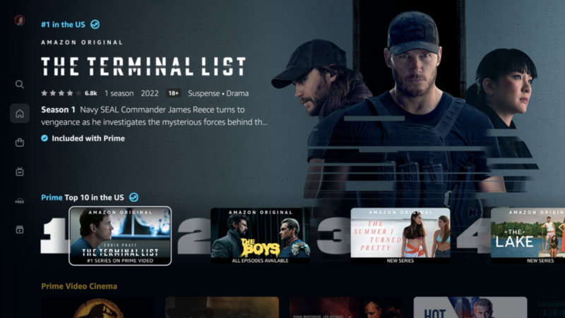
Amazon Prime Video finally gets a desperately needed redesign

Enlarge / This is Amazon Prime Video's new look. (credit: Amazon)
Amazon Prime Video may have a compelling value proposition and some great original series to watch, but its interface has always been hideous compared to what competitors offer. Granted, the current state of affairs is what it is partly because the one we're using now is a decade old, give or take. But it wasn't all that attractive even back then.
Fortunately, Amazon is completely overhauling the Amazon Prime Video design at long last. The updated interface will start rolling out to users this week.
At first glance, the redesign is all about modernizing the look and making the experience more similar to what you get with just about every other streaming service. But it also addresses one of the biggest user complaints that isn't just about looks: It offers a more elegant way to tell which videos are available free to Prime subscribers, and which ones you have to pay a la carte for.