Buttons beat touchscreens in cars, and now there’s data to prove it

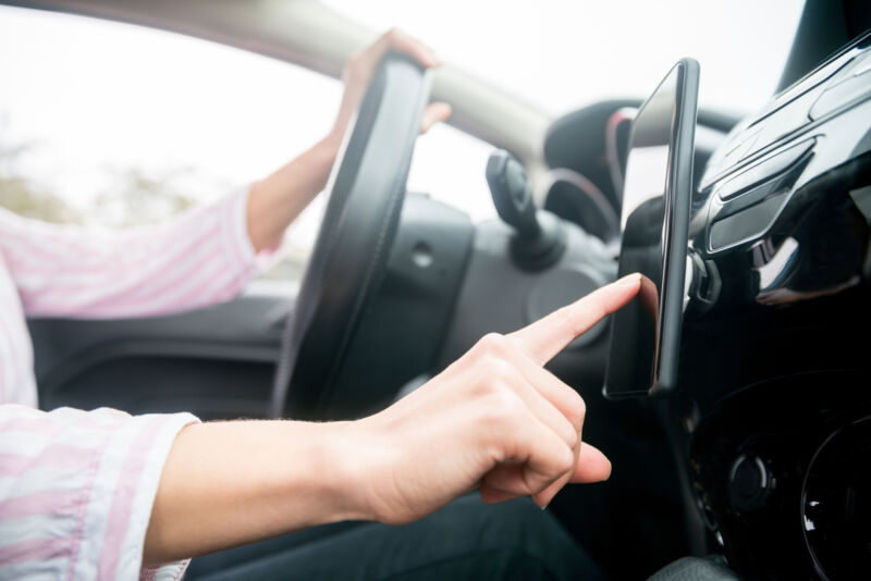
Enlarge / Not all progress is good. (credit: Hispanolistic/Getty Images)
It's probably a little early to be warning of extinction, but in some new cars, buttons are becoming hard to find. Given that a screen has to go into the dashboard anyway (thanks to things like backup camera requirements) and the fact that people increasingly won't consider a car without Android Auto or Apple CarPlay, touchscreens make life easier for automakers in terms of design and assembly.
It's just that they don't make life easier for drivers. Instead, we're treated to bad interfaces that don't create muscle memory but instead distract us while we should be driving. And now, Swedish car publication Vi Bilagare has the data to prove it.
VB tested 11 new cars alongside a 2005 Volvo C70, timing how long it took to perform a list of tasks in each car. These included turning on the seat heater, increasing the cabin temperature, turning on the defroster, adjusting the radio, resetting the trip computer, turning off the screen, and dimming the instruments.