Oppo Find N2 review: Beautiful hardware that Android just can’t deal with

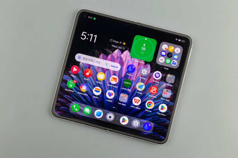
Enlarge / The inner display of the Oppo Find N2. (credit: Ron Amadeo)
One of the more interesting designs we've seen in the wild world of foldable smartphones comes from the Oppo Find N2. Its unique form factor and construction make it the lightest tablet-style foldable on the market, and it manages to have one of the least-noticeable creases of any foldable device.
While the phone is not shipping in the US, Oppo's sub-brand OnePlus shares a lot of parts and software with the company, so we may see something similar here someday. But the limited distribution isn't a huge loss, as Android is kind of a disaster on devices of this size. The device clearly needs to show something other than a phone UI on the big interior screen, but Android boots into a phone UI anyway. This means the bigger screen often presents a worse user experience because Android doesn't know what to do with it.
The phone also reveals Android's dark secret: Even if you dig into the developer settings and force everything to act as a tablet app, those apps don't look good on foldables, either. Google's tablet resurrection plans revolve around ultrawide 16:10 tablets, and those interfaces are cramped on the smaller square displays of foldables. Apps built for tablets are just not good enough for foldables.