Google Maps’ new color scheme test looks a lot like Apple Maps

The familiar Google Maps interface might start looking a bit different soon. 9to5Google reports that Google is testing a major redesign of the default map layer with a new color scheme.
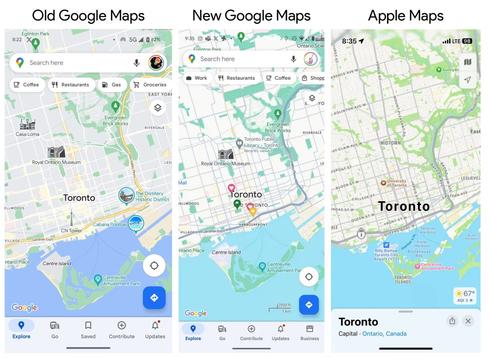
The new color scheme looks a lot more like Apple Maps. Today, Google Maps has a gray background for land and white roads, but this new version has a nearly white background for land and darker gray roads, just like Apple Maps. This one change makes a lot of sense: Gray is a lot closer to the actual color of a road, and the darker color lets roads stand out more on the map. Pretty much every color has been tweaked, though-the blue water is much lighter. The green forest is darker. Major highways, instead of being bright yellow, are now a darker gray than the normal roads.

Navigation mode picks up the new color scheme, too, with a darker green for the header and a dark blue for your current route. Previously, navigation was sort of themed around the Google logo colors, with Google Green for the header, red for a location pin, and blue, yellow, or red for the route, depending on traffic. The new design is a lot more muted.