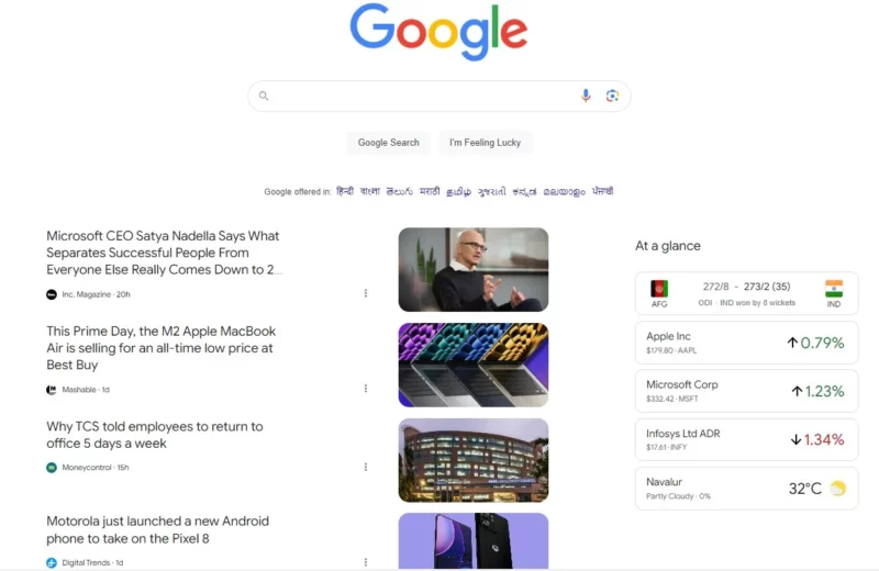
Google.com tests a news-filled homepage, just like Bing and Yahoo

Enlarge / The future of Google.com? Experiments in India show this news-filled version of Google.com. (credit: MSPoweruser)
Google is still wondering if it should make major changes to its homepage. The last experiment we saw filled the usually stark white page with info cards showing things like the weather and stocks, but this new experiment, spotted by the site MSPoweruser, has a much bigger focus on news.
Instead of a homepage featuring only the Google logo, a search box, and a few buttons, this latest experiment looks a lot more like the "Google Discover" newsfeed you get on the Google mobile app. That means rows of news articles that Google has algorithmically detected will interest you, often with wild month-to-month quality swings in the sites it promotes. To the right of the newsfeed is a stack of "at a glance" cards featuring sports scores, stocks, and the weather. The change makes Google look a lot busier-and a lot more like Bing and Yahoo.
The Verge reached someone at Google about this and was told it's an experiment currently being run in India.