Results of the Gaia artwork contest 2018 – Top 12
It's time! Time for the top 12 of the Gaia artwork contest 2018!
The submissions are ordered from place #12 to #1. As you can see, we've received an amazing selection of great art this year again. I was a bit worried if we'll receive enough worthy entries for a contest limited to just Gaia, but the quality of the top entries was once again exceptional and surpassed my expectations! Please show your support by visiting the artists' websites and/or by writing a comment in the comment section of this blog post!
One thing that I found surprising is that Viviana isn't the clear main character in any of the submissions although she's by far the most popular character among our readers.
-

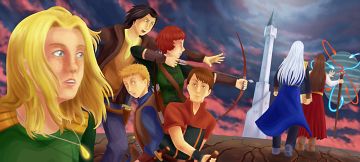
Place 12 goes to Aisea Peralta (website)
Aisea's submission for last year's contest reached #3. Her new drawing features more characters and more references to the last chapter. But more does not always mean better. Composition and coloration just don't reach the very high standard set by Aisea's more abstract piece last year. It's still a very nice drawing, of course, and I'm happy to have received it.
This is a color-corrected version of the original version which has a yellow tint that I'm not fond of.
-

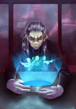
Place 11 goes to Jarrod Sievert (website)
[Artist's comment: I am an artist on Tapastic and draw and write a gag comic called Fairy Stories. I thought that it would be meta to draw the professor that announces a contest in your comic.]
Jarrod was one of the first artists to send their submissions and at that time I assumed that his interesting take on Hel Rekdal would be one of the winners. It's great how Hel is drawn in such a unique style but still instantly recognizable.
This is a color-corrected version of the original version whose contrast is much too low.
-

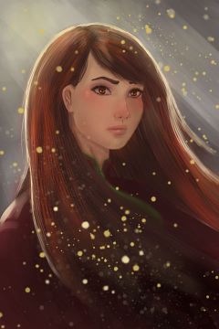
Place 10 goes to Sara Ferreira
Sara's drawing has the highest technical quality of all submissions from this year. It's a stunning portrait! However, the drawing also has a severe problem: The likeliness to Lilith just isn't that high. Drawing the two streaks of hair in front of her ears would have helped a lot. Furthermore, the hair is too red, rather resembling Ira Catao (see below), and the eyes should have been blue instead of brown.
I asked Sara for an alternative version with blue eyes, since I assumed that to be an easy fix, but the ice-cold eyes in the alternative version look out-of-place and Sara somehow managed to make several other parts of the portrait worse. The original version with the brown eyes also has a strong JPG compression although I always ask for uncompressed PNGs. I always talk about how the highest technical skill doesn't secure you a winning place in my contests, and placing this entry so low should show once and for all that I live by these words!
-
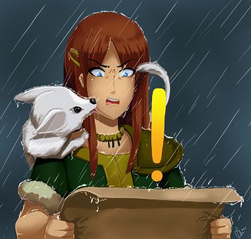
[Artist's comment: The image bases largely on Ira's "I'm so sick and tired of dungeons!" expression in The Way Back Home 12. I decided to add a quest exclamation mark, as we had the new World of Warcraft expansion release. I find that her words resonate with me when I'm grinding dungeons!]
No artwork contest is complete without a submission from Oliver Barber! With three of his drawings he reached #3 in 2015, #2 in 2016, and #10 in 2017. Once again he shows his good sense of humor and solid drawing technique. The submissions placed between #6 and #9 are extremely close together. Oliver got the short end of the stick this time and doesn't receive prize money for the first time. I'm confident that he will get over it soon.
-

Place 8 goes to Yenrou (website)
[Artist's comment: Eric, Ira and Talon into another great adventure! Because I heard that people are shipping Eric and Ira, I decided to make a cute scene with them, of course Talon is here too.]
Yenrou is another artist that has successfully entered our contests multiple times already. He reached #6 in 2014, #18 in 2015, and #3 in 2016. The strongest part of this piece is the lovely background. Without the background, it would have been placed at #12 at most.
-

Place 7 goes to Erin Roosa (website)
Finally! Erin made it into the top 8 that receive a piece of the prize money this year! I admire Erin's tireless dedication after reaching #19 in 2014, #21 in 2015, #23 in 2016, and #14 in 2017. I think I would have given up at some point. This year's drawing clearly shows how Erin has improved as an artist over the years!
There is also an alternative version with stars and flames. The composition is even better this way, but the digital effects clash with the classical look of the rest of the artwork. There is another version with the same height as the alternative version.
-

Place 6 goes to Angelica Audal
[Artist's comment: I started reading Gaia recently between my free time and it is really interesting. I love the female characters, having their own quirks and each of them are pretty strong. Faye may not be one of the main characters but she has this aura of fierceness that I really like.]
Angelica reached #15 last year with a funny drawing of Sandra and Woo. This year's entry that features Faye Galitas is even better. It shines with an excellent composition and use of color. It may be simpler than the other entries in this top 12 list, but it's truly a work of art!
-
Place 5 goes to Audrey Croce
[Artist's comment: I choose to make a Rainbow Knife, I like this item and the way it made Viviana suffer. Don't take me wrong: I love Viviana's character, but sometimes the protagonists need to understand that they aren't invincible and they make mistakes that could threaten someone's life, be it acquaintances or strangers"
Well, I like Powree's depiction of the blade, I image it being diaphanous and lightly shining so I made it with a clear plexiglass blade colored with resin and used a hollow hilt to hide a flashlight. I took 3 pictures of the blade:
- The first one in daylight so you can see a faint glow.
- The second one is taken in semi-darkness to see the light on the blade.
- The last one to see how I constructed the knife with the flashlight.]
After Audrey reached #8 in 2016 with a Woo puppet and won the contest in 2017 with a statue of Ars, she decided to create a replica of the rainbow knife this year. The rainbow knife looks very cool! I'm quite sad that I can only see pictures of it instead of holding it in my own hands. However, I'm lamenting the quality of the photos that don't do her creation justice. This year's photos are even worse than last year's. Audrey needs a better camera and/or a better photographer to take pictures of her creations. Here's an example how a really good photo of a knife would look like.
-

Place 4 goes to Daniel Ayala (website)
Daniel's drawing is super stylish and shines with an amazing color composition. Eldor's face and hair is drawn particularly well. If Gaia took place in a cyberpunk setting, this is how it would look like! He gave his drawing the title Gaiapunk which I also found clever.
-

Place 3 goes to Cabbage OnFire
[Artist's comment: Lilith is my favorite character from Gaia, so I decided to try doing a semi-abstract thing that would capture her situation - Eldor's control, the overwhelming effect of the spell book on her mind, and the truth about her conception under the Great Tree. Most of the magicky-looking symbols I borrowed from random Gaia pages, as well as some of the math expressions. I decided to mix the two since I really like the way Gaia integrates magic and physics in the story and how all the powerful wizards are basically mathematicians.]
Cabbage OnFire's drawing has a truly remarkable composition. There are so many objects floating around and it still doesn't look cluttered. It also illustrates Lilith's descent into madness in a striking manner.
-

Place 2 goes to Gatekid3 (website)
[Artist's comment: After Ilias hit that sore spot about Sandril's father in the first chapter I can definitely imagine Sandril sneaking in a kick to the face like that. The Red Hall put an emphasis on their rivalry that I don't remember seeing surface again.]
After reaching only mediocre rankings in 2015 and 2016 with normal digital drawings, Gatekid3 has found his destiny in creating GIF animations. His animation of Sandy South an Qoo reached #6 in 2017, and this year's animation of Ilias and Sandril engaging in a sword fight is even better! Just drawing sword fights is a constant headache for me and Powree, and he even animated one! Note all the nice details like the shaking background after Ilias' counter-attack! I can't stop watching the animation again and again!
-

Place 1 goes to Gian Pusung (website)
An arrangement of characters from a fantasy story in this manner may not be terribly original, but the execution is truly excellent! The characters all have distinct, dynamic poses and although they are drawn in a unique style, they are instantly recognizable. The line art is of professional quality and the muted colors also work very well.
There is also an alternative version with a nice background. But I think it distracts too much from the characters in the lower half of the drawing. Something more abstract may have worked better.

