Android 11 Preview hands-on—Notification changes, dark mode options, and more
by Ron Amadeo from Ars Technica - All content on (#4ZMR7)

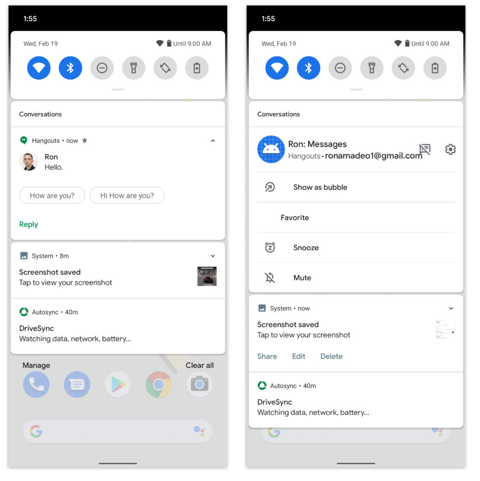
Left: The new "Conversations" notification section. Right: Long-pressing on the message notification and opening up a huge option panel. [credit: Ron Amadeo ]
The Android 11 Developer Preview is out, and I've tried it for a few hours. I'm back to report my findings.
To be honest, there are not a lot of user-facing changes in this first preview release. Like the earlier Android 11 post laid out, this is almost entirely API changes with little to see from a UI perspective. Right now, Android 11 looks just like Android 10. Hopefully, Google is just holding back, and we'll see more in future Developer Preview releases.
Android 11
- Android 11 Preview hands-on-Notification changes, dark mode options, and more
- Google launches the Android 11 Developer Preview today
Read 6 remaining paragraphs | Comments