Android 11 Preview 2 hands-on: More polish and a new install method
It came out much later in March than we expected, but yesterday Google launched the second developer preview for Android 11, the next big version of Android due out at the end of the year. Despite the coronavirus disrupting just about every part of normal life, Google posted the same schedule it did with Preview 1, indicating that the plan is still to have a preview release every month. (Elsewhere in Google, the Chrome team is taking a different approach and pausing releases for a while.)
Anyway, here are the important new things in this release.
Even more notification changes
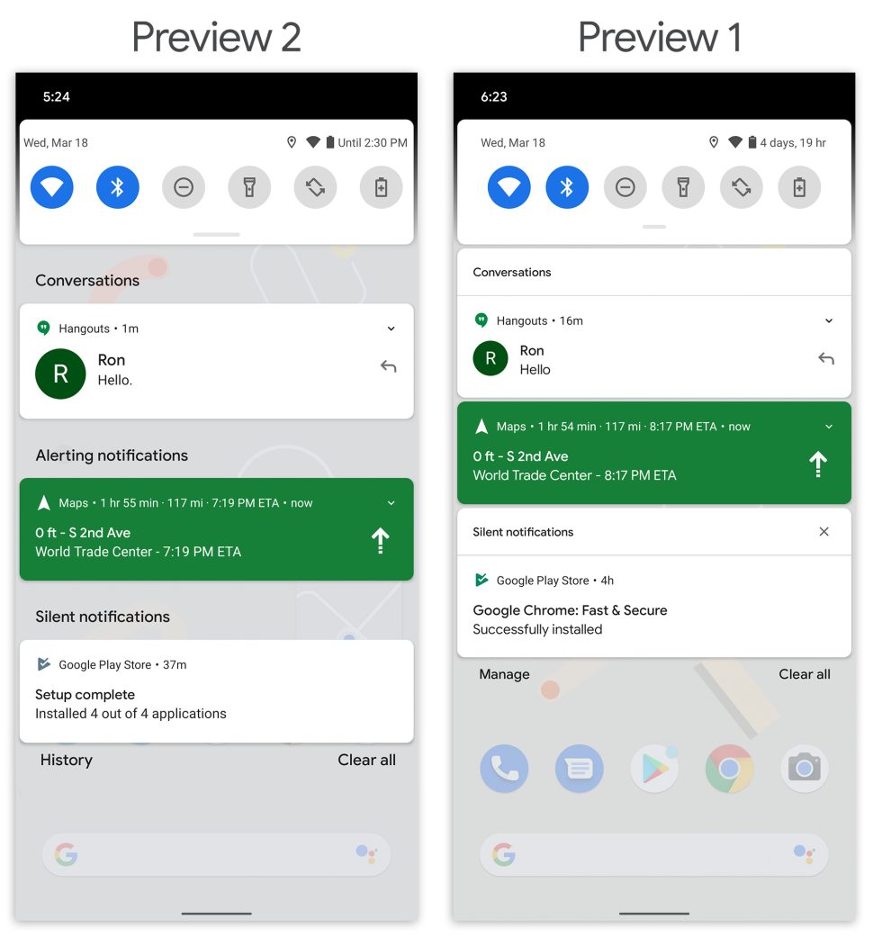
The notification looks under construction, but right now it uses a lot more vertical space with these giant headers. [credit: Ron Amadeo ]
The notification panel is all kinds of different in Preview 2. Google went crazy with notification category titles. Precious space in the notification panel is now sucked up by giant titles labeled "Conversations," "Alerting Notifications," and "Silent Notifications." These are not only hard to read because they are text on a semi-transparent surface; they also don't make a ton of sense. "Alerting notifications" is used for everything that isn't silent or a conversation, but is a music player really an "alerting" notification? Is Google Maps?
Read 14 remaining paragraphs | Comments