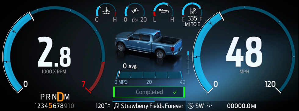
This is what Ford’s new F-150 display and infotainment system looks like

The most conventional view shows you your engine revs on the left and speed on the right, with other pertinent information in the middle. [credit: Ford ]
Among the most immediately noticeable technology upgrades in the new Ford F-150 are the truck's digital displays. We didn't have any images to share when our coverage was published on Thursday, but Ford sent over a pair of short clips that show off the new UI for the digital main instrument cluster and its latest Sync 4 infotainment system. So we decided to share them with you now. You can check out the gallery above or watch the pair of video clips embedded below.
12.3-inch main instrument displayThe F-150 isn't the first Ford to get an all-digital dash; you can find a 12-inch display instead of old-fashioned dials in newer Mustangs, and the electric Mustang Mach-E crossover uses a 10-inch display in front of the driver. The 12.3-inch screen that faces you in a 2021 F-150 looks more elegant than any of those 'stangs, though:
All-New F-150 Digital Cluster.
"The idea is it presents information in a very directed way so that it almost behaves like a concierge. So it's presenting the most important information and being able to move things around in a digital environment to make room for other content that's perhaps more important," said Mark Sich, F-150 digital designer at Ford. The move away from a skeuomorphic UI required some testing with Ford's truck customers, Sich told Ars. "What we discovered was that, as long as the information is presented in a real, digestible, understandable, hierarchical way, they were willing to really take that leap of faith."
Read 4 remaining paragraphs | Comments