Why I use KDE
Over the decades, my primary operating system of choice has changed a few times. As a wee child of six years old, we got out first PC through one of those employer buy-a-PC programs, where an employer would subsidize its employees buying PCs for use in the home. The goal here was simple: if people get comfortable with a computer in their private life, they'll also get comfortable with it in their professional life. And so, through my mother's employer, we got a brand new 286 desktop running MS-DOS and Windows 3.0. I still have the massive and detailed manuals and original installation floppies it came with.
So, my first operating system of choice' was MS-DOS, and to a far lesser extent Windows 3.0. As my childhood progressed, we got progressively better computers, and the new Windows versions that came with it - Windows 95, 98, and yes, even ME, which I remarkably liked just fine. Starting with Windows 95, DOS became an afterthought, and with my schools, too, being entirely Windows-only, my teenage years were all Windows, all the time. So, when I bought my first own, brand new computer - instead of old 386 machines my parents took home from work - right around when Windows XP came out, I bought a totally legal copy of Windows XP from some dude at school that somehow came on a CD-R with a handwritten label but was really totally legit you guys.
I didn't like Windows XP at all, and immediately started looking for alternatives, trying out Mandrake Linux before discovering something called BeOS - and despite BeOS already being over by that point, I had found my operating system of choice. I tried to make it last as long as the BeOS community would let me, but that wasn't very long. The next step was a move to the Mac, something that was quite rare in The Netherlands at that time. During that same time, Microsoft released Windows Server 2003, the actually good version of Windows XP, and a vibrant community of people, including myself, started using it as a desktop operating system instead.
I continued using this mix of Mac OS X and Windows - even Vista - for a long time, while having various iterations of Linux installed on the side. I eventually lost interest in Mac OS X because Apple lost interest in it (I think around the Snow Leopard era?), and years later, six or seven years ago or so, I moved to Linux exclusively, fully ditching Windows even for gaming like four or so years ago when Valve's Proton started picking up steam. Nowadays all my machines run Fedora KDE, which I consider to be by far the best desktop operating system experience you can get today.
Over the last few years or so, I've noticed something fun and interesting in how I set up my machines: you can find hints of my operating system history all over my preferred setup and settings. I picked up all kinds of usage patterns and expectations from all those different operating systems, and I'd like to enable as many of those as possible in my computing environment. In a way, my setup is a reflection of the operating systems I used in the past, an archaeological record of my computing history, an evolutionary tree of good traits that survived, and bad traits bred out.

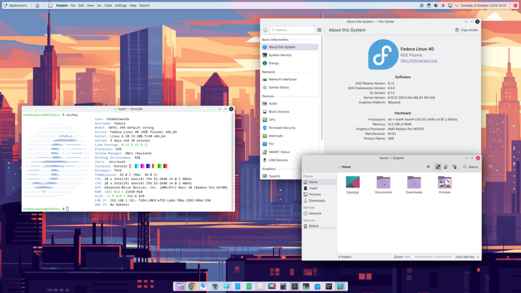
Taking a look at my bare desktop, you'll instantly pick up on the fact I used to use Mac OS X for a long time. The Mac OS X-like dock at the bottom of the screen has been my preferred way of opening and managing running applications since I first got an iBook G4 more than 20 years ago, and to this day I find it far superior to any alternatives. KDE lets me easily recreate a proper dock, without having to resort to any third-party dock applications. I never liked the magnification trick Mac OS X wowed audiences with when it was new, so I don't use it.
The next dead giveaway I used to be a Mac OS X user a long time ago is the top bar, which shares quite a few elements with the Mac OS X menubar, while also containing elements not found in Mac OS X. I keep the KDE equivalent of a start menu there, a button that brings up my home folder in a KDE folder view, a show desktop button that's mostly there for aesthetic reasons, KDE's global menubar widget for that Mac OS X feel, a system tray, the clock, and then a close button that opens up a custom system menu with shutdown/reboot/etc. commands and some shortcuts to system tools.
Another feature coming straight from my days using Mac OS X is KDE's equivalent of Expose, called Overview, without which I wouldn't know how to find a window if my life depended on it. I bind it to the top-left hotcorner for easy access with my mouse, while the bottom-right hotcorner is set to show my desktop (and the reason why I technically don't really need that show desktop button I mentioned earlier). I fiddled with the hot corner trigger timings so that they fire virtually instantly. Waiting on my computer is so '90s.
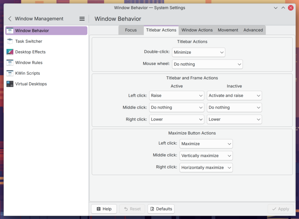
It's not really possible to see in screenshots, but my stint using BeOS as my main operating system back when that was a thing you could do also shines through, specifically in the way I manage windows. In BeOS, double-clicking a titlebar tab would minimise a window, and right-clicking the tab would send the window to the bottom of the Z-stack. I haven't maximised a non-video window in several decades, so I find double-clicking a titlebar to maximise a window utterly baffling, and a ridiculous Windows-ism I want nothing to do with. Once again, KDE lets me set this up exactly the way I want, and I genuinely feel lost when I can't manipulate my windows in this manner.

For the pedantic among us - including myself - I do have to mention that these BeOS window management quirks are, if I have my history straight, originally copied from the classic Mac OS. Be, Inc. was founded by former Apple engineers, after all, and once the AT&T Hobbit processor was cancelled, followed by the failure and cancellation of the BeBox, BeOS positioned itself as a PowerPC Mac OS replacement, before eventually also adding x86 support. However, I never used the classic Mac OS when it was current, so BeOS is where I found and adopted these quirks.
You can also see BeOS represented in a very unexpected place: my terminal colour scheme. BeOS' terminal had black text on a white background, and while the modern KDE terminal application has additional niceties the BeOS terminal didn't have - coloured text! - the basic black-on-white is still by far my preferred terminal colour scheme. I definitely unlearned that DOS white-on-black pretty quickly, and thankfully, pretty much any modern terminal emulator allows you to set your own preferred colour scheme.
And yes, there's some holdovers from Windows in there too. I really like the original, basic Start menu from the Windows 9x days, and I keep that around in my modern KDE desktops; just a simple list of categories with cascading menus, and that's it. Virtually everything else Microsoft added to the Start menu since has made it worse, and I firmly believe that original design all the way back from 1995 is still an excellent, unobtrusive, yet patently discoverable way of finding applications you don't use very often. Add in modern tools like KRunner - the always accessible KDE system search tool that prioritises applications - and that's all I personally need to launch applications that don't deserve a spot in my dock.
You'll notice that the red thread running through all of this is KDE Plasma. Out of all the major desktop environments today, KDE is the only one still catering to people who want their graphical user interface to be adaptable to their needs, instead of asking the user to adapt. Windows, macOS, GNOME - they all expect me to mold myself into their predefined shape, whereas I can freely mold KDE to fit my shape.
This goes far beyond just shaping the desktop environment - panels, desktop icons, etc. - itself. One of the most underrated features of KDE is the ability to turn off and edit toolbars, and this feature alone would be enough to draw me towards using KDE. I can't stress how much I love that I can edit the toolbars of virtually every KDE application to fit my exact needs and wishes, so I don't have buttons or toolbars I don't ever use taking up space and distracting me. Add to that the ability to individually turn labels on and off per toolbar item, and you can really make the UI of your applications suit your specific needs and wishes.


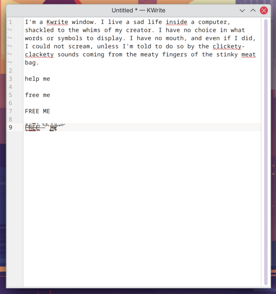
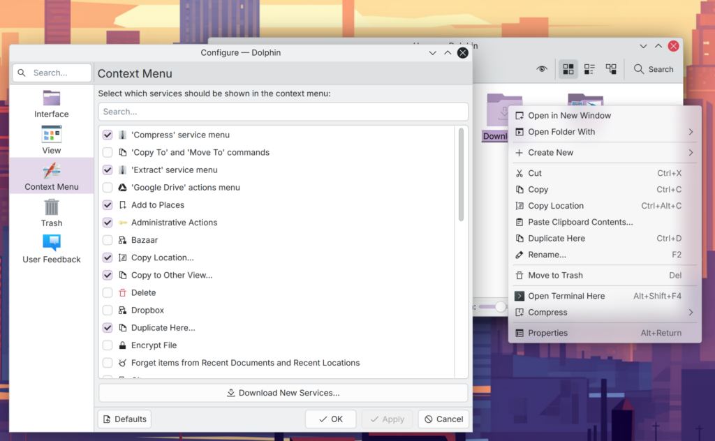
Kwrite doesn't need any toolbars or buttons at all, so all I have enabled are the default window chrome and line numbers. The same applies to my terminal, which just has its window chrome enabled, and nothing else. I changed Dolphin, KDE's file manager, to move buttons around a bit to better fit my needs, and I added a button to show and hide hidden files, which I weirdly use a lot. Dolphin also allows me to add or remove whatever I want from its context menu, so I remove anything I don't need to end up with a context menu specifically optimised for me. I extensively modify Kmail and its various sub-windows, since most of the more groupware-like stuff I simply don't need at all. And so on.
It's remarkable how KDE has managed to withstand the onslaught of rigid, mobile-inspired UI design with oversized buttons, endless seas of white space, toggles designed for touch instead of cursors, and so on. Whereas all of their competitors seem to be shoehorning touch-optimised UI elements into a cursor-driven environment, KDE still treats the mouse cursor as the primary input, and it shows. KDE still understands that on my desktop or laptop computer, where 99.9% of my input is done with a mouse and keyboard, the UI should reflect that. That means KDE tends to be more dense, show more information, and isn't afraid to show buttons and other UI elements where it makes sense, as opposed to the trend of hiding everything from the user in favour of oversized buttons and immense amounts of whitespace to accomodate fat fingers that are, in reality, rarely used.
On top of that, KDE doesn't infantalise its users. It treats its users not as children that need to be protected from themselves, but as grown adults that can make their own informed choices to shape and mold their computers in a way that suits them best. Yes, this means there are a lot of settings panels in KDE, some of which might be quite complex, but KDE trusts its users to be able to handle this responsibility. When using, say, iOS, macOS, or GNOME, I feel like I'm being treated like a child who isn't yet ready to make their own informed decisions in life, imposing a very my way or the highway"-style of 1950s parenting. I'm sure this works just fine for millions of people, but I find it condescending, insulting even.
I was reading Carl Svensson's in-depth critique of GNOME's file manager recently - a great read - wherein he also linked to one of his earlier articles about the decline of usability in modern software. One part in particular in that article stood out to me; after showing a screenshot of Blender, a by necessity incredibly complex piece of software with a very complex user interface, Svensson nails the problem with, in this case, GNOME's UI design so well I'm suspecting he's a carpenter by trade (his emphasis at the end there, not mine):
I honestly can't see how a program like Blender could possibly be created using Gnome's guidelines - or indeed toolkit: certain time-tested UI elements aren't even allowed in Gnome anymore, such as menu bars and hierarchical pull down menus. Progressive disclosure" and the prevailing interpretation of navigation structures" means completely replacing certain parts of the interface with others - instead of letting the user decide what's relevant for them to see at any given moment. Frequently used actions should be close at hand" - but in a program like Blender, frequently used actions vary profoundly with what kind of project is being worked on and what stage that project is in. I find it unlikely that a developer can make such judgement calls better than a user spending tens of thousands of hours in the program during the span of a career. Then again, Focus on one situation, one type of experience." is rather telling. Using software professionally isn't about having a chic, boutiqueexperience- it's about getting the job done as quickly and efficiently as possible.Sometimes, that means working with irreducible complexity.
Carl Svensson
And this hits right at the heart of the problem with the type of modern, minimalist, touch-first UI design embodied by GNOME, Windows, and now even macOS: it doesn't allow for complexity, because the UI wrongfully assumes it's running on a device with touch input owned by a child. The fact that your human interface guidelines, ostensibly developed for a mouse-first, desktop interface, do not allow for the kinds of complex applications people use to get work done - whether that be a spreadsheet, something like Blender, or even a word processor - should really make you pause and think about what your goals are, and if you might be heading down the wrong path.
This is why I use KDE. It's the only major environment that respects me as a user, and fully embraces the input method it knows people are using. I'm genuinely baffled by how much animosity there seems to be among certain UI designers towards the mouse, and how desperately they are trying to embrace touch-first UI ideas that simply have no place on a desktop or laptop with a cursor. It feels like they want to be making a phone or tablet UI so bad that they lose all sight of what people are actually using out here in the real world.
This will sound harsh, but that doesn't make it any less true: nobody uses GNOME or Windows applications on tablets or smartphones (the macOS situation is more complex, of course). I absolutely respect the hard work and love people are putting into making a GNOME or even Plasma-based smartphone, but the reality of the matter is that as it stands right now, I doubt there's even more than 10000 people using GNOME or KDE Plasma on a smartphone. So why should the millions of people using GNOME or KDE Plasma be forced to use a UI primarily inspired by touch?
KDE seems to, for now at least, understand this, and that makes it the last popular mouse-first desktop environment that trusts its users with settings, complexity where inevitable, and configurability. Everyone else has either succumbed to the lure of infantilising touch interfaces, or is far too niche to serve as a proper alternative.
And that's why I use KDE.
Addendum I: Obviously, KDE isn't perfectAll of this being said, KDE is far, far from perfect, and the various KDE contributors I've interacted with will be the first to acknowledge this. I want to bring some balance into this article by discussing some of the things KDE definitely needs to work on, and some worrying trends I'm seeing lately that have me mildly worried about where KDE might be going in the future.
First and foremost, especially newer KDE applications seem to not always respect the variety of choices KDE offers. A great example is the global menubar widget; newer applications like Tokodon, Weather, Spectacle, or even the Settings application, do not have a menubar to export, meaning the widget in the top bar remains eerily empty. I understand they want these applications to not have a menubar visible by default, but I think there's still enough functionality to populate at least a basic menubar to be displayed for those of us using the global menubar widget or who just want a regular menubar attached to the window. This same group of applications also do not allow their toolbars to be hidden or edited, which is another massive regression from the norm.
This is a worrying trend I hope will be halted.
A second major issue is the messy state of KDE's various theming options. KDE is well-known for its ability to be themed, but the options for it are confusingly spread out, including the oddity where applications and the Plasma desktop elements use different theming engines. You can end up in a situation where you find a good application theme, but then need to hunt to find the accompanying Plasma theme, assuming it exists at all. It all feels a bit disjointed and chaotic, and I know KDE developers agree, because they are working on greatly streamlining this process, including a unified theming engine called Union. Setting a wallpaper presents a similar issue if you want the same wallpaper applied at your SDDM login screen, desktop, and lock screen - you need to use three distinct settings panels to do this.
It also feels like the powerful Plasma widget engine has been collecting some cobwebs and dust bunnies lately. The first-party, included widgets often feel sparse and limited, quite contrary to the rest of KDE, and the third-party widget offerings are, well, varying in quality, to put it diplomatically, and outdated widgets that don't even function anymore are still listed in the download new widgets dialog. The widgets activated in a default installation - the system tray, the taskbar, and so on - are often in a good state, but everything else definitely needs some love, and perhaps a development sprint or whatever is needed where experienced KDE contributors take stock of what new widgets people might want and then make them.
Finally, the KDE application ecosystem is not as healthy as it could be. Some KDE staples like Kmail can feel quite outdated, and KDE's own browser, Falkon, which has the potential to be excellent, needs a lot of TLC to be brought up to speed with what users expect of a browser (something that might be important, for no particular reason at all). It also seems like while the GNOME/libadwaita world gets a steady stream of cool, new small applications, it's a bit more silent on the KDE front in this regard.
There are smaller issues here and there, as there are with any major, complex software project, but these are some of the what I consider to be big ticket items that I personally would love to see some attention diverted towards. Of course, I'm just a user, and in the end, it's up the KDE project to allocate what I'm sure are fewer resources than they'd like to have.
Addendum II: Actually, GNOME is greatWhile I've said some harsh words about GNOME in this article, I want to stress that this is just my personal opinion, and reflects nothing but my own preference in how I use my computer. While GNOME is simply not suited to my needs, it is an absolutely outstanding desktop environment, created by a team of people who know what they're doing, who deeply care, and who more often than not receive an entirely undeserved, very nasty, almost personal kind of abuse that goes far beyond merely stating a dislike for GNOME.
GNOME may not be for me, but the Linux (and BSD) world should be deeply thankful for having such an excellent desktop environment as the face of the desktop segment of the market. GNOME is still kilometres ahead of whatever Windows and macOS are doing, and if KDE didn't exist, I'd happily use GNOME without so much as a single hesitation. A piece of software not suiting your needs doesn't mean it's bad or that the people making it are bad people. It just means you shouldn't be using it.