For long stories, such as book reviews (and probably this one), Slashdot would use a short synopsis of the story (they call it the "titletext") to display on the front page feed. This way, the front page entry isn't overly long, but it still gives you an option to click the story for the full review.
I had been debating adding such a feature but now it's looking like it really is the right thing to do.
>I like the colours and layout. Reminds me of the old slashdot just with a different pallete.
Yes. It's gorgeous, it loads instantly, and it renders perfectly in any engine. This of all things should never change (and I'd love it if Pipecode became a standard for discussion sites). Theming would be neat, but shouldn't be a particularly high priority, IMO.
3. A working user page, moderation, signature lines, and a method for quoting other than the old Usenet '>' standard. And the volume of people, of course. No particular person (there are plenty of /.ers I'd love to see over here, several I really wouldn't, and a whole bunch of whom I have no particular opinion) but just the critical mass needed to keep a discussion board going. I've done my best to help by putting a reference to |. into my SoylentNews .sig--are there any other reasonably non-spammy ways people can think of to get the word out?
4. So far, the balance of stories on the front page has been about right, IMO: a fair helping of both computer-specific and general-interest science and engineering. Let's keep that up, if we can. Most of my submissions will probably be science-oriented since that's what I do for a living; but as a bioinformaticist, I always have one foot in the IT world and I like knowing what's going on there whether or not it's relevant to my work. As with the best of old /., it's the comments that make the difference.
Re: Reusability is really, really hard. (Score: 2, Interesting)
>I'm more concerned with how the stage as a whole will deal with multiple cycles through the transonic re-entry regime and with landing system.
Yeah. That. The engines are tough--they have to be--but I can easily envision a scenario where perfectly good engines rip themselves out of an overstressed airframe (spaceframe?) that developed some kind of undectable fatigue over the course of multiple launches.
Re: Reusability is really, really hard. (Score: 1)
Yes, the copy/paste stuffed it; and now I can't find that link :P
However, I was referring to the prediction that chocolate may be as expensive as gold: http://www.independent.co.uk/life-style/food-and-drink/features/chocolate-worth-its-weight-in-gold-2127874.html
Re: I really feel that these sort of disks are starting to be seriously limited.. (Score: 1)
"Okay then, for when you want a straight binary copy of a whole drive what would you use instead of dd?"
That's a somewhat different goal from the average "backup", but
dd_rescue
or
ddrescue
do what
dd
does, but with greater flexibility.
I've used both in attempts to rescue TiVo drives (well, to rescue the contents before the drive finished dying, actually), with probably as much success as was going to be possible under the circumstances.
I think that the engines will prove capable of multiple uses. They've ground tested them extensively for multiples of the flight time. While its definitely not the real thing I believe it to be good enough to reasonably assume they'll work for multiple flights. And the F9 first stage does have engine out capability. I'm more concerned with how the stage as a whole will deal with multiple cycles through the transonic re-entry regime and with landing system. We'll see how things play out, though.
Cheers, -WW
Re: Reusability is really, really hard. (Score: 2, Informative)
At this point, they're going for landing the 1st stage, with an eye to eventually reusing it. Full reusability (i.e. including the 2nd stage), probably is waiting till the next generation.
Of course it's all a bit experimental at this point -- nobody's ever soft-landed their heavy-lift liquid-fuel boosters (though the SSMEs are close, in a way), so what sort of damage they receive and what economical refurbishing practices will look like is not really known... depending on how many (and which) components turn out to be cheaper to replace every flight than to overbuild and maintain for repeated uses, "full" reuse may never happen.
I want to know who to sue as I didn't get a single-digit UID as I didn't know about this site until just now.
All kidding aside, great work. I started on something similar when I first saw Slashdot Business Intelligence rear it's ugly head, and had a vision for it that was just like this .. blue color and all.
I definitely like the pipe dot name better than slashampersand (the name I came up with), though.
So where can I checkout the source?
I've volunteered some on the soylentnews side, they have a pretty good team together.
I have always been pro-start-from-scratch, though. Never thought slashcode would ever be so closely mimicked.
I'm glad that both sites exist, if anything, to send a message and maintain free-press for developers and some fans of tech.
>Your comment has inspired a theory: In OpenOffice Calc I can close this large panel of icons down easily. In MS Office I can't. Perhaps this simple ability to be able to remove the parts of the interface makes it more appealing.
Options options options. Give users a choice if possible. The heart of enlightenment.
Speaking of changes, I am looking at the latest OpenOffice.org Calc. It has the standard dropdown menus at the top starting from the left, File Edit Insert Format Tools Data Window Help, and on the right a large ribbonesque properties box taking up 1/7 of the screen showing icons for text alignment orientation cell border etc. I am not offended by this. It has been sitting there for the last few hours. I haven't used any of the options in this spreadsheet. It isn't offensive. It has an x in the top right corner for closing it.
I find the MS Office ribbon highly offensive. I don't find this offensive. I can't quite put my finger on why.
Your comment has inspired a theory: In OpenOffice Calc I can close this large panel of icons down easily. In MS Office I can't. Perhaps this simple ability to be able to remove the parts of the interface makes it more appealing.
Or maybe that it is taking up horizontal room for which I have lots and not crowding the screen vertically.
Making a reusable crew transport vehicle like the Dreamcatcher (or, for that matter, what the Shuttle was originally supposed to be) is "easy" enough, for certain values of that word. Making a heavy-lift system that's fully reusable ... isn't. Full reusability is a great long-term goal, but maybe that's something for the next generation?
Well, yeah--the decision to put that option in is one of the few times I can think of recently where the people in charge of UI (don't get me started on "UX") have actually listened to their users. I just wish it happened more often, and that there weren't so many boneheaded, arbitrary changes in the first place.
Re: I actually like global menus ... (Score: 2, Informative)
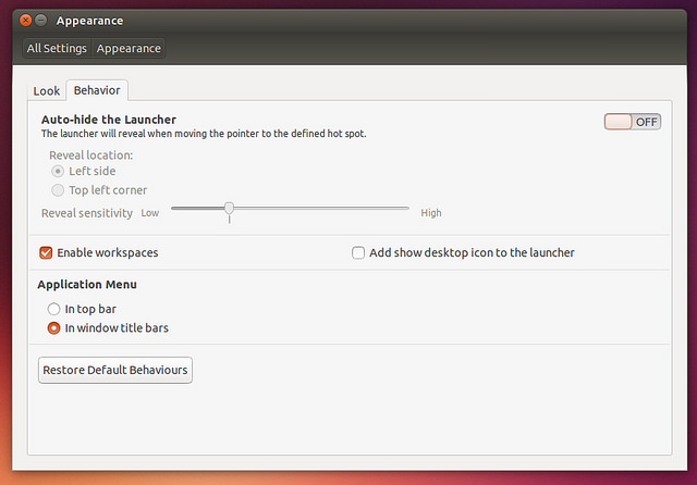
In this case, it seems like they are giving you the choice. There's a new option in the Appearance Settings , which defaults to the current behaviour -- I expect that they'll want to change the default in some future release.
I think it's almost axiomatic that any significant UI changes will cause outrage in the short term (e.g. Windows 8, Slashdot Beta, any time Facebook changes anything, Xbox 360 dashboard, Netflix...). People hate change; even actual interface improvements will probably be met with hostily in the short term. As a developer, you can expect at least a couple of weeks of overwhelmingly negative feedback for any significant UI alterations you make -- but if you're not starting to see mixed to positive to responses once the initial shock dies down, then you may have to admit that you have actually made things worse...
... but I like choice even more. I really wish interface designers (or their bosses) would get this through their heads: when people are used to doing something a certain way, don't force them to do it a different way, unless it's absolutely necessary for the application to function. If you come up with a new way that you think is better, great, make it an option or even set it as the default--but always offer your users a choice of switching back to the behavior they're used to, preferably without jumping through a lot of hoops, or you will accomplish nothing good.
It seems like they are giving you the choice in this case. There's a new option in the Appearance Settings , which defaults to the current behaviour -- I expect that they'll want to change the default in some future release. I think it's almost axiomatic that any significant UI changes will cause outrage in the short term (e.g. Windows 8, Slashdot Beta, any time Facebook changes anything, Xbox 360 dashboard, Netflix...). People hate change. As a developer, you can probably expect at least two weeks of negative feedback for any significant UI alteration -- but if you're not starting to see mixed to positive to responses once the initial shock dies down, then you may have to admit that you actually made things worse...
... but I really wish interface designers would realize that taking choice away is a bad thing . If your users have become accustomed to doing something one way and you want to encourage them to do it another way, fine. Change the default settings or whatever. But you should almost always leave them the option of using the methods they're accustomed to. The one exception I can think of to this is when leaving the old interface in place will truly, fundamentally break the application--and really, how often does that actually happen?
I like the colours and layout. Reminds me of the old slashdot just with a different pallete. The ability to choose different themes or set specific colours would be nice. This site has real potential.
I just wrote up a submission for you! If I have time, I'll see if I can do a couple over the weekend as well. I may be being dense again, but it's not clear if we can vote on articles in the pipe, or how to get them onto the front page? I did notice a couple of minor points around submitting:
A Preview button might be nice :)
I got bitten by the Unicode rejection when trying to submit, which I think was due to extended characters in the source article I quoted:
I needed to replace any visibly non-ASCII characters I could see (em-dashes mainly), but still couldn't submit.
I then copied the submission text out of |. and pasted into Notepad, then copy-pasted it back, which seemed to render the text admissible.
Other than that it was pretty straightforward :) While I'm here, one last thing which would be superawesome would be a couple of navigation links in the comment view:
Parent
Prev/next in thread
Prev/next on site
[The last two I would like because I've taken to browsing comments by entering http://pipedot.org/comment/ n manually and then adjusting the value of n by editing the URL...]
It would be nice if the comment box let you know what is allowed and what isn't. For instance, do image tags work? Nope, doesn't seem like it... How about Bobby; DROP TABLE users;?
I thought, for about a microsecond,that that "rattle the Dice" line looked familiar, then remembered it should have my name in front of it, and now I'm wondering why it doesn't.
It does look a very simple clean interface, like slashdot used to be. I will probably steal^W be inspired by it for s'qute. Competition is good. There are literally millions of people looking for clever discussions on the internet. Hopefully soylentnews , pipedot , slashdot and s'qute will all diverge and develop their own character and community.