Story
Apple's New MacBookSimilar News
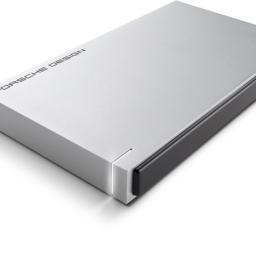 |
One port to rule them all? No problem for this chubby child LaCie has an external drive that can hook up to Apple’s single-port MacBook.…
|
 |
by Matt Burns from Crunch Hype on (#4MG1)
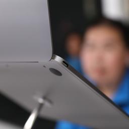
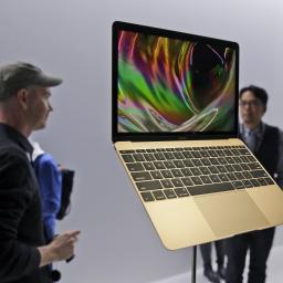
Apple announced the new MacBook today, and in true Apple fashion, it does things differently. A lone USB-C port will handle the charging, data input and video out. So how will users recharge an iPhone and the laptop at the same time? Buy these adapters from Apple of course! Apple just released a series of accessories for the USB-C port in the new MacBook. To use a standard USB cable,… Read More
|
 |
by Guardian Staff from on (#4KPS)
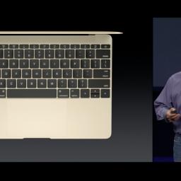
Apple unveils more details of the much anticipated Apple Watch and a new, thinner MacBook Continue reading...
|
 |
by Samuel Gibbs in Berlin and Alex Hern from on (#4K74)
Apple’s smallest laptop increases in screen size but shrinks in body size with new reversible USB type-C ports
|
 |
by Technology Staff from on (#4KAR)
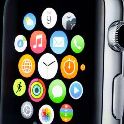
Everything you need to know about Apple’s new products and announcments, from the Apple Watch to the new MacBook to Apple TV, in brief Continue reading...
|
Apple held its Apple Watch event today, but despite all the hype, the two most exciting announcements had nothing to do with the Apple Watch. I want to start the announcement that excited me the most, even though the general public won't care all that much: ResearchKit. ResearchKit combines the iPhone and HealthKit to allow iPhone owners to participate in medical research.This may sound like something trivial, but anyone who has ever done any serious scientific research - medical or otherwise - knows how hard it is to find enough quality participants. ResearchKit will allow users to opt-in into medical research programs, so you can collect data through your iPhone and send it straight to researchers. They can then use this data to aid in research for conditions like diabetes or breast cancer.In addition - and this is hugely important - Apple announced that it will release ResearchKit as open source, so that other platforms can participate in this endeavour too. In other words, Android or Windows Phone users could install applications to aid medical research as well, assuming developers implement support for it. I'm really hoping the big players - Apple, Google, Microsoft, etc. - come together to make sure this is a proper open standard, implemented on all the major smartphone platforms.Cancer has had a huge impact on my life - even though I - thank the goddess - have never had cancer, I've had people close to me and my family die all around me ever since I can remember. I've seen families torn apart by it, I've seen people fight through it to live another day (like my mother), and I've seen people suffer horrendous pain. In fact, I'm sure we all have.However, I've also seen what medical research has done for those suffering from cancer. Even a few years can make a huge difference - breast cancer treatment today is better than it was only a few years ago. And of course, while my personal frame of reference is cancer, there are countless other horrible diseases that could benefit greatly from more and easier research participation.So yes, this was, at least for me, as a human being who cares about the people around him, the most significant and most important part of today's event. I'm setting my cynical self aside for a second, and I'm really hoping the industry gets behind this as quickly as possible. Please.That being said, on to new products. Apple announced a new MacBook that's crazy thin, has a fancy new keyboard, and a nice new touchpad. It's only 0.92kg, 13.1mm thick, and has a 12" 2304x1440 display, and comes in silver, blackish-silver and gold. The specifications are a bit disappointing, though: a 1.1GHz dual-core Intel Core M with Intel HD Graphics 5300. It's got 8GB of RAM, and a 256GB SSD (configurable to 512GB). Best thing: it's completely fanless.The keyboard replaces the scissor mechanism with a butterfly one, which sounds like marketing nonsense, but actually makes sense. Whereas scissor hinges causes keys to wobble upon keypress, the butterfly gine has a more uniform keypress. I'll have to try it out to see if it translates into actual benefit, but it sure does look like it. Similarly, the touchpad has been redone as well, and now implements Apple's confusing force touch stuff from the Apple Watch. I think a force touch is a harder press, but I still have no clue.All in all, this looks like a fantastic, if not underpowered laptop - until you hit the price. The price is very hefty - $1549 in the US, and â¬1449 in the EU. No thanks.Lastly, we have the Apple Watch. Apple essentially just redid the demo from late last year, showing very little new information or functionality. Basically, take any Android Wear device, add the ability to answer calls on the device itself, make the software more complicated and the UI uglier and messier, add several hundreds of dollars or euros to the price, and you've got yourself an Apple Watch. In other words, dangerously close to that Tizen Samsung Gear thing nobody wanted.Apple had one job this evening: tell us why we want an Apple Watch. Tell us why we should spend at least $349/â¬399 (the price of the small version of the cheapest model), all the way up to â¬17000 (the most expensive gold model) for a gadget so we have to take our phone out of our pockets slightly less often. The cold and harsh truth is that Apple failed to answer that question - what they showed us was a very complicated, finnicky device with an incredibly hefty price tag (only the garish aluminium/rubber small models are $349/â¬399 - the better-looking models are all around â¬900-â¬1000).You don't have to believe me - take it from The Verge's Nilay Patel, not exactly a vocal Apple critic, who actually tried the device out after the event.That's sort of the defining theme of the Apple Watch so far: it's nicer than I expected and I'm sure the confusing interface settles down into a familiar pattern after you use it for a while, but I'm still not sure why you'd want to put this thing on your wrist all the time. Apple's big task at this event was convincing people that a use case for the Watch exists, and at this moment it still feels like an awful lot of interesting ideas without a unifying theme. We'll have to wait until we get review units in hand and spend way more time with one to really understand the value of the Apple Watch.The device is riddled with unintuitive and arbitrary UI conventions, and just as I predicted when the device was first announced, Patel states it feels disjointed and confusing. This is by no means a surprise to me, but it is a surprise for a first-gen Apple product. The iPod, the first iPhone, the iPad - they were all quite intuitive and easy to grasp, but the Watch, clearly, seems not to be so.This is a matter of taste, of course, but the applications Apple showed didn't look particularly nice, either. Words like garish, information overload, cramped come to mind. Android Wear is already confusing and cumbersome at times due to the small screen, and Apple is cramming a lot more functionality and user interface in that same space. It doesn't take a rocket scientist to figure out that's not going to be easy to use. All in all, nor this event, nor the first hands-on reports seem to allay my initial concerns about the confusing and cumbersome UI.Apple promises "all-day" battery life of 18 hours, which is less than what I get out of my Moto 360 (two days easy, three days with effort), and more or less forces daily charging. It'll be available in select countries starting in April.
from Techreport on (#4MKB)
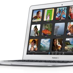
At Apple's press event today, the company returned its mid-line MacBook to its product lineup. And yes, it's the thinnest Apple notebook ever. But there's much more to the new wafer-thin MacBook than meets the eye. ...Read more...
 |
by Sam Machkovech from Ars Technica - All content on (#4KE4)
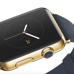
Get up close and personal with a $10,000 watch and a new take on the trackpad.
|
 |
from heise online News on (#4KBJ)
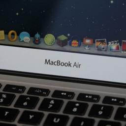
Bei seinem "Spring-Forward-Event" in San Francisco hat Apple auch überarbeitete Notebooks angekündigt. Zu den Neuerungen zählen schnellere Prozessoren und längere Akkulaufzeiten.
|
 |
by Andrew Cunningham from Ars Technica - All content on (#4K6T)
All laptops pick up Broadwell, better battery life, and better 4K support.
|
 |
by Lee Hutchinson from Ars Technica - All content on (#4K5V)
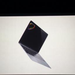
New keyboard and trackpad tech, 2304x1440 display, 14nm Intel Core M CPU.
|
1
